Pisanello Palette 5
Nocturnal Bister
Nocturnal Night-register palette - very low values, the world after dark.
Bister Dark warm brown - a traditional ink and wash pigment made from wood soot.

Palette Analysis
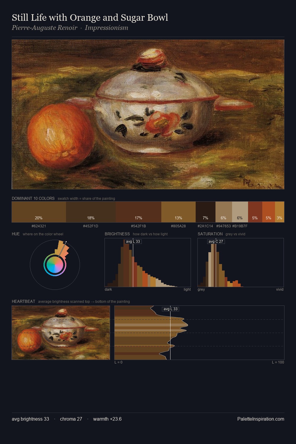
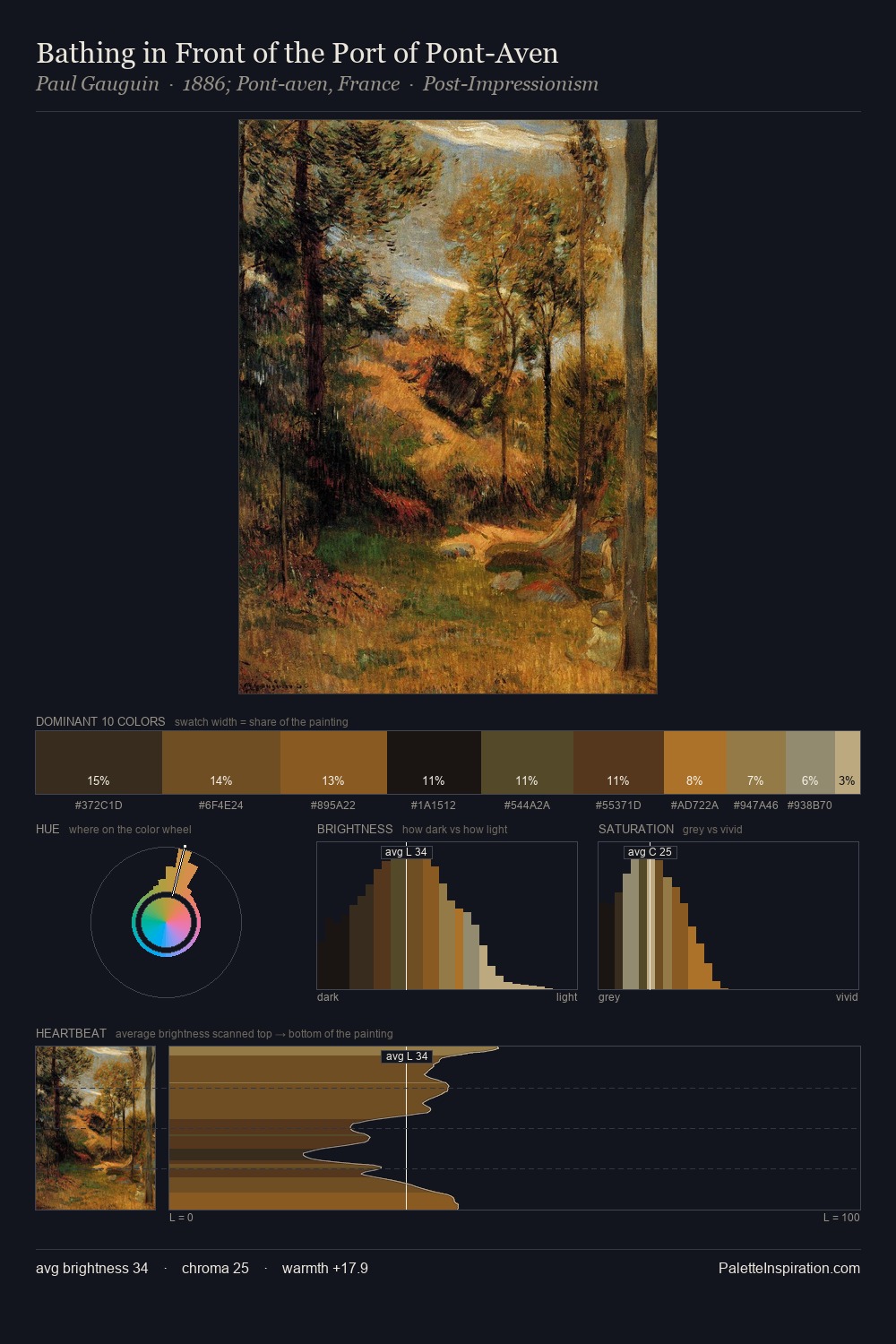
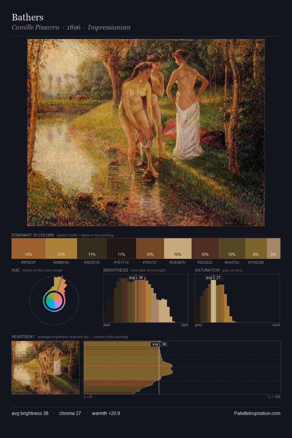
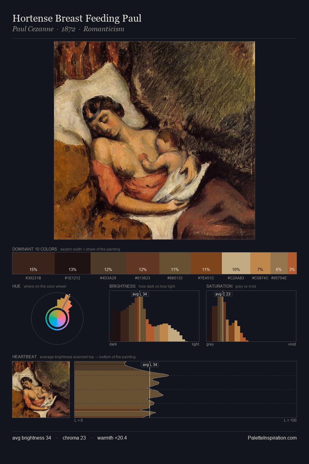
Pisanello occupies the comfortable middle of the value scale, avoiding both extremes to hold the eye in a sustained middle grey. Pisanello orchestrates warmth above all else - reds, ambers, and siennas take the lead. Chroma is kept low across all colours, producing the soft, enveloping quality that characterises tonal painting. Only 10.1% is devoted to #54331C, yet that small allocation delivers the palette's entire chromatic tension. At 52 units across the value scale, the palette keeps contrast readable without letting it dominate. This is palette 5 of Pisanello's sequence - a single chapter in a chromatic story told across many works.
Example use cases
- theater design
- jewelry brands
- tobacco-adjacent retail
- event branding
- film & entertainment
I Love This!
Use This Palette
Copy, export, or download for your project
Copy, export, or download for your project
Copy:
Download:
Share: