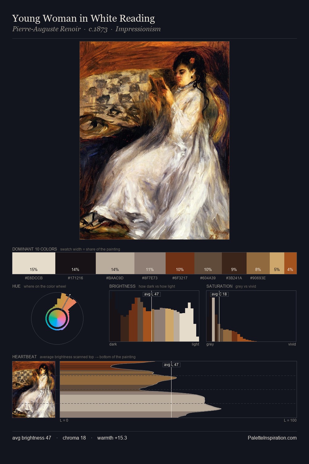
Pinturicchio Palette 6
Shadowed Umber
Shadowed Low-key - values weighted toward shadow, the palette of dim interiors and overcast skies.
Umber Dark earthy brown - raw or burnt umber, a foundational old-master earth pigment.

Palette Analysis
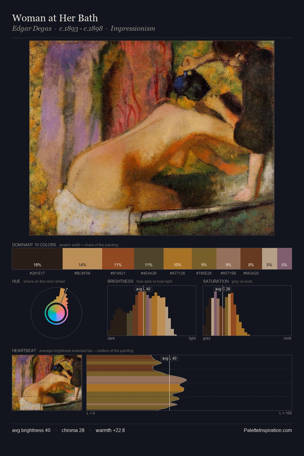
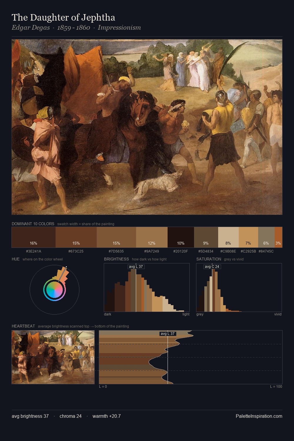
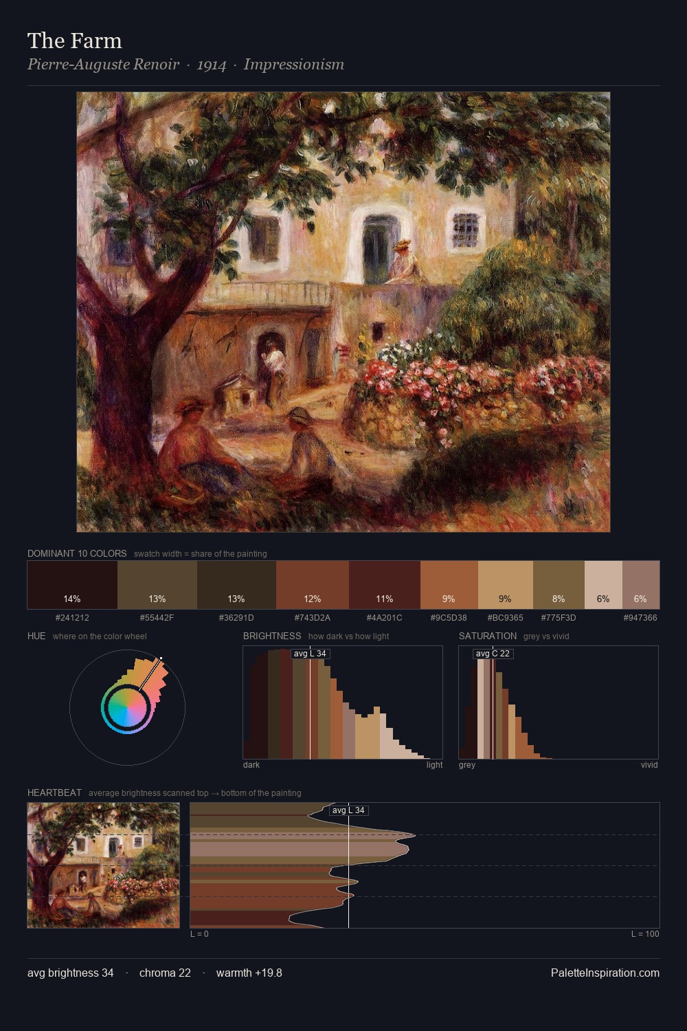
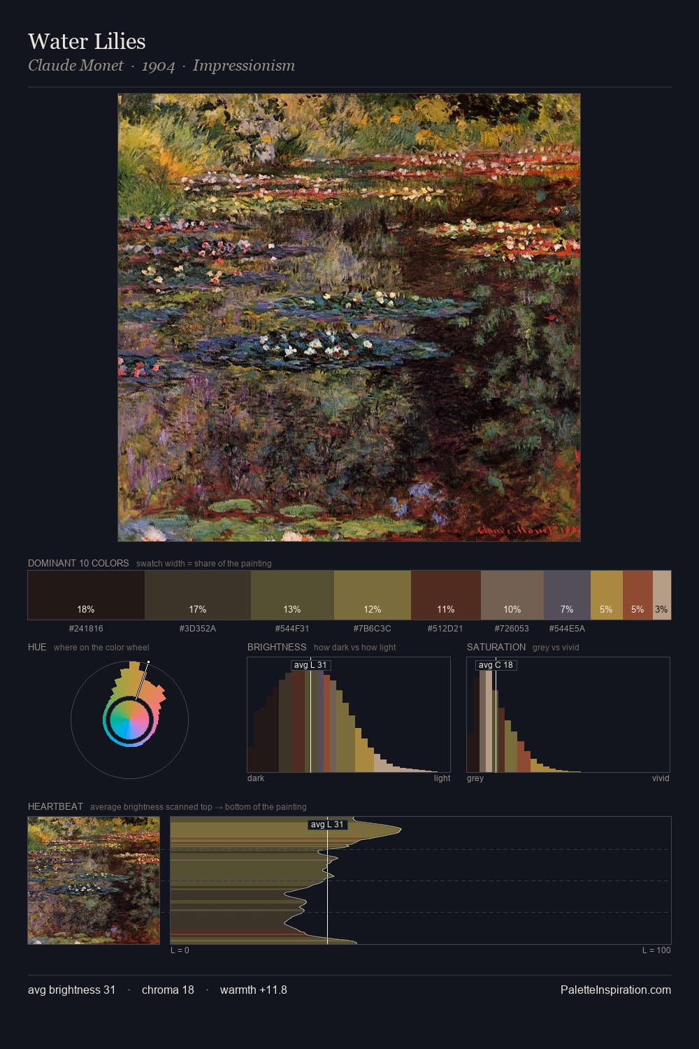
Mid-key values give Pinturicchio its characteristic quietness - nothing blazes, nothing disappears. Yellow, ochre, sienna: warm hues that Pinturicchio deploys as the palette's primary energy. All colours lean toward grey, building depth through value rather than colour punch. #7B6636 delivers the chromatic peak at only 9.9% - a small shot of colour with outsized visual impact. The value range of 51 units sits in the comfortable middle: enough depth, enough light, neither extreme. Palette 6 sits within the larger chromatic argument that Pinturicchio's complete body of work advances.
Example use cases
- music labels
- luxury hospitality
- editorial photography
- leather goods
- premium streaming
I Love This!
Use This Palette
Copy, export, or download for your project
Copy, export, or download for your project
Copy:
Download:
Share: