Pieter van Mol Palette 4

Palette Analysis
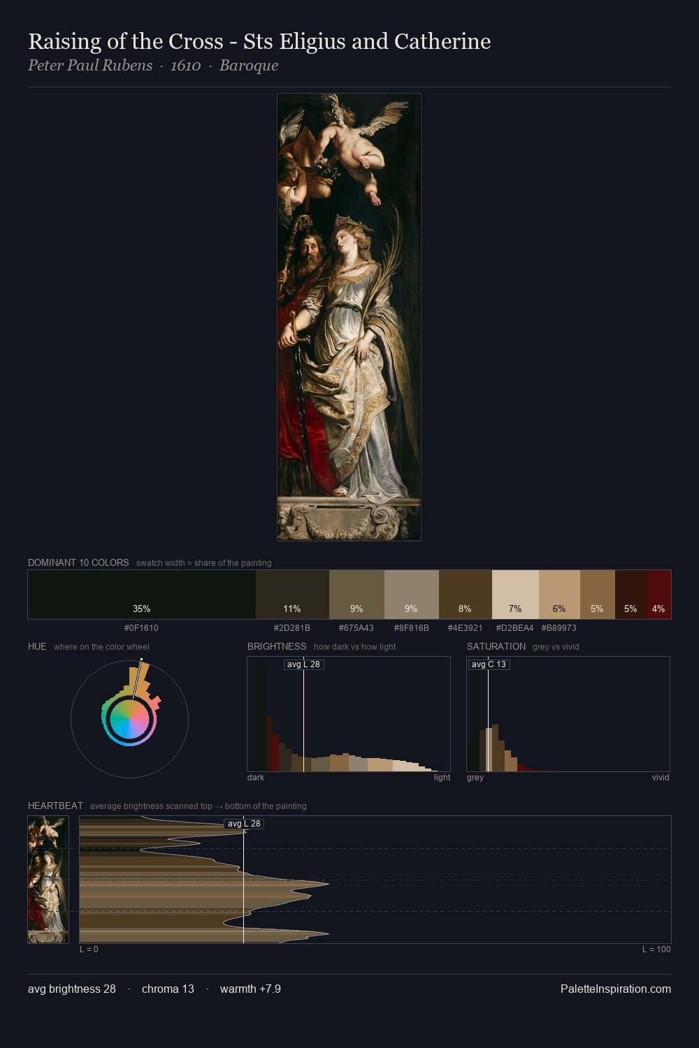
Low-key values are the structural spine of Pieter van Mol, giving it gravity and atmosphere. Neither warm nor cool has the upper hand here; the equilibrium between the two generates the palette's visual energy. The absence of saturated colour is itself an expressive choice: this is a palette of restraint and atmosphere. 36.1% of the palette belongs to #15130F, a concentration that makes it the unmistakable visual centre. #BE9467 functions as the palette's exclamation mark: highest chroma, lowest percentage (4.2%). 59 units of value range underpin the palette's structural clarity: the eye always knows where light falls. This tonal restraint is characteristic of the Pieter van Mol approach: colour serves light, not the reverse. In the context of Pieter van Mol's full range of palettes, group 4 represents one movement in an ongoing chromatic dialogue.
Example use cases
- theater design
- jewelry brands
- tobacco-adjacent retail
- event branding
- film & entertainment
I Love This!
Copy, export, or download for your project