Pieter van Mol Palette 3

Palette Analysis
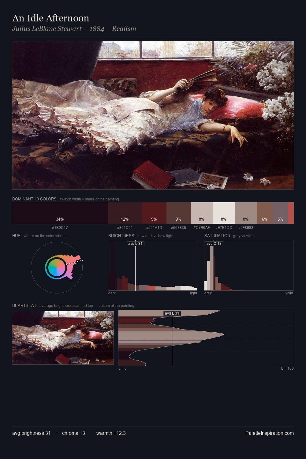
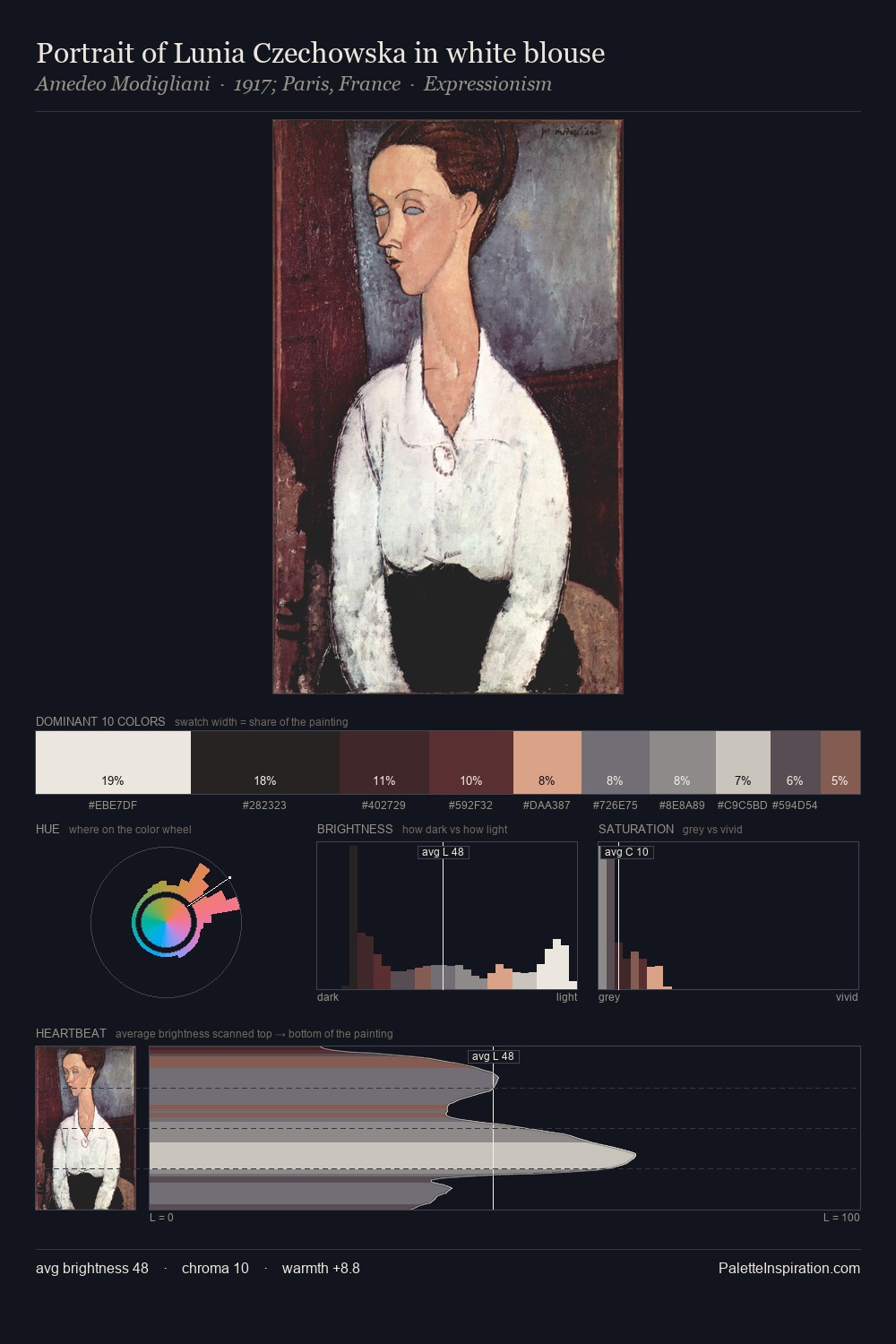
Darkness anchors Pieter van Mol; light is rationed, creating dramatic contrast rather than open air. Warm and cool tones are held in careful balance - neither family dominates, creating tension and resolution simultaneously. Chroma hovers near zero; colour declares itself through subtle shifts in hue rather than outright saturation. 45.9% of the palette belongs to #111115, a concentration that makes it the unmistakable visual centre. The highest-chroma note - #885E4C - appears at just 3.0%, deployed as a precision accent against the quieter ground. 81 units of value range underpin the palette's structural clarity: the eye always knows where light falls. This tonal restraint is characteristic of the Pieter van Mol approach: colour serves light, not the reverse. In the context of Pieter van Mol's full range of palettes, group 3 represents one movement in an ongoing chromatic dialogue.
Example use cases
- theater design
- jewelry brands
- tobacco-adjacent retail
- event branding
- film & entertainment
I Love This!
Copy, export, or download for your project