Pieter de Hooch Palette 3

Palette Analysis
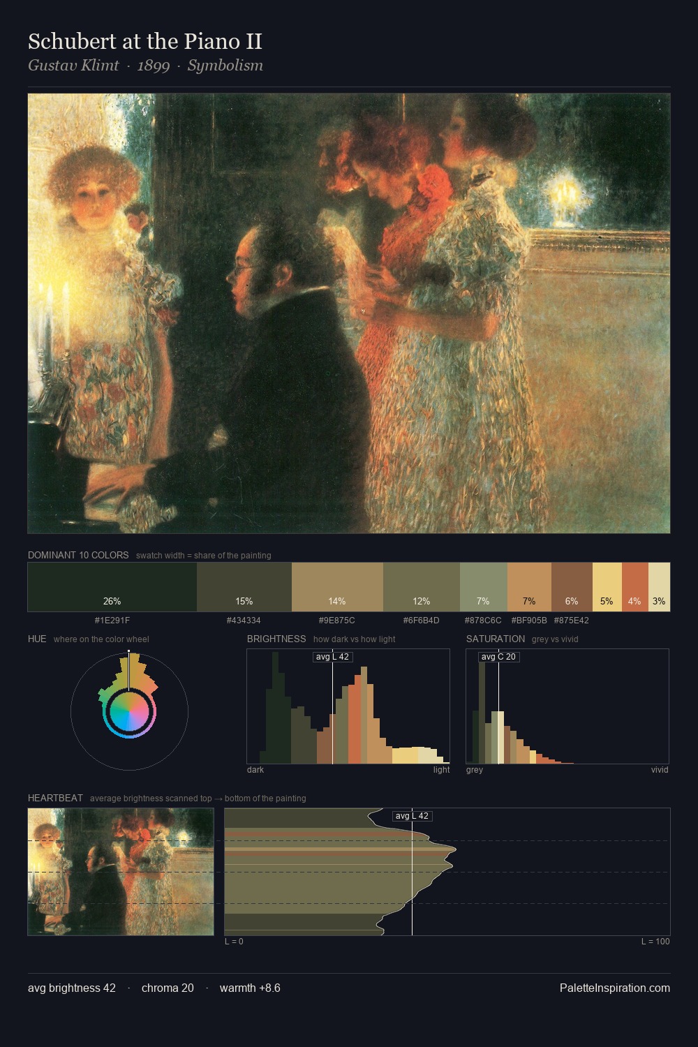
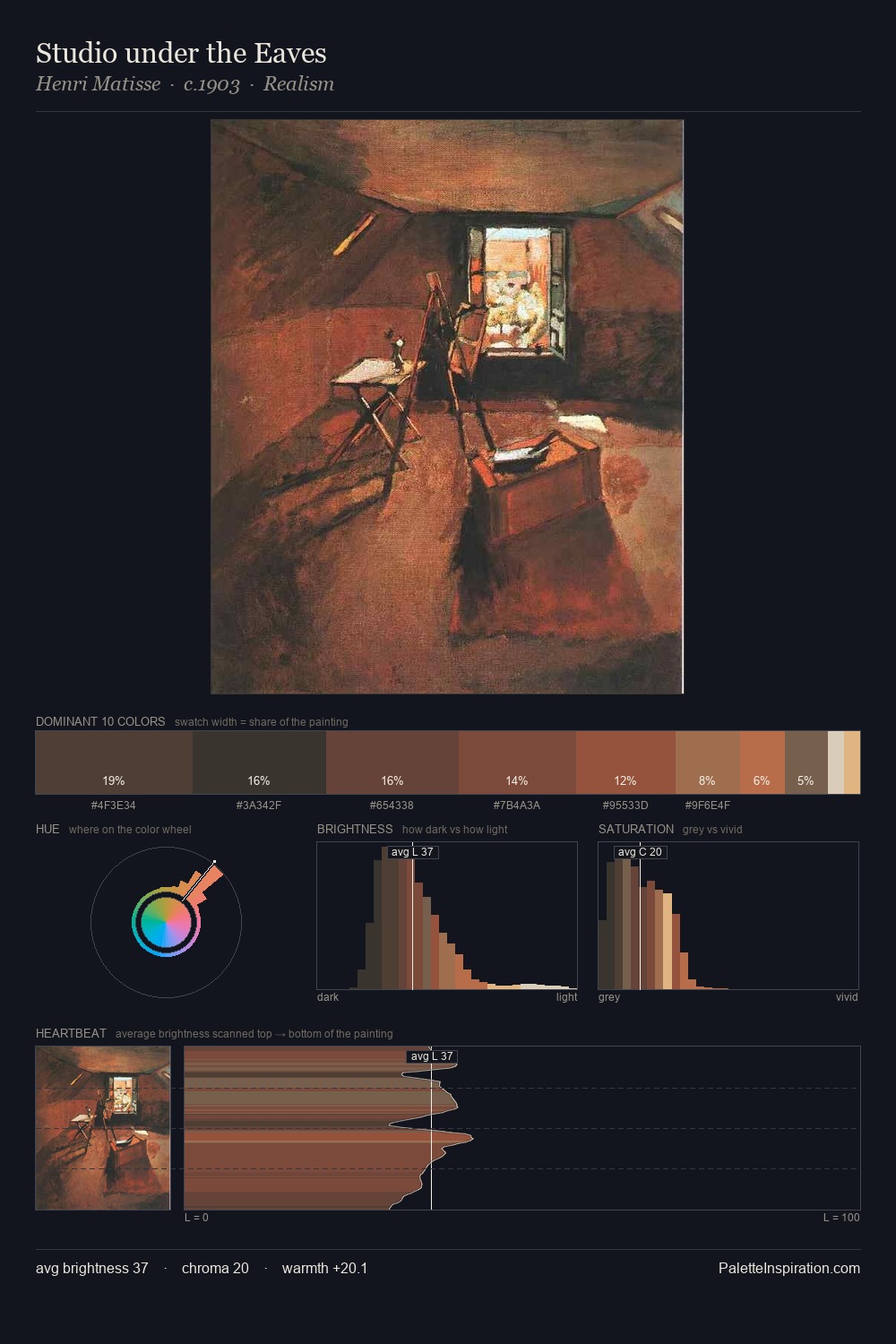
Pieter de Hooch keeps values measured and balanced, a hallmark of tonal restraint. Blues and teal-greys govern the palette, lending it an aquatic or atmospheric quality. Every colour is desaturated; the palette proceeds through near-neutrals and gently-coloured greys. A single dominant - #292D2B at 31.4% - sets the character of the whole composition. The saturated accent, #DC9C6A, registers at 2.5% - sparse enough to feel like a deliberate surprise. From deepest dark to palest light, the palette traverses 56 units of the value scale - a span that creates natural depth. The mid-to-high key, cool bias, and moderate chroma point to outdoor observation - sky and diffused daylight as the dominant light source. Palette 3 sits within the larger chromatic argument that Pieter de Hooch's complete body of work advances.
Example use cases
- theater design
- jewelry brands
- tobacco-adjacent retail
- event branding
- film & entertainment
I Love This!
Copy, export, or download for your project