Pieter de Hooch Palette 5
Muted Topaz
Muted Deliberately desaturated - chroma pulled toward gray, the restraint of tonal painting.
Topaz Golden yellow - the color of topaz gemstone, warm and slightly saturated.

Palette Analysis
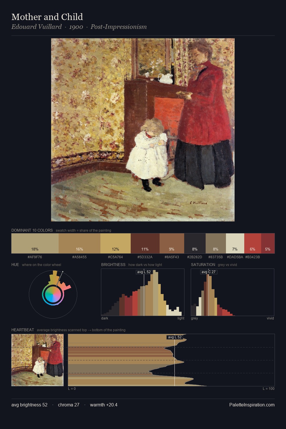
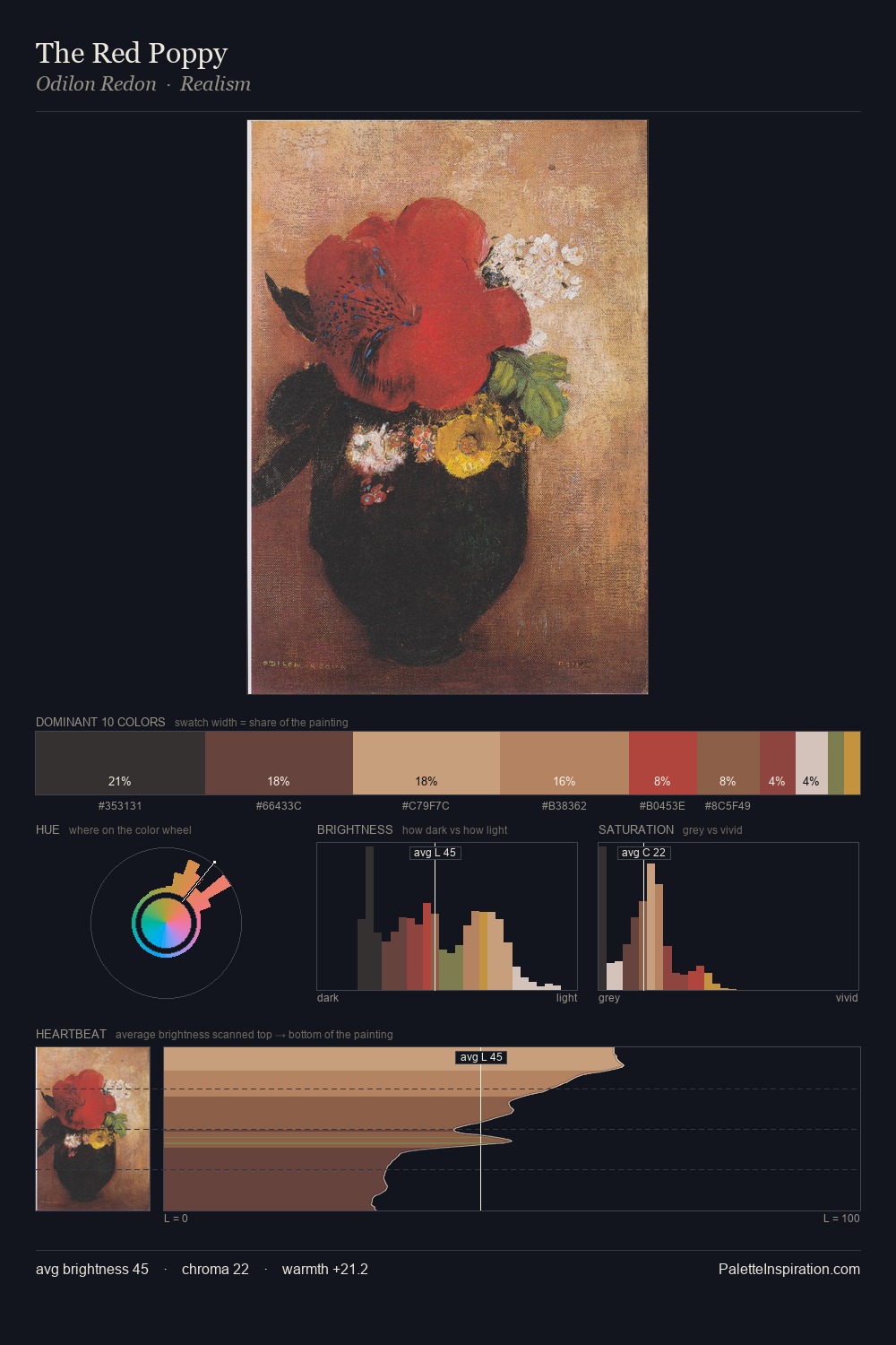
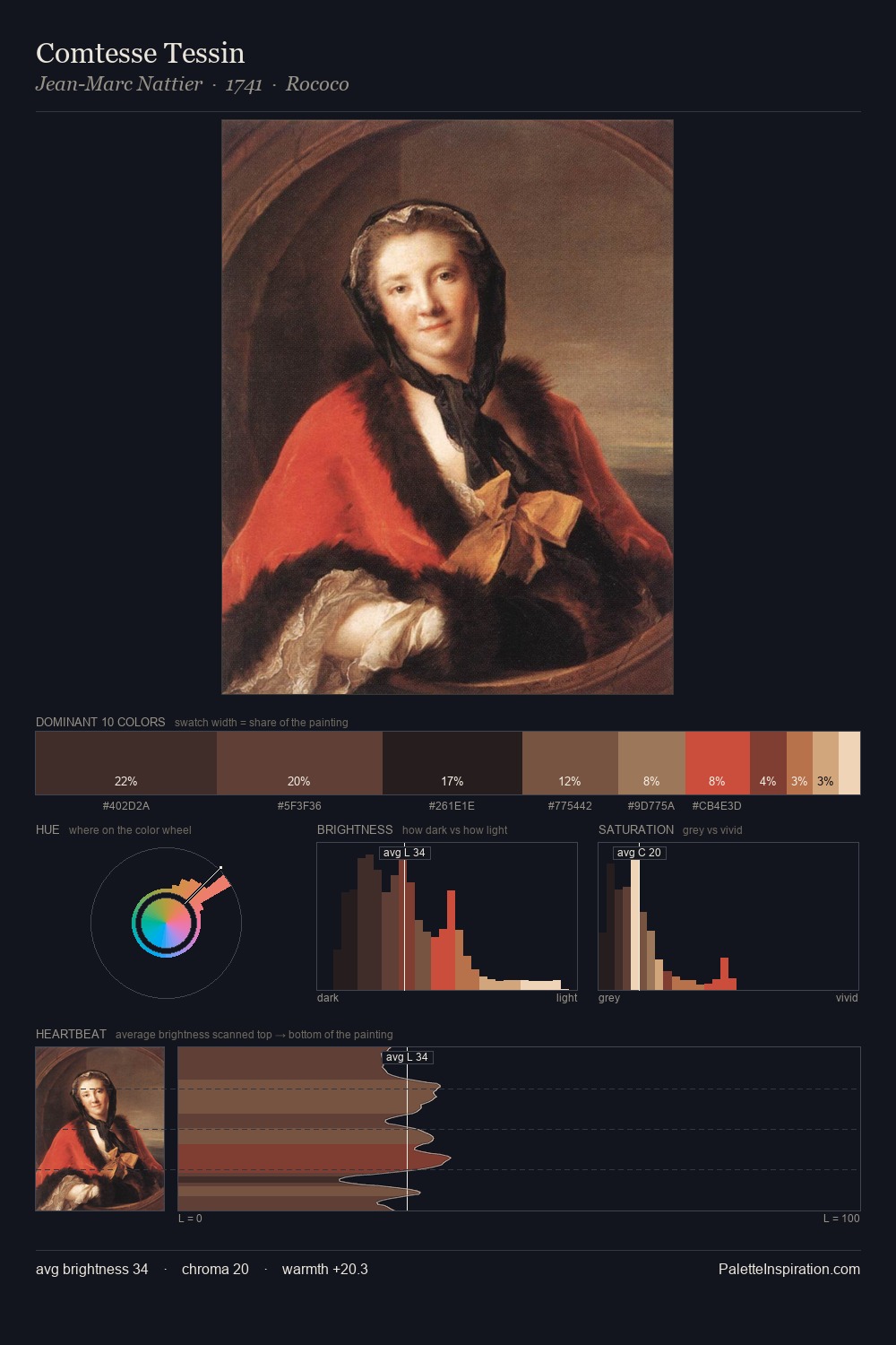
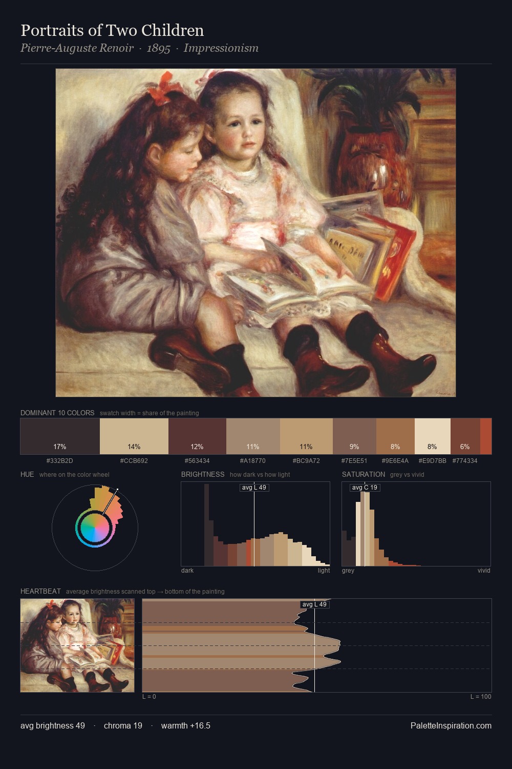
The value structure of Pieter de Hooch is mid-key: quiet, controlled, and cohesive. Warmth dominates - the palette of Pieter de Hooch leans heavily on the yellow-orange-red arc of the colour wheel. Chroma is moderate: colours carry enough saturation to be read as colour, but the palette stops well short of garish intensity. At 8.6%, #B48D57 carries the palette's sharpest chromatic charge: an accent that earns its place precisely because it is withheld. The value range spans 61 units across the palette, providing the full gamut from deep shadow to near-white and ensuring clear tonal hierarchy. Pieter de Hooch's palette 5 carries its own internal logic while remaining in conversation with the artist's broader colour intelligence.
Example use cases
- food packaging
- leather accessories
- travel & outdoor
- natural cosmetics
- interior design
I Love This!
Use This Palette
Copy, export, or download for your project
Copy, export, or download for your project
Copy:
Download:
Share: