Pieter Claesz Palette 3

Palette Analysis
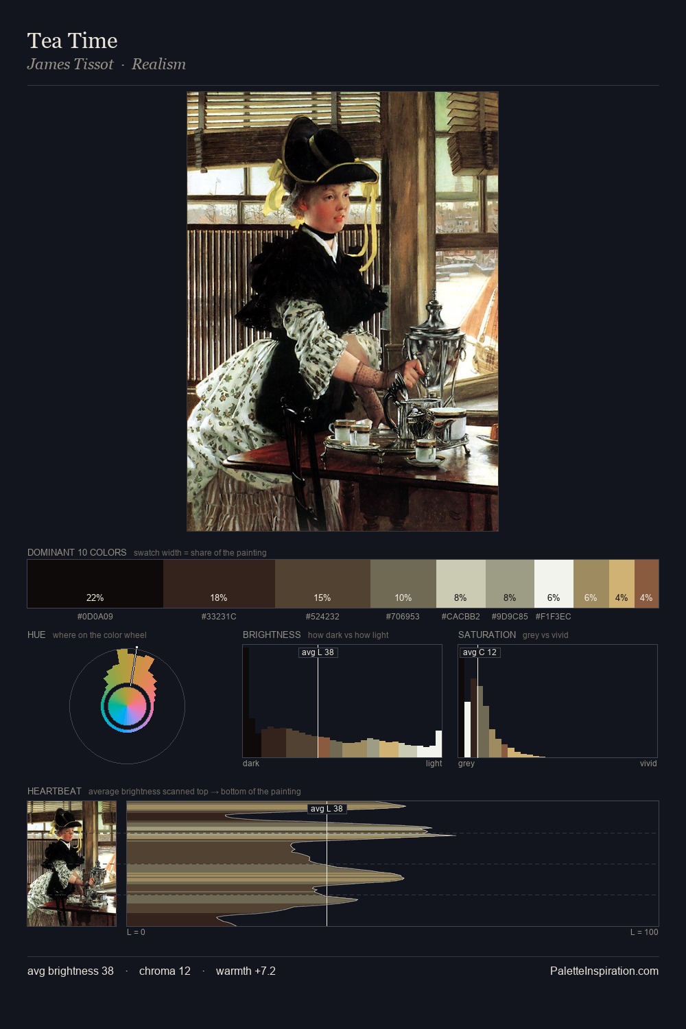
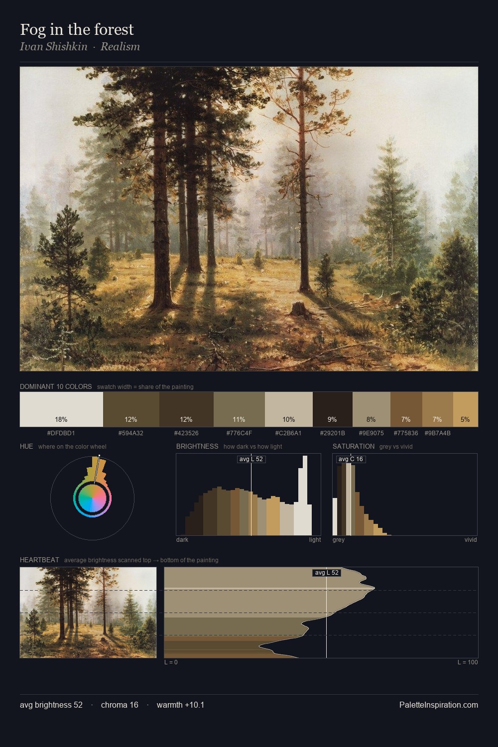
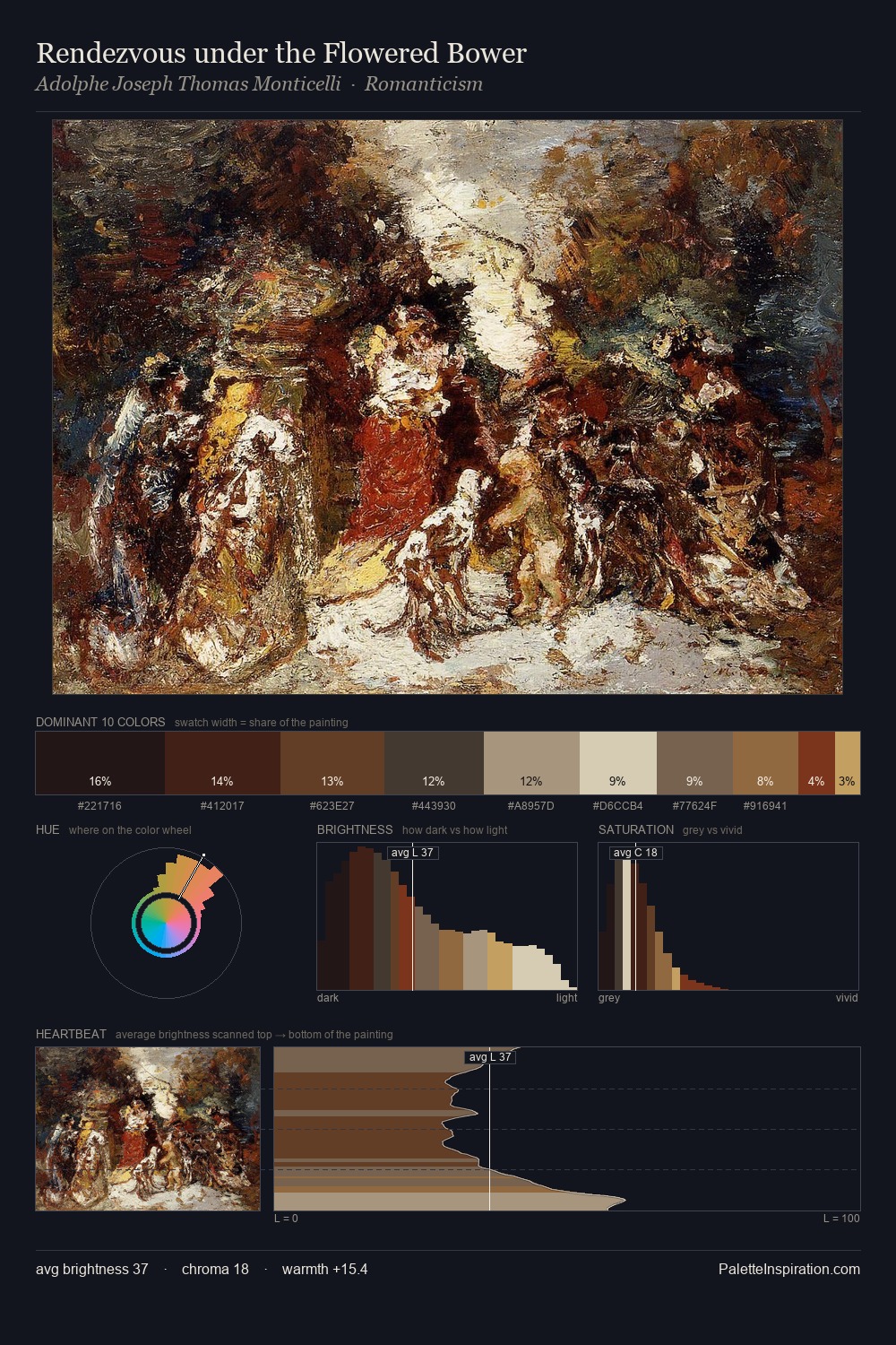
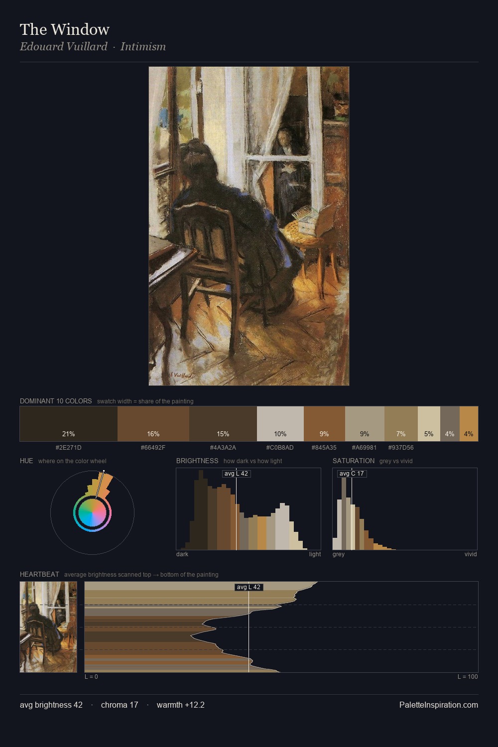
Pieter Claesz sits in the centre of the value range, lending the palette a sense of even, sustained light. Pieter Claesz orchestrates warmth above all else - reds, ambers, and siennas take the lead. Chroma hovers near zero; colour declares itself through subtle shifts in hue rather than outright saturation. 29.9% of the palette belongs to #1D1918, a concentration that makes it the unmistakable visual centre. At 2.5%, #C69E57 carries the palette's sharpest chromatic charge: an accent that earns its place precisely because it is withheld. 61 units of value range underpin the palette's structural clarity: the eye always knows where light falls. In the context of Pieter Claesz's full range of palettes, group 3 represents one movement in an ongoing chromatic dialogue.
Example use cases
- theater design
- jewelry brands
- tobacco-adjacent retail
- event branding
- film & entertainment
I Love This!
Copy, export, or download for your project