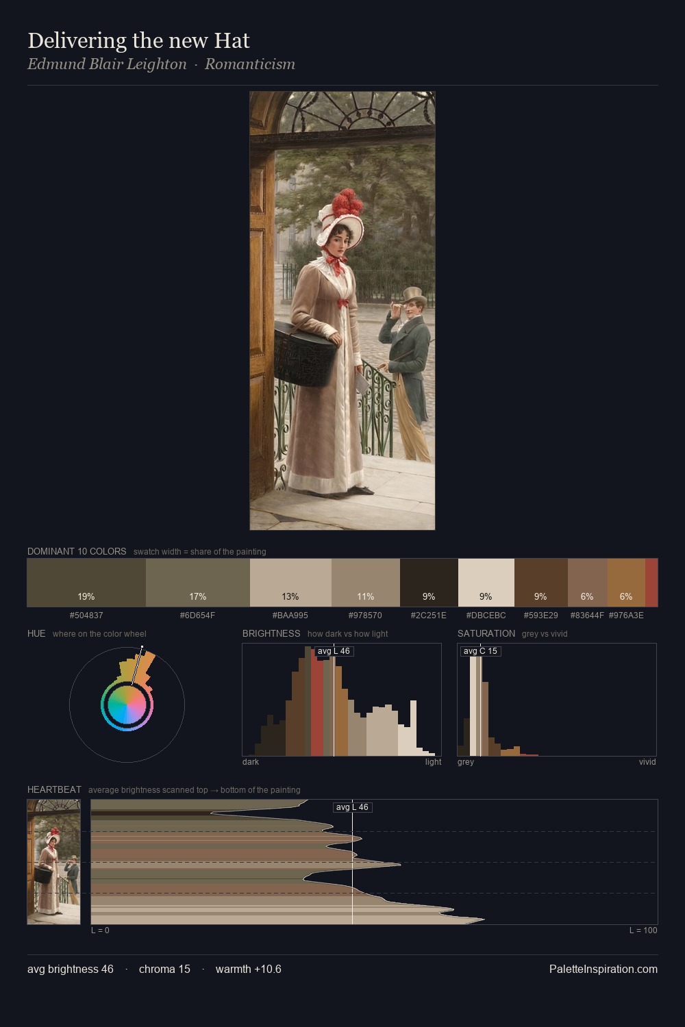
Pieter Brueghel the Younger Palette 9

Palette Analysis
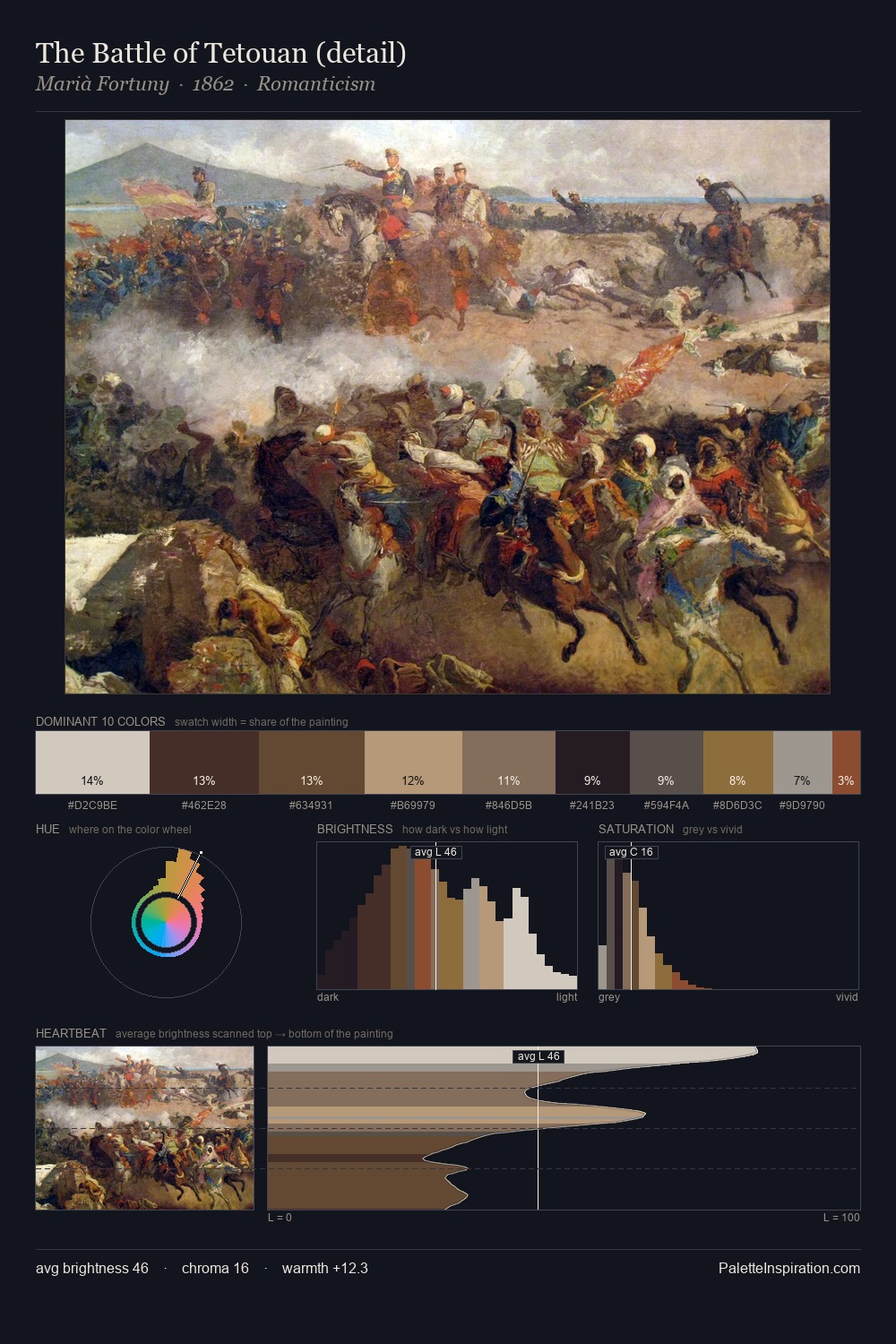
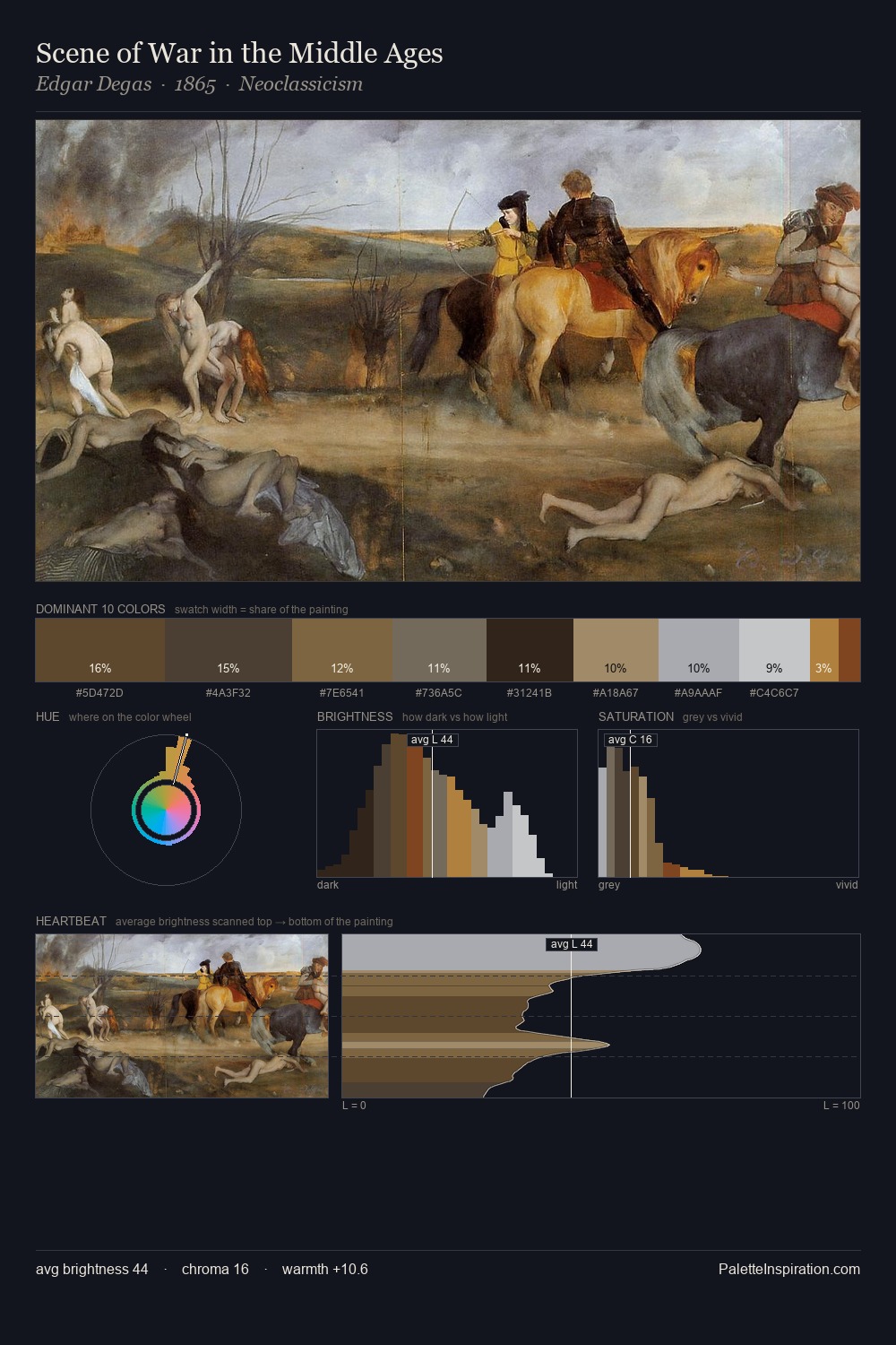
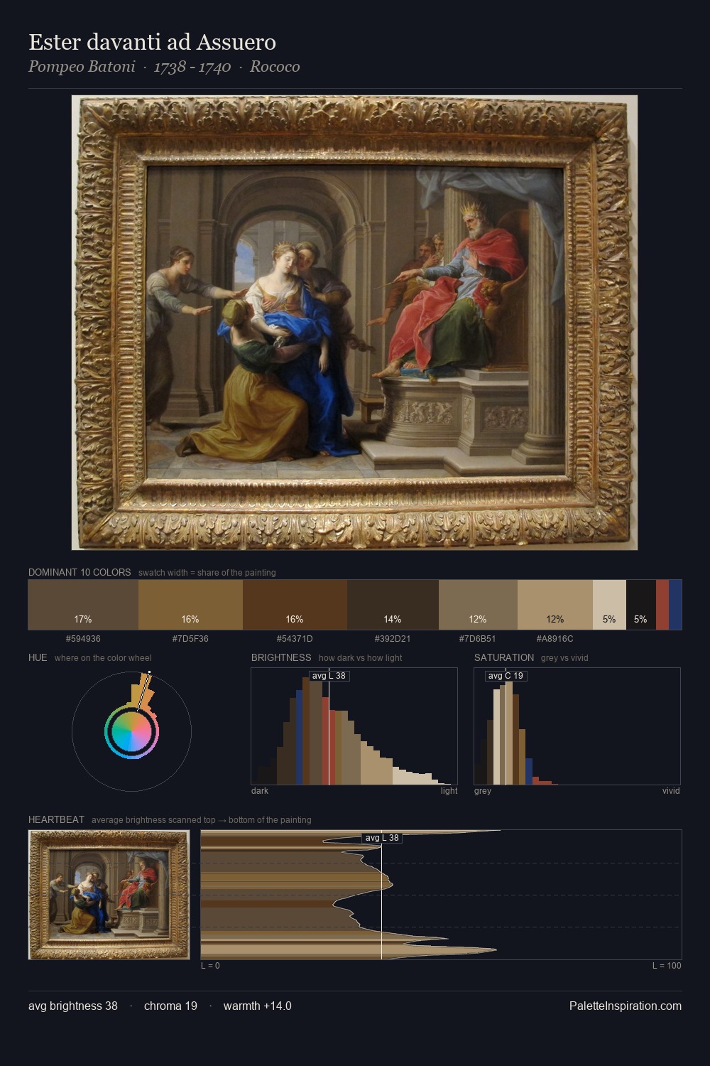
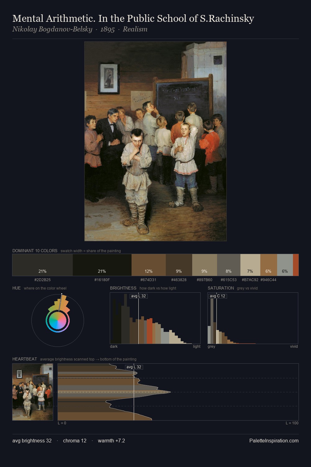
Pieter Brueghel the Younger sits in the centre of the value range, lending the palette a sense of even, sustained light. Pieter Brueghel the Younger builds on cool foundations: the palette favours the blue-cyan-green arc. Muted throughout, the palette achieves its effects through value and temperature rather than chromatic force. #24211D claims 30.0% of the surface, functioning as the work's tonal foundation. Only 7.8% is devoted to #8C6B3E, yet that small allocation delivers the palette's entire chromatic tension. Value range is moderate at 49 units - enough contrast for legibility, not so much as to fragment the tonal unity. High luminosity and cool temperature suggest the plein-air condition: unfiltered daylight and open sky. This is palette 9 of Pieter Brueghel the Younger's sequence - a single chapter in a chromatic story told across many works.
Example use cases
- theater design
- jewelry brands
- tobacco-adjacent retail
- event branding
- film & entertainment
I Love This!
Copy, export, or download for your project