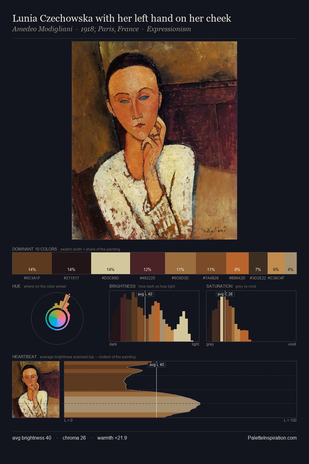
Petrus van Schendel Master Palette
Shadowed Umber
Shadowed Low-key - values weighted toward shadow, the palette of dim interiors and overcast skies.
Umber Dark earthy brown - raw or burnt umber, a foundational old-master earth pigment.

Palette Analysis
Petrus van Schendel distributes its values across the middle register, creating harmony without high contrast. The dominant temperature is warm, with earth tones and fire-hues setting the emotional key. Chroma hovers near zero; colour declares itself through subtle shifts in hue rather than outright saturation. #613A1E delivers the chromatic peak at only 9.3% - a small shot of colour with outsized visual impact. A value spread of 67 units gives the palette both depth and air - shadows are genuinely dark, lights genuinely light. This is the light Petrus van Schendel preferred, made measurable.
Example use cases
- theater design
- jewelry brands
- tobacco-adjacent retail
- event branding
- film & entertainment
I Love This!
Use This Palette
Copy, export, or download for your project
Copy, export, or download for your project
Copy:
Download:
Share: