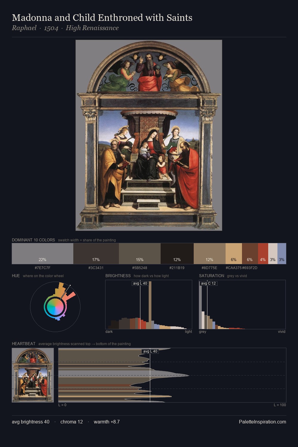
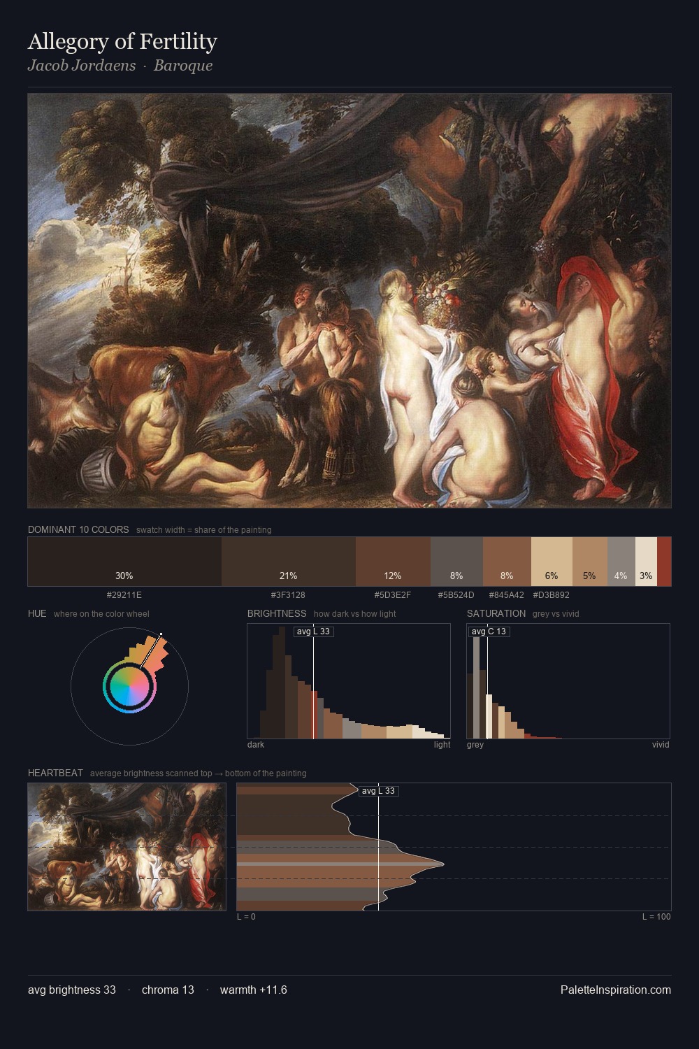
Petrus Christus Palette 5

Palette Analysis
Petrus Christus distributes its values across the middle register, creating harmony without high contrast. Temperature reads distinctly warm: the reds and earth tones from Petrus Christus carry the compositional weight. Saturation is deliberately withheld - the beauty here lies in the near-monochromatic gradations rather than colour difference. #2E2D27 at 26.3% of the palette: an overwhelming presence that pulls all other colours into its gravitational field. The saturated accent, #ECDAC7, registers at 7.8% - sparse enough to feel like a deliberate surprise. 70 units of value range underpin the palette's structural clarity: the eye always knows where light falls. In the context of Petrus Christus's full range of palettes, group 5 represents one movement in an ongoing chromatic dialogue.
Example use cases
- theater design
- jewelry brands
- tobacco-adjacent retail
- event branding
- film & entertainment
I Love This!
Copy, export, or download for your project