Petrus Christus Palette 1
Muted Fawn
Muted Deliberately desaturated - chroma pulled toward gray, the restraint of tonal painting.
Fawn Light warm tan - the color of a young deer, soft and golden-brown.

Palette Analysis
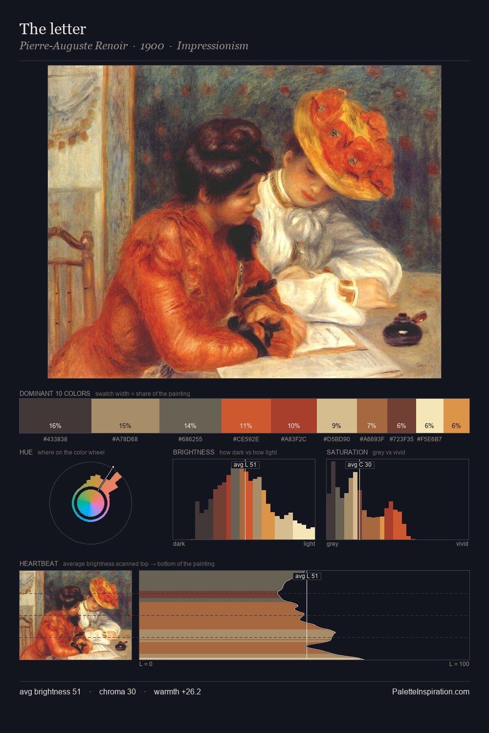
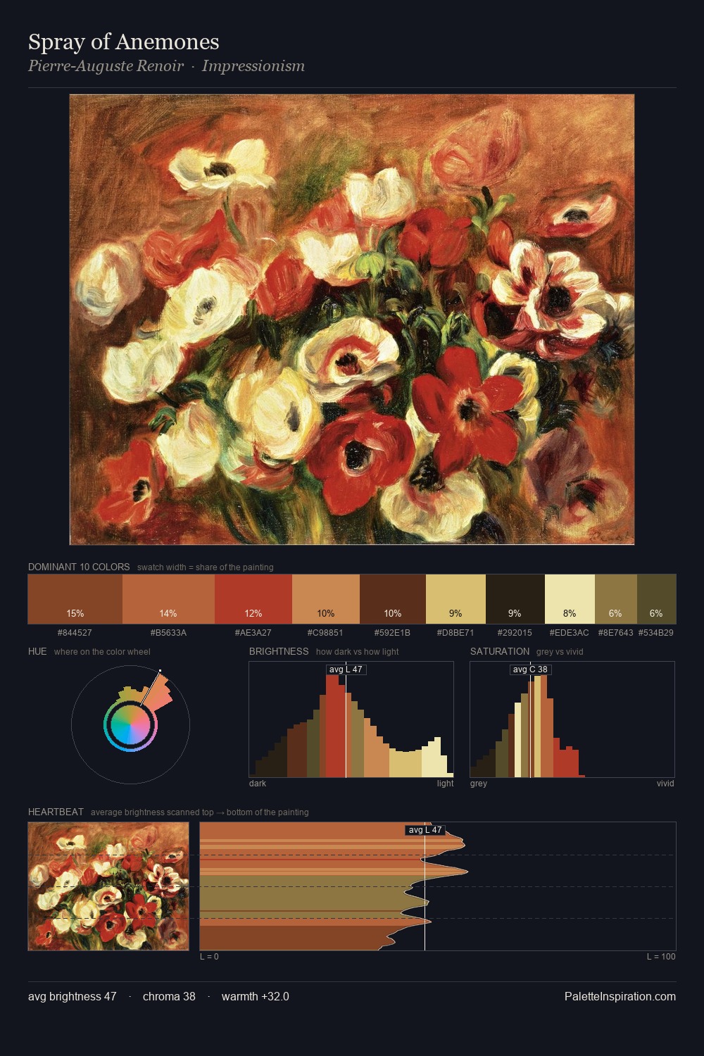
Values in Petrus Christus rest in the mid-range - neither dramatically lit nor steeped in shadow. Warm hues command this palette; Petrus Christus favours the reds, oranges, and yellows of firelight and earth. Colours are neither washed out nor blazing; they occupy the productive middle ground of the chroma scale. #A94335 delivers the chromatic peak at only 6.4% - a small shot of colour with outsized visual impact. From deepest dark to palest light, the palette traverses 66 units of the value scale - a span that creates natural depth. Palette 1 sits within the larger chromatic argument that Petrus Christus's complete body of work advances.
Example use cases
- publishing
- corporate identity
- consumer apps
- hospitality
- design agencies
I Love This!
Use This Palette
Copy, export, or download for your project
Copy, export, or download for your project
Copy:
Download:
Share: