Pellegrino Tibaldi Palette 5
Palette Analysis
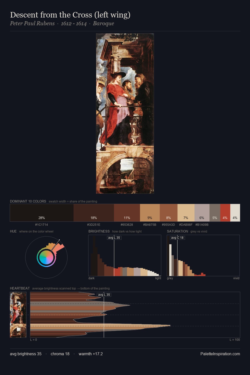
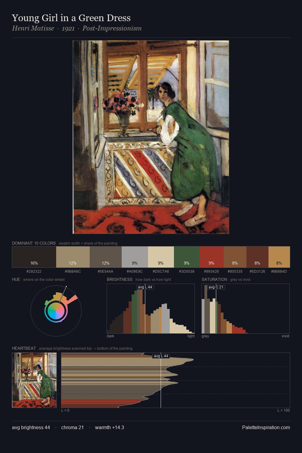
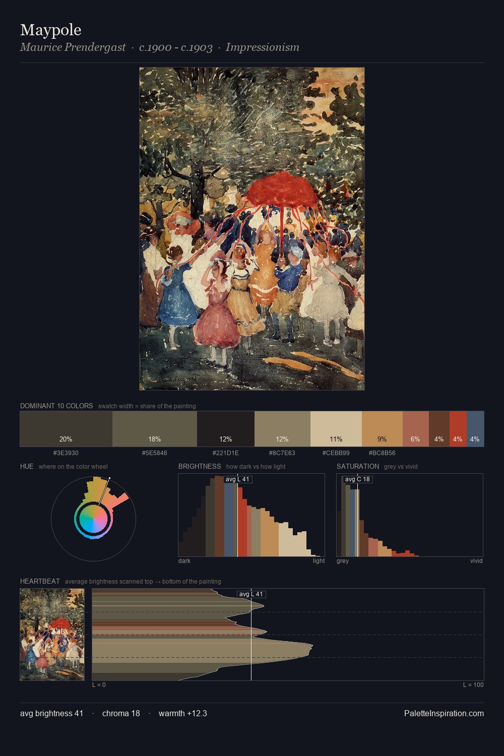
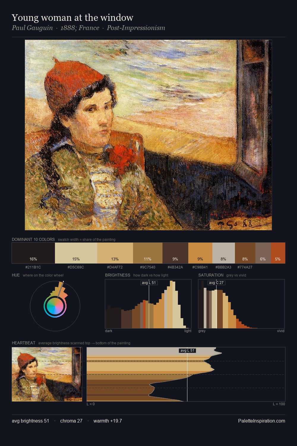
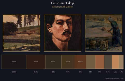
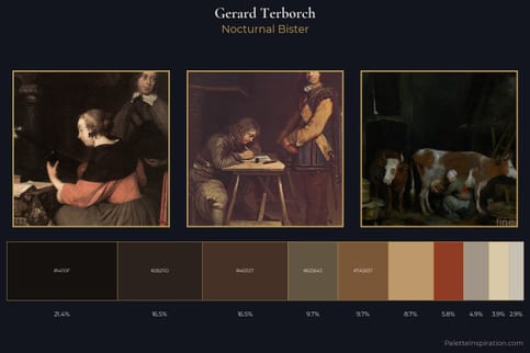
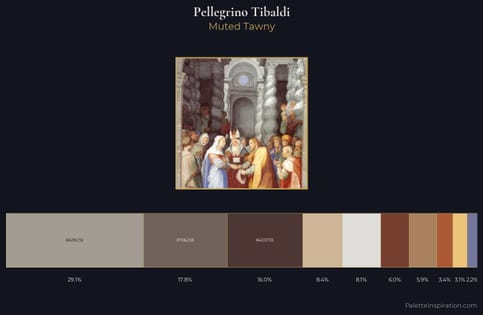
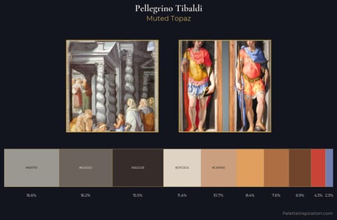
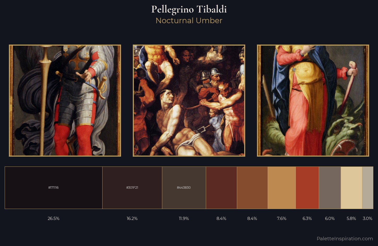
Pellegrino Tibaldi occupies the comfortable middle of the value scale, avoiding both extremes to hold the eye in a sustained middle grey. The dominant temperature is warm, with earth tones and fire-hues setting the emotional key. All colours lean toward grey, building depth through value rather than colour punch. At 26.5%, #171116 functions less as a colour accent and more as a complete atmospheric environment. Only 5.8% is devoted to #DDC699, yet that small allocation delivers the palette's entire chromatic tension. From deepest dark to palest light, the palette traverses 64 units of the value scale - a span that creates natural depth. This is palette 5 of Pellegrino Tibaldi's sequence - a single chapter in a chromatic story told across many works.
Example use cases
- theater design
- jewelry brands
- tobacco-adjacent retail
- event branding
- film & entertainment
I Love This!
Copy, export, or download for your project