Peder Severin Kroyer Palette 4

Palette Analysis
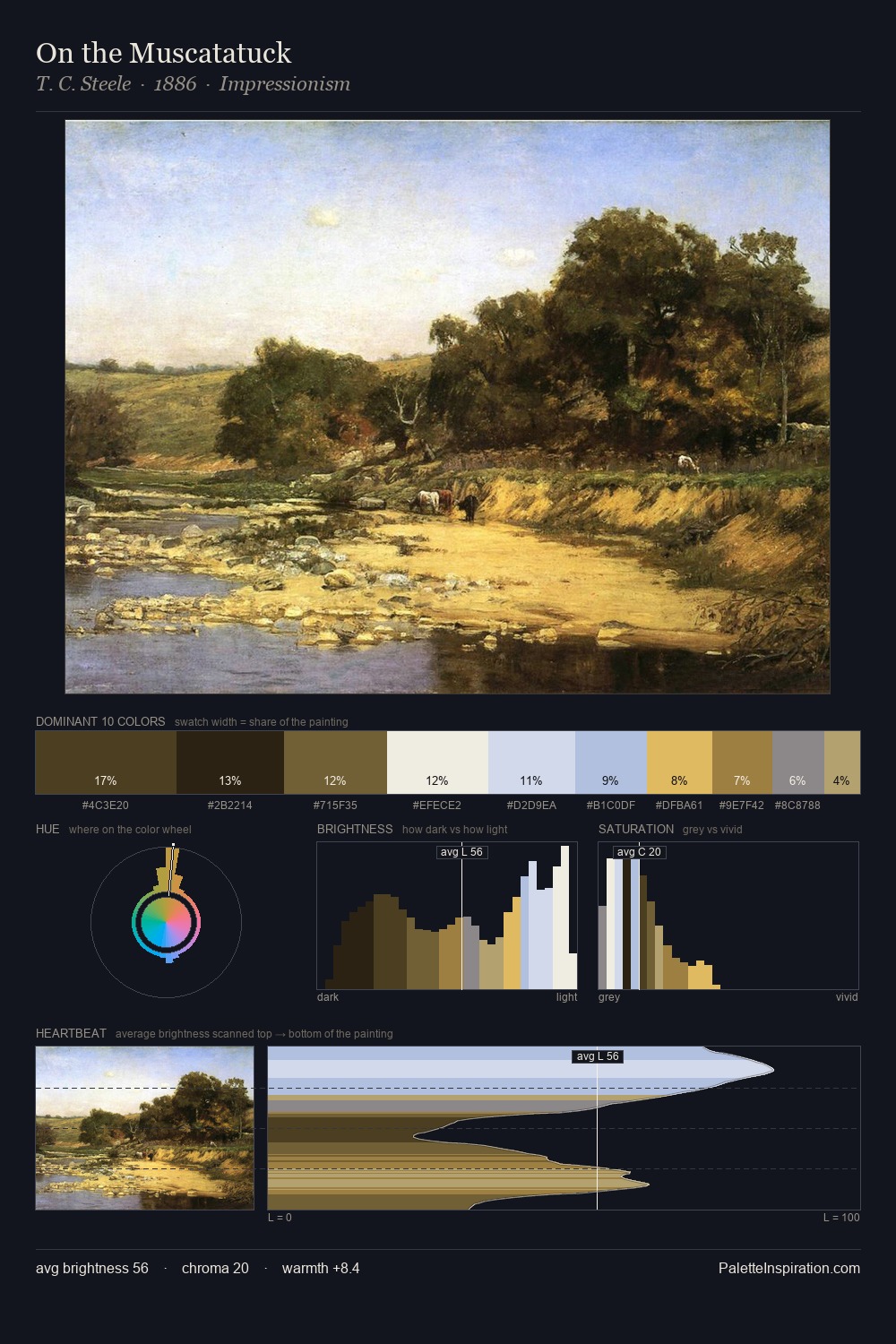
Peder Severin Kroyer sits in the centre of the value range, lending the palette a sense of even, sustained light. Peder Severin Kroyer builds on cool foundations: the palette favours the blue-cyan-green arc. Chroma hovers near zero; colour declares itself through subtle shifts in hue rather than outright saturation. At 6.6%, #BA995A carries the palette's sharpest chromatic charge: an accent that earns its place precisely because it is withheld. 69 units of value range underpin the palette's structural clarity: the eye always knows where light falls. The palette has the character of outdoor light: cool, mid-bright, with colour rendered faithfully rather than expressively. In the context of Peder Severin Kroyer's full range of palettes, group 4 represents one movement in an ongoing chromatic dialogue.
Example use cases
- ceramics & pottery
- boutique hospitality
- menswear
- heritage food brands
- craft & artisan brands
I Love This!
Copy, export, or download for your project