Paul Sandby Master Palette

Palette Analysis
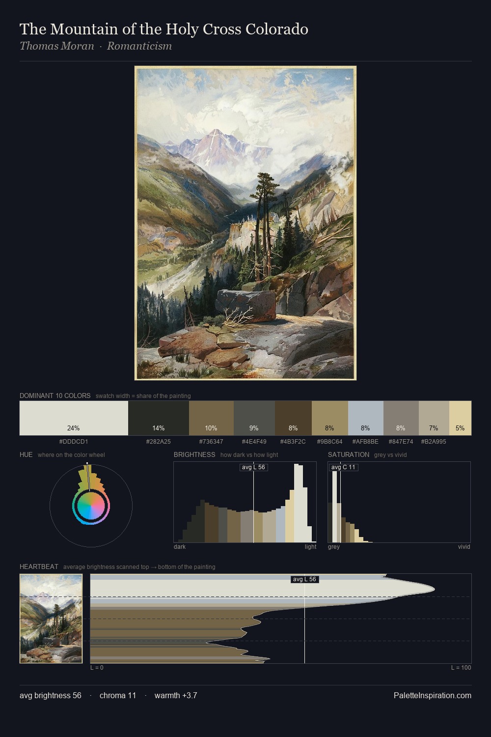
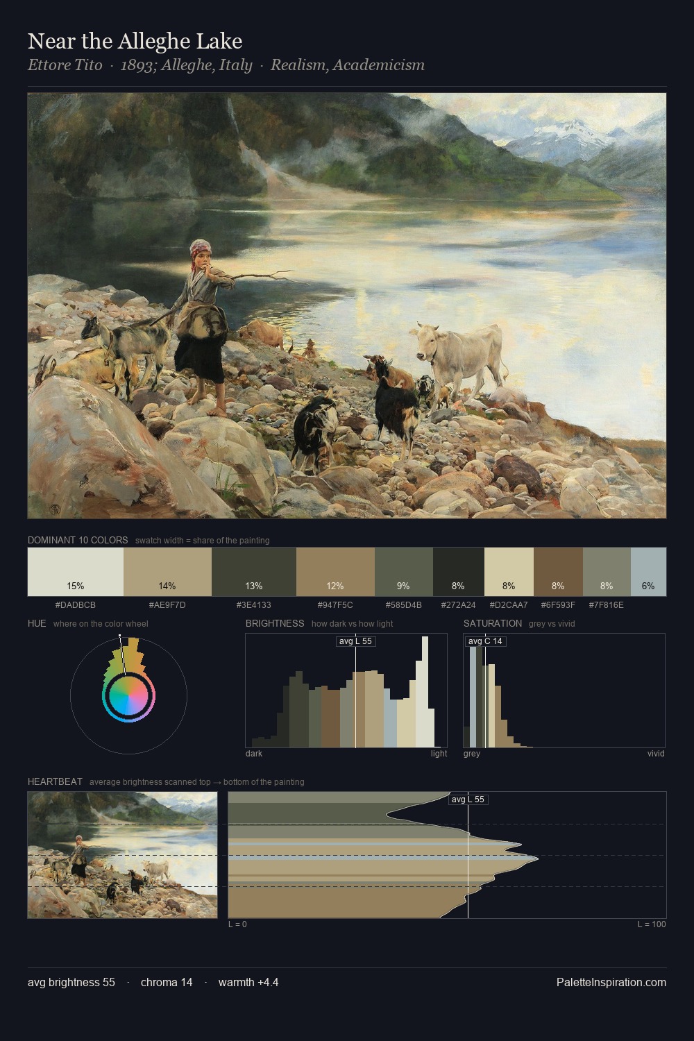
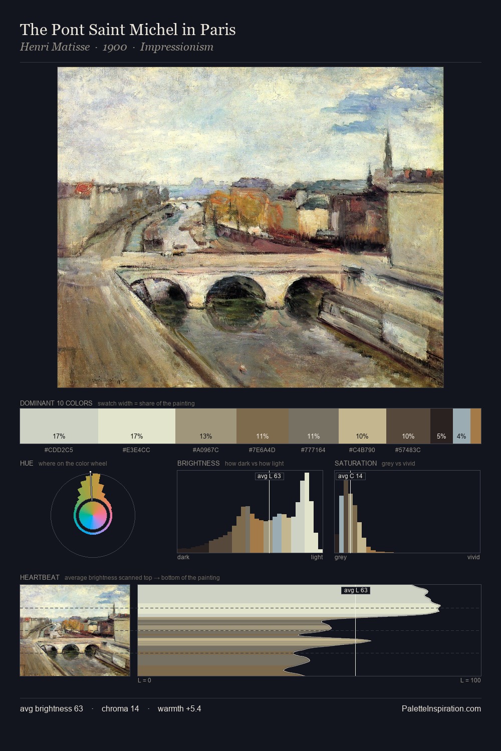
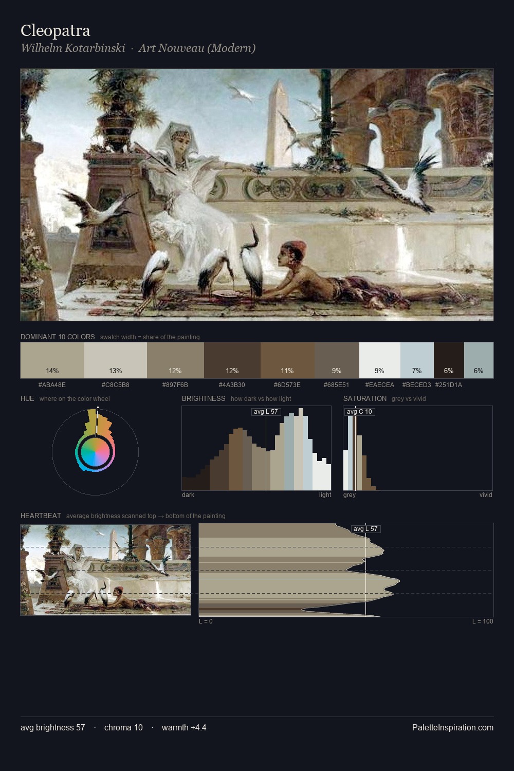
Values in Paul Sandby tilt decisively toward white, giving the palette its luminous character. Cool tones set the register here - the blues and greens easily outweigh any warm accents. Chroma is kept low across all colours, producing the soft, enveloping quality that characterises tonal painting. The highest-chroma note - #D8C39F - appears at just 10.0%, deployed as a precision accent against the quieter ground. The value range spans 65 units across the palette, providing the full gamut from deep shadow to near-white and ensuring clear tonal hierarchy. The palette has the character of outdoor light: cool, mid-bright, with colour rendered faithfully rather than expressively. The palette is recognisably Paul Sandby's own: particular in its temperature, chroma, and the economy of its brightest note.
Example use cases
- exhibition design
- foundation branding
- estate management
- art education
- museums & galleries
I Love This!
Copy, export, or download for your project