Paul Klee Palette 7
Muted Vermillion
Muted Deliberately desaturated - chroma pulled toward gray, the restraint of tonal painting.
Vermillion Brilliant red-orange - the classic mercury sulfide pigment, vivid and warm.

Palette Analysis
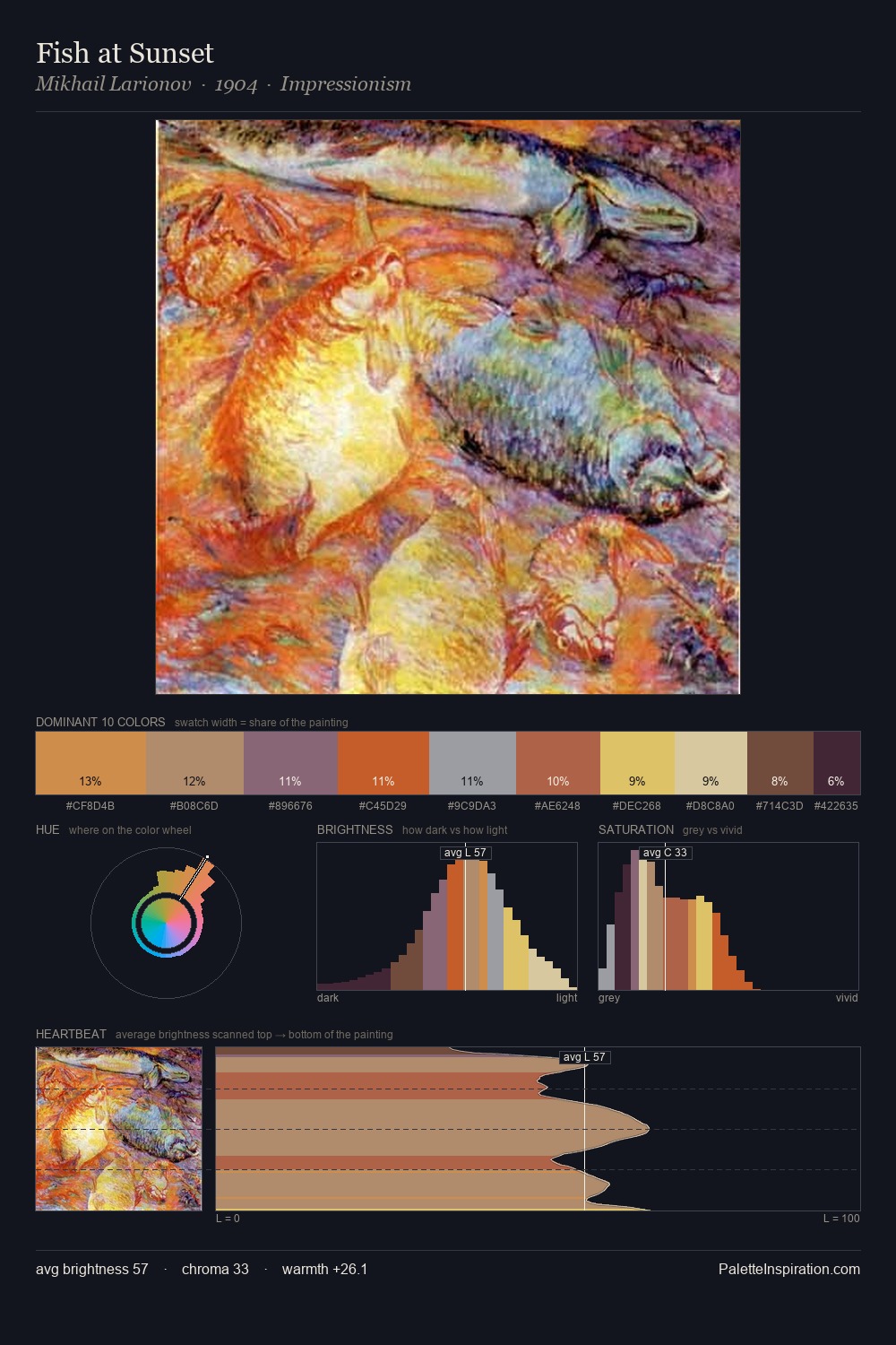
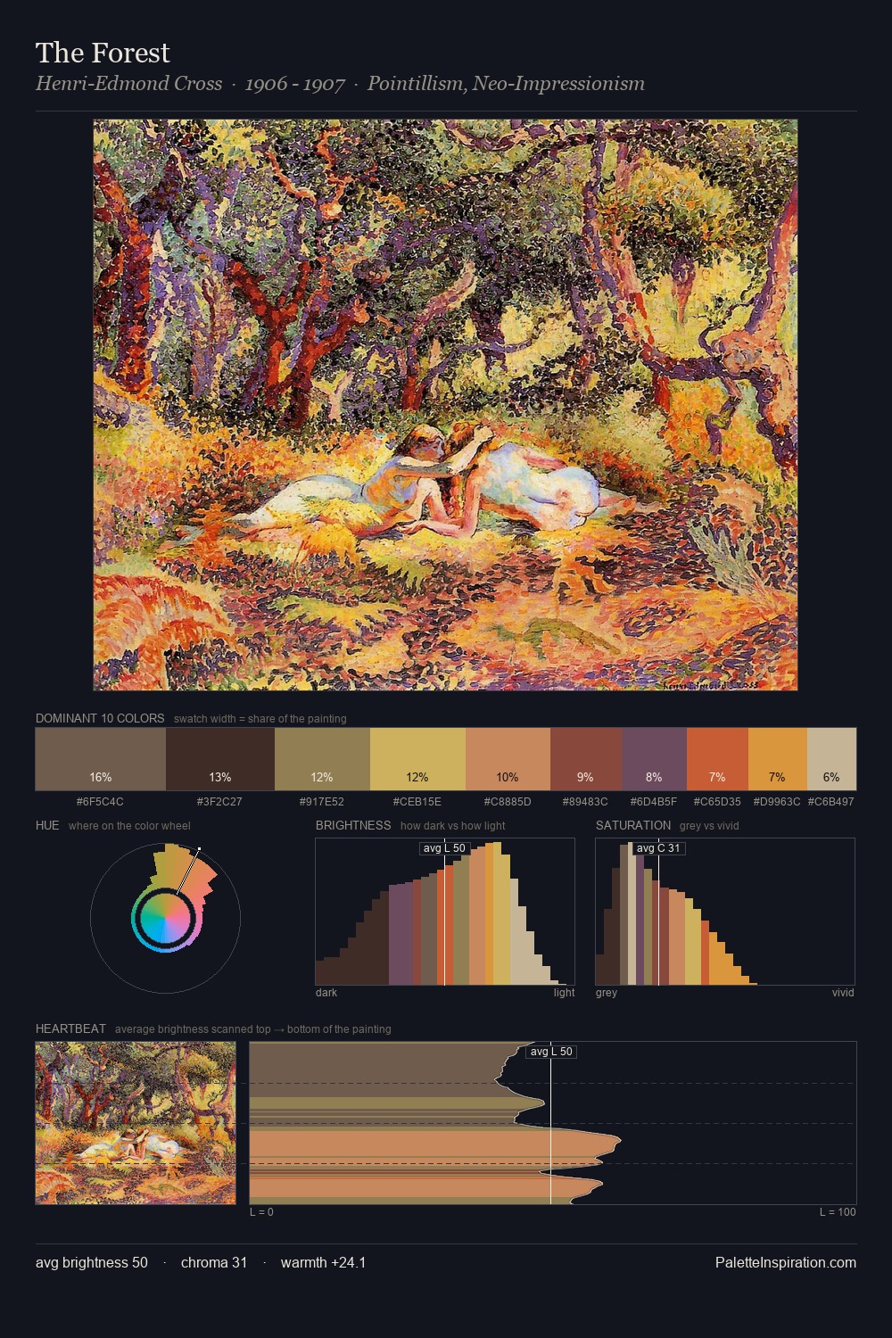
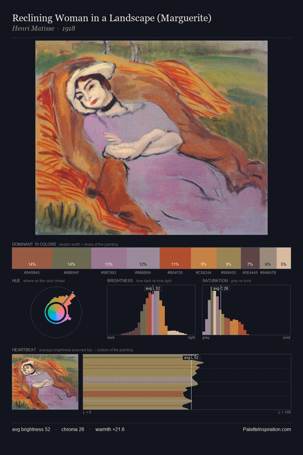
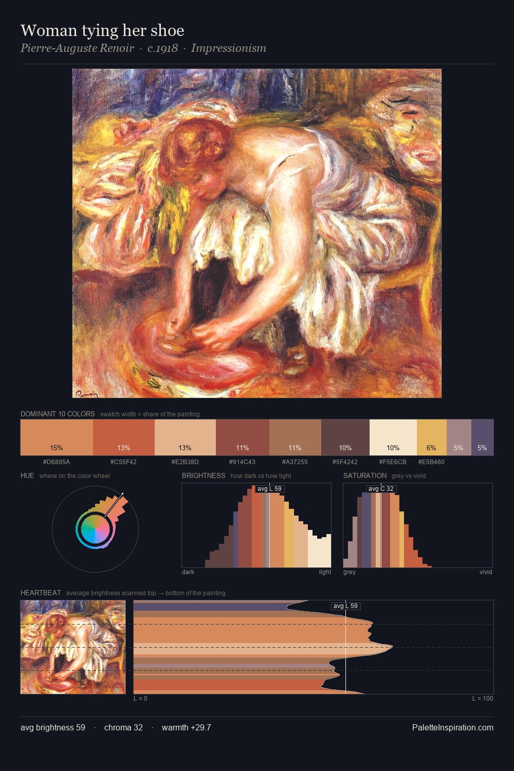
Paul Klee distributes its values across the middle register, creating harmony without high contrast. Warmth dominates - the palette of Paul Klee leans heavily on the yellow-orange-red arc of the colour wheel. A restrained, mid-chroma palette: every hue is present and legible, but nothing shouts. At 11.5%, #CC624D carries the palette's sharpest chromatic charge: an accent that earns its place precisely because it is withheld. 33 units of value spread create a palette that is varied but unified - contrast in the service of harmony. In the context of Paul Klee's full range of palettes, group 7 represents one movement in an ongoing chromatic dialogue.
Example use cases
- publishing
- corporate identity
- consumer apps
- hospitality
- design agencies
I Love This!
Use This Palette
Copy, export, or download for your project
Copy, export, or download for your project
Copy:
Download:
Share: