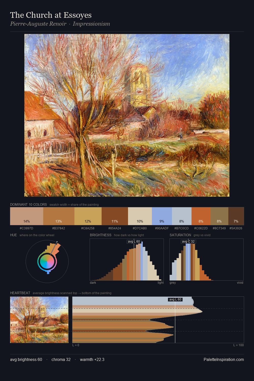
Paul Klee Palette 4
Pale Champagne
Pale High-key and low-chroma - delicate, bleached, washed with light.
Champagne Pale gold - the color of sparkling wine, high-key and lightly warm.

Palette Analysis
Paul Klee is high in key: pale, luminous, and filled with optical air. Paul Klee keeps warm and cool in parity, a balance that lends the work a perceptual shimmer. Colours are neither washed out nor blazing; they occupy the productive middle ground of the chroma scale. #D5AC4F delivers the chromatic peak at only 3.6% - a small shot of colour with outsized visual impact. The palette spans 48 value units: a measured range that delivers coherence over drama. The combination of mid-to-high key, balanced temperature, and elevated chroma is characteristic of Impressionist observation: light broken into its component hues. This is palette 4 of Paul Klee's sequence - a single chapter in a chromatic story told across many works.
Example use cases
- ceramics & pottery
- boutique hospitality
- menswear
- heritage food brands
- craft & artisan brands
I Love This!
Use This Palette
Copy, export, or download for your project
Copy, export, or download for your project
Copy:
Download:
Share: