Paul de Vos Palette 4

Palette Analysis
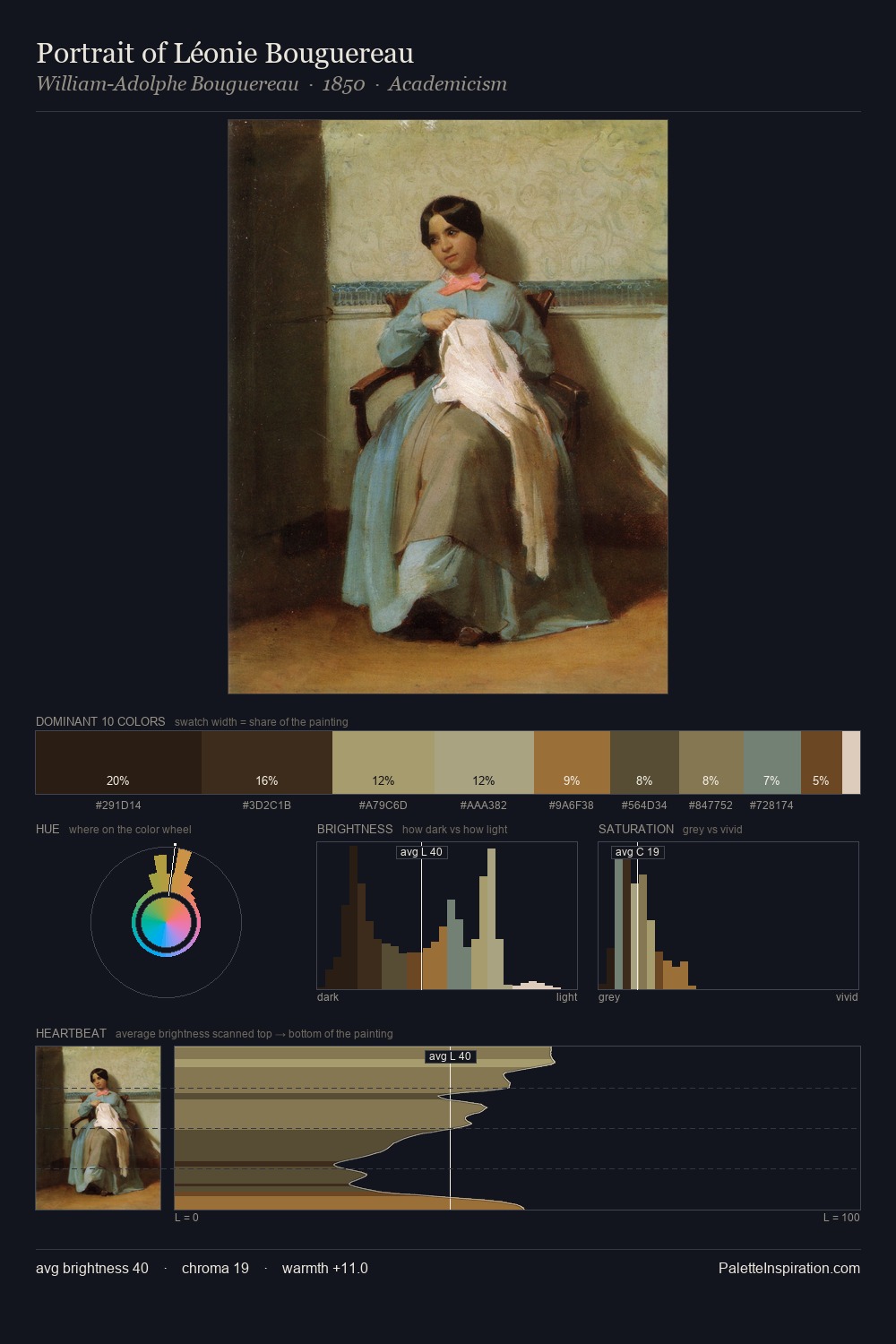
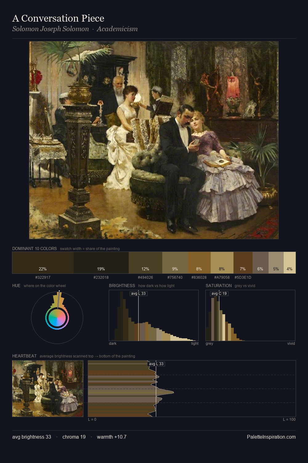
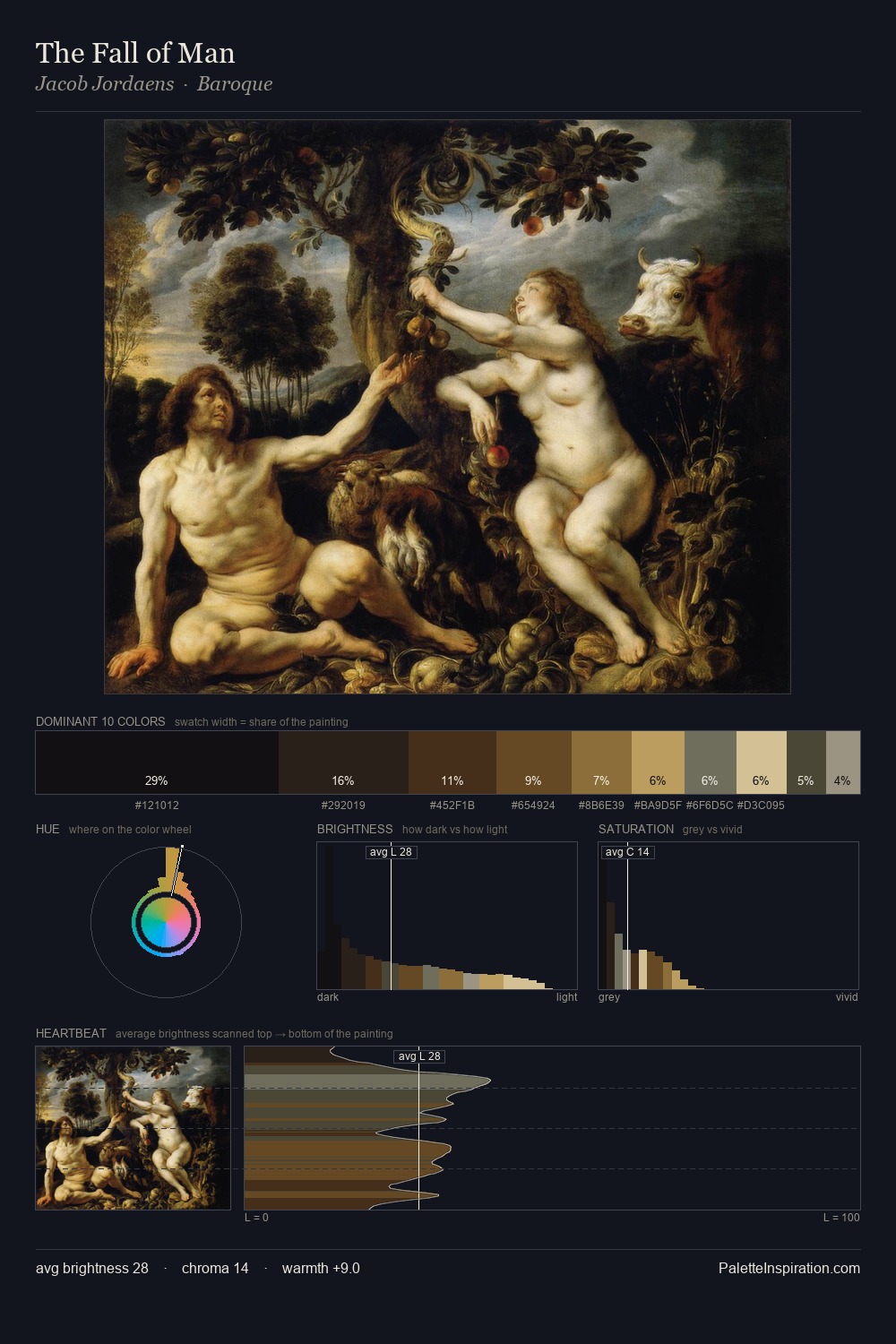
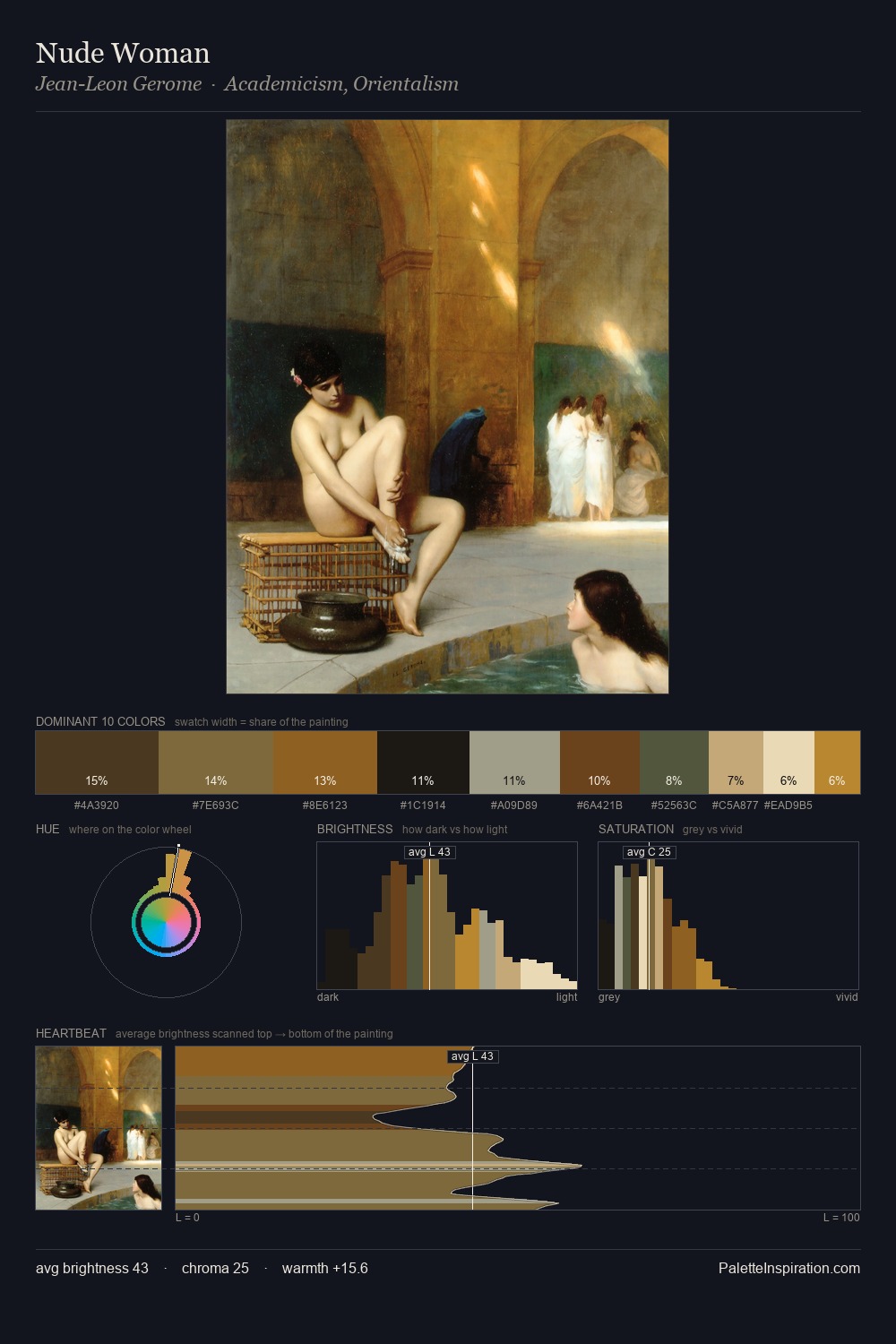
Paul de Vos sits in the centre of the value range, lending the palette a sense of even, sustained light. Paul de Vos tilts toward cool - blues and silver-greys carry the structural weight. Saturation is deliberately withheld - the beauty here lies in the near-monochromatic gradations rather than colour difference. The highest-chroma note - #916927 - appears at just 6.5%, deployed as a precision accent against the quieter ground. The value range of 46 units sits in the comfortable middle: enough depth, enough light, neither extreme. The palette has the character of outdoor light: cool, mid-bright, with colour rendered faithfully rather than expressively. Paul de Vos's palette 4 carries its own internal logic while remaining in conversation with the artist's broader colour intelligence.
Example use cases
- theater design
- jewelry brands
- tobacco-adjacent retail
- event branding
- film & entertainment
I Love This!
Copy, export, or download for your project