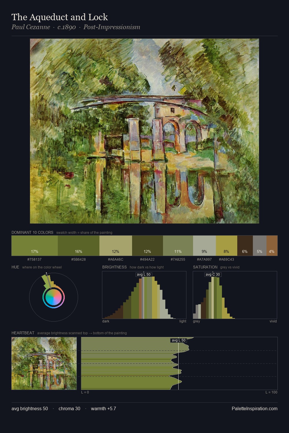
Paul Cezanne Palette 5

Palette Analysis
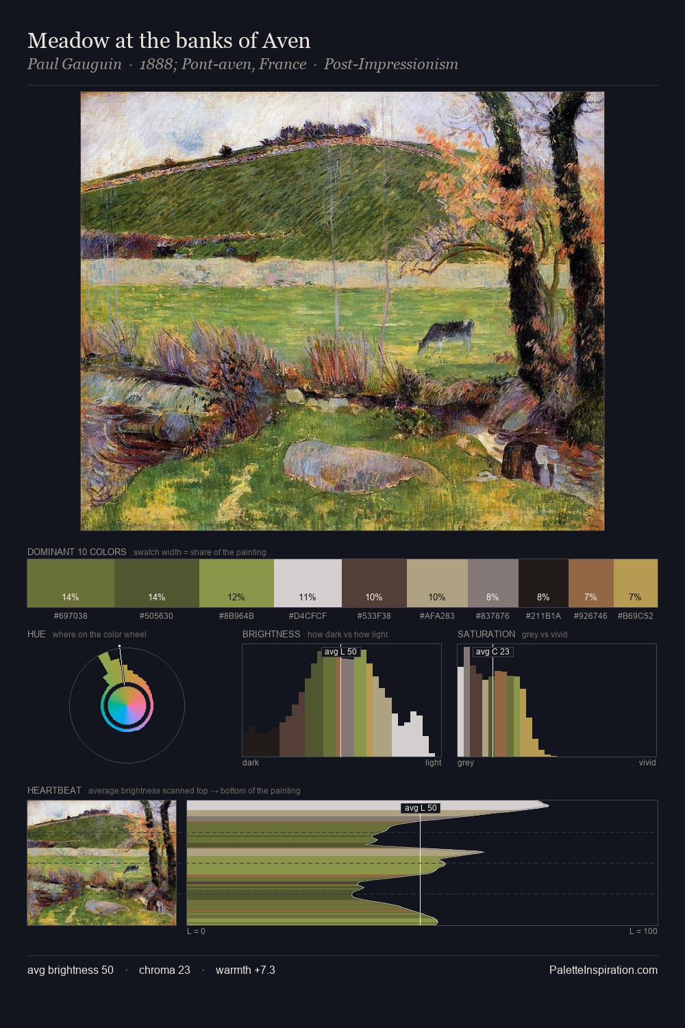
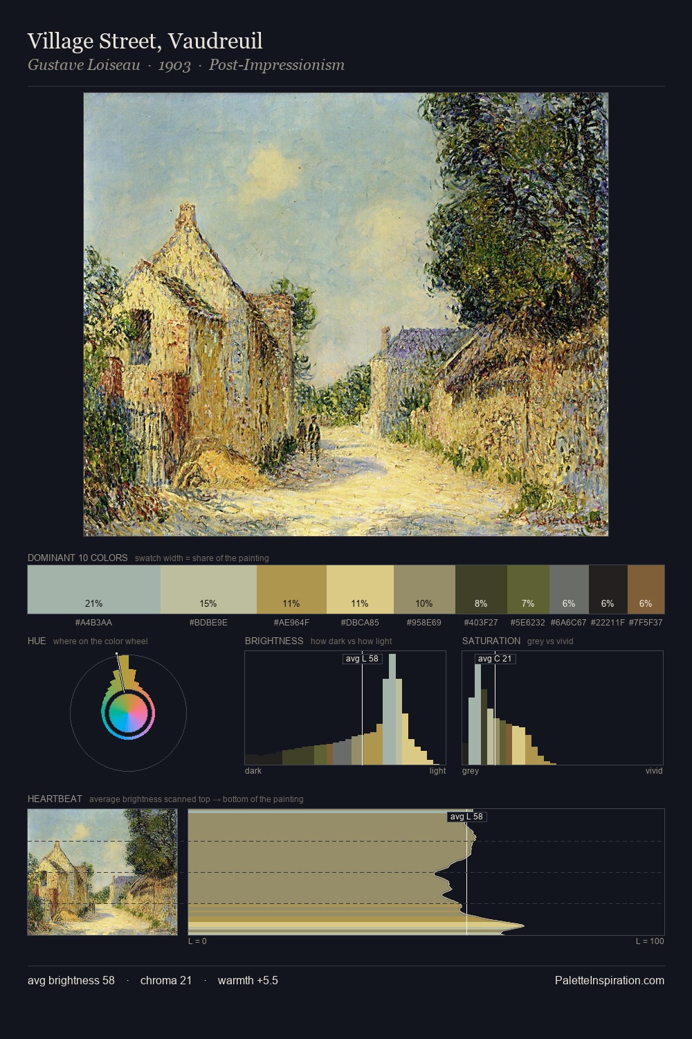
Paul Cezanne sits in the centre of the value range, lending the palette a sense of even, sustained light. Temperature is cool-dominant, with blue and green families claiming the largest areas. Saturation is deliberately withheld - the beauty here lies in the near-monochromatic gradations rather than colour difference. The saturated accent, #9D6A49, registers at 7.6% - sparse enough to feel like a deliberate surprise. At 49 units across the value scale, the palette keeps contrast readable without letting it dominate. The palette has the character of outdoor light: cool, mid-bright, with colour rendered faithfully rather than expressively. Paul Cezanne's palette 5 carries its own internal logic while remaining in conversation with the artist's broader colour intelligence.
Example use cases
- ceramics & pottery
- boutique hospitality
- menswear
- heritage food brands
- craft & artisan brands
I Love This!
Copy, export, or download for your project