Paul Cezanne Palette 2

Palette Analysis
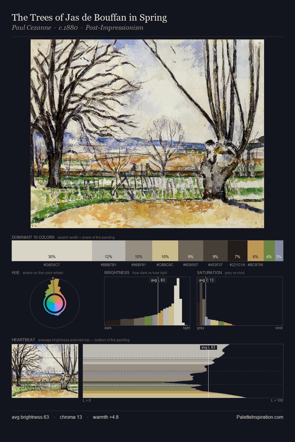
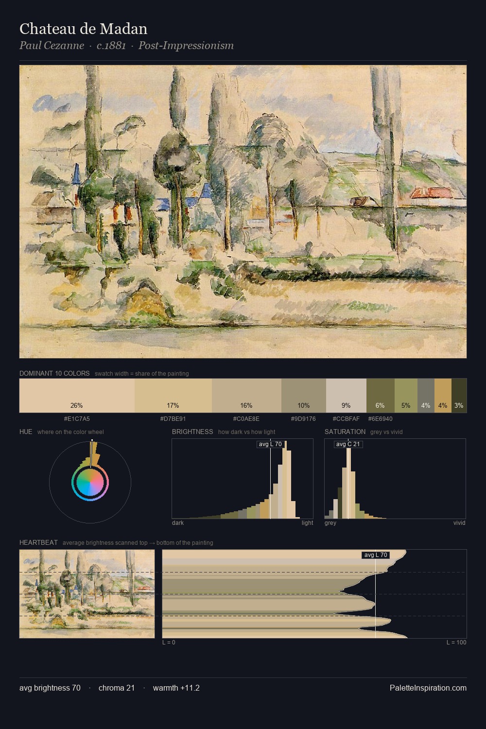
Paul Cezanne is strongly light-biased - shadow is suggested rather than declared. Cool hues prevail: blues, greens, and greys anchor the palette's emotional temperature. Saturation is deliberately withheld - the beauty here lies in the near-monochromatic gradations rather than colour difference. The most saturated colour, #B68A4C, is reserved to 3.3% of the surface, where it acts as a focal punctuation. 54 units of value spread create a palette that is varied but unified - contrast in the service of harmony. The mid-to-high key, cool bias, and moderate chroma point to outdoor observation - sky and diffused daylight as the dominant light source. Palette 2 sits within the larger chromatic argument that Paul Cezanne's complete body of work advances.
Example use cases
- food packaging
- leather accessories
- travel & outdoor
- natural cosmetics
- interior design
I Love This!
Copy, export, or download for your project