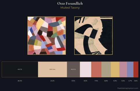
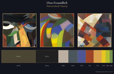
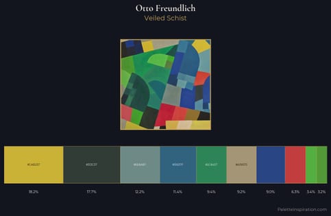
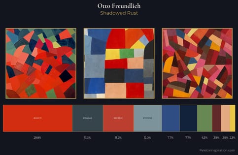
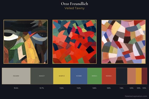
Otto Freundlich Palette 3
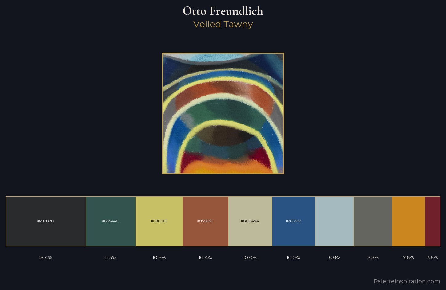
Veiled Tawny
Veiled Partially obscured light - mid-dark with a hazy, scrim-filtered quality.
Tawny Warm orange-brown - a traditional term for the color of tanned leather or lion fur.
Palette Analysis
Otto Freundlich occupies the comfortable middle of the value scale, avoiding both extremes to hold the eye in a sustained middle grey. Otto Freundlich builds on cool foundations: the palette favours the blue-cyan-green arc. All colours lean toward grey, building depth through value rather than colour punch. The saturated accent, #6F202B, registers at 3.6% - sparse enough to feel like a deliberate surprise. At 51 units across the value scale, the palette keeps contrast readable without letting it dominate. High luminosity and cool temperature suggest the plein-air condition: unfiltered daylight and open sky. This is palette 3 of Otto Freundlich's sequence - a single chapter in a chromatic story told across many works.
Example use cases
- art galleries
- creative studios
- consumer goods
- lifestyle media
- professional services
I Love This!
Use This Palette
Copy, export, or download for your project
Copy, export, or download for your project
Copy:
Download:
Share: