Otto Freundlich Palette 2
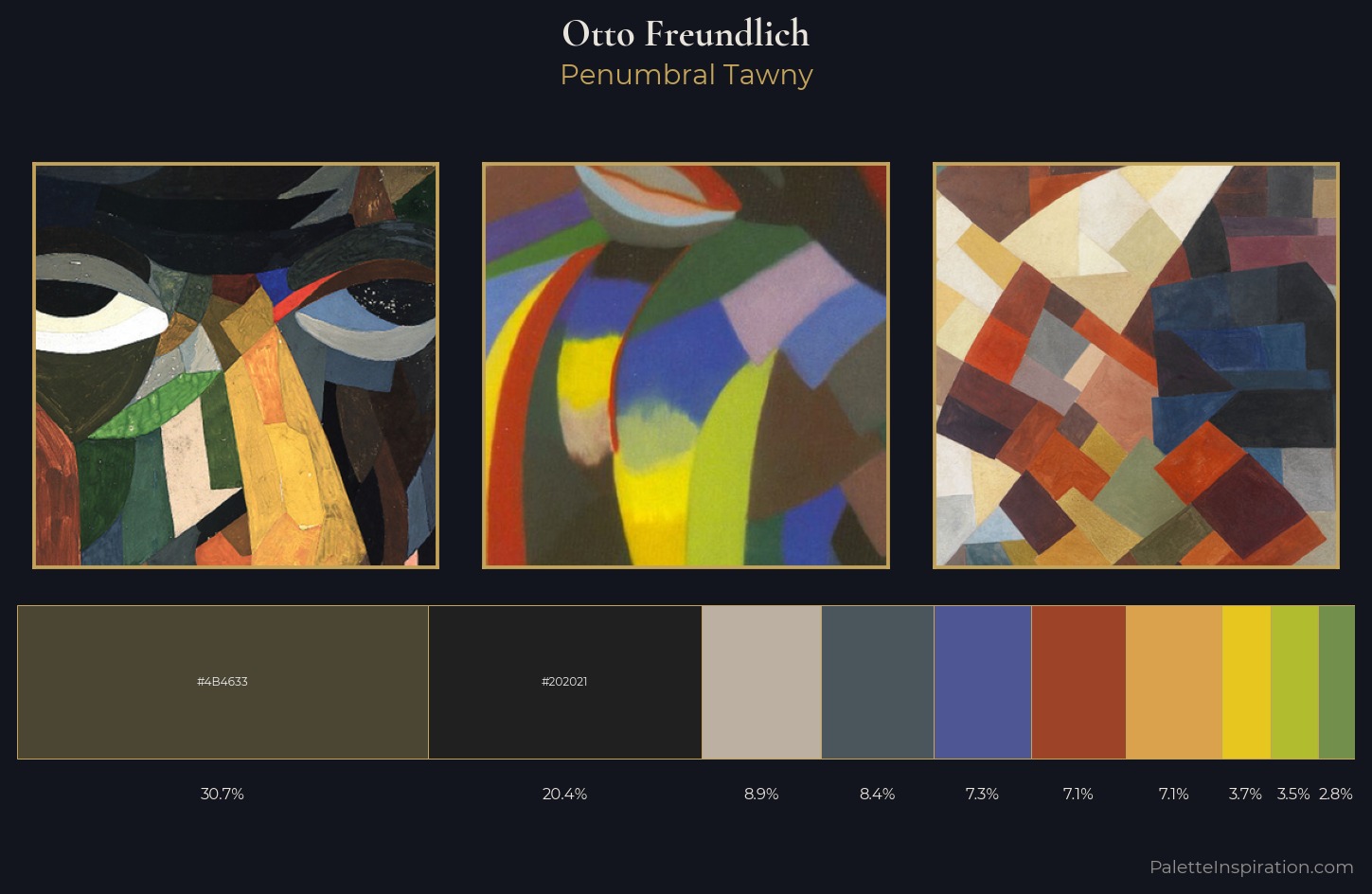
Palette Analysis
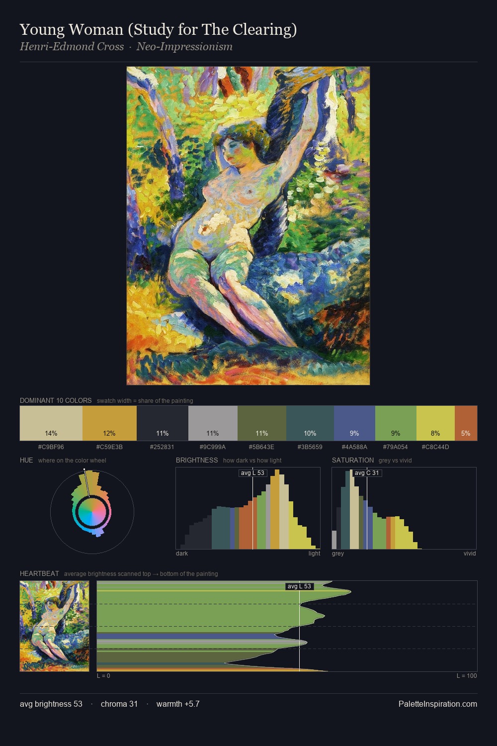
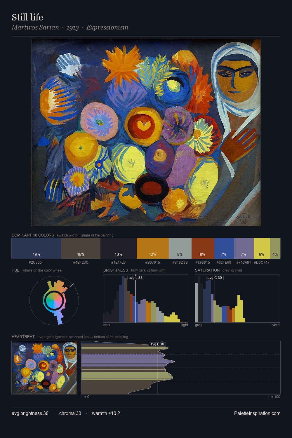
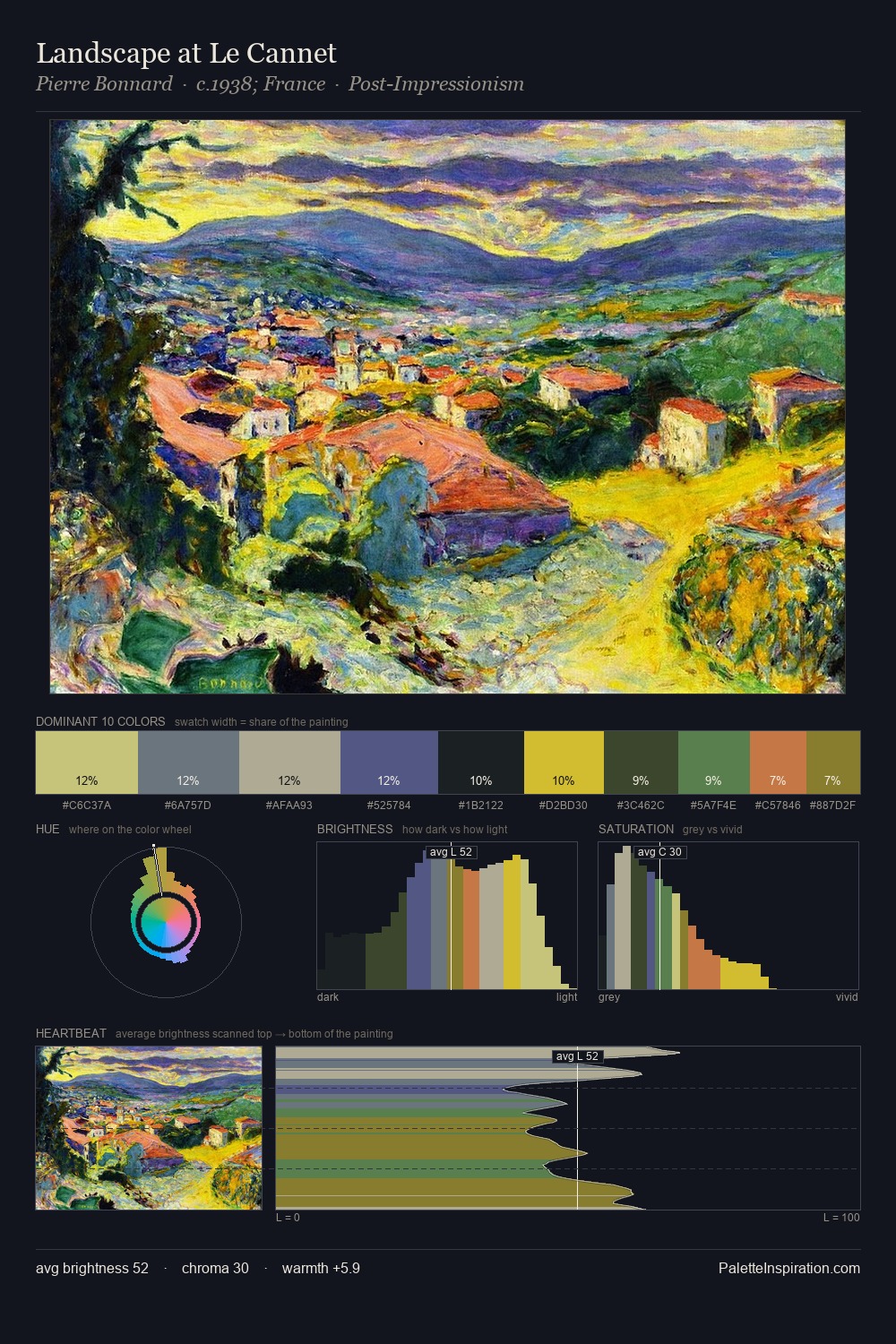
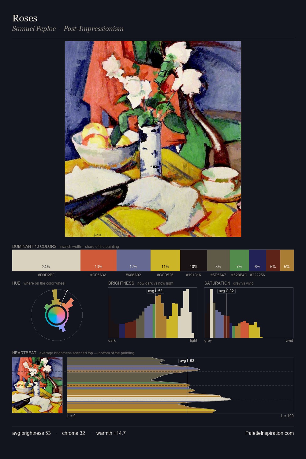
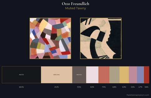
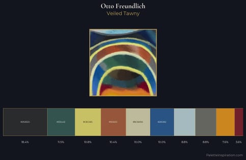
Otto Freundlich sits in the centre of the value range, lending the palette a sense of even, sustained light. Blues and teal-greys govern the palette, lending it an aquatic or atmospheric quality. Chroma hovers near zero; colour declares itself through subtle shifts in hue rather than outright saturation. At 30.7%, #4B4633 functions less as a colour accent and more as a complete atmospheric environment. The most saturated colour, #B1BC2F, is reserved to 3.5% of the surface, where it acts as a focal punctuation. A value spread of 59 units gives the palette both depth and air - shadows are genuinely dark, lights genuinely light. High luminosity and cool temperature suggest the plein-air condition: unfiltered daylight and open sky. This is palette 2 of Otto Freundlich's sequence - a single chapter in a chromatic story told across many works.
Example use cases
- theater design
- jewelry brands
- tobacco-adjacent retail
- event branding
- film & entertainment
I Love This!
Copy, export, or download for your project