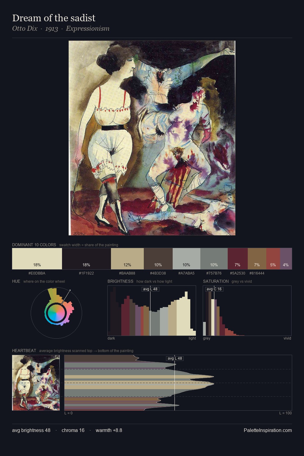
Otto Dix Palette 5
Veiled Tawny
Veiled Partially obscured light - mid-dark with a hazy, scrim-filtered quality.
Tawny Warm orange-brown - a traditional term for the color of tanned leather or lion fur.

Palette Analysis
Values in Otto Dix rest in the mid-range - neither dramatically lit nor steeped in shadow. Cool hues prevail: blues, greens, and greys anchor the palette's emotional temperature. Muted throughout, the palette achieves its effects through value and temperature rather than chromatic force. The most saturated colour, #995049, is reserved to 2.1% of the surface, where it acts as a focal punctuation. At 65 units of value range, the palette has the tonal breadth to sustain complex spatial readings. The palette has the character of outdoor light: cool, mid-bright, with colour rendered faithfully rather than expressively. Palette 5 sits within the larger chromatic argument that Otto Dix's complete body of work advances.
Example use cases
- boutique hospitality
- film production
- menswear
- art prints & posters
- heritage brands
I Love This!
Use This Palette
Copy, export, or download for your project
Copy, export, or download for your project
Copy:
Download:
Share: