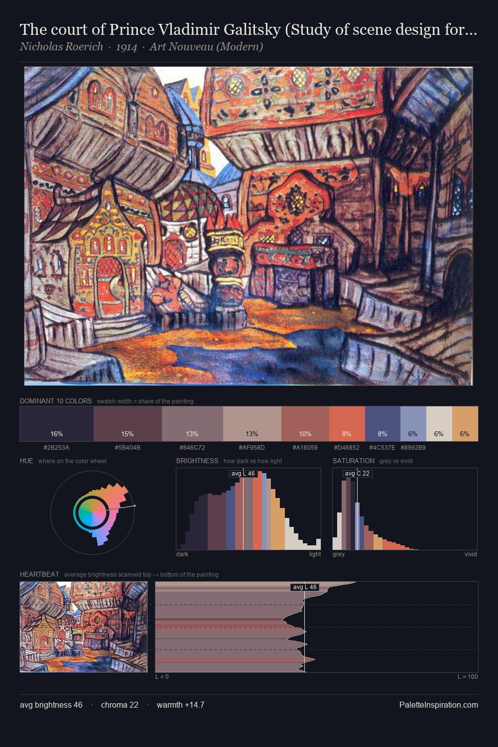
Nicholas Roerich Palette 3

Palette Analysis
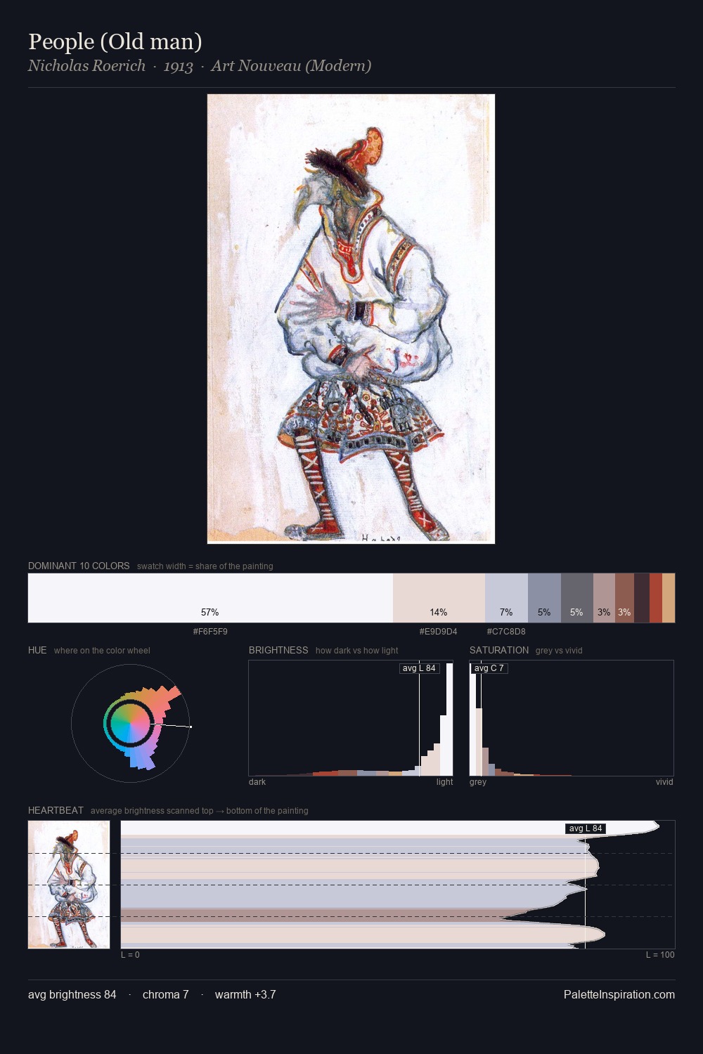
Nicholas Roerich works in the upper reaches of the value scale, creating an atmosphere of brightness and expansiveness. Cool hues prevail: blues, greens, and greys anchor the palette's emotional temperature. Every colour is desaturated; the palette proceeds through near-neutrals and gently-coloured greys. 30.1% of the palette belongs to #F7F7F8, a concentration that makes it the unmistakable visual centre. The saturated accent, #C69C5E, registers at 6.5% - sparse enough to feel like a deliberate surprise. The full value range is 61 units: broad enough to build convincing three-dimensional form. The palette has the character of outdoor light: cool, mid-bright, with colour rendered faithfully rather than expressively. This is palette 3 of Nicholas Roerich's sequence - a single chapter in a chromatic story told across many works.
Example use cases
- publishing
- corporate identity
- consumer apps
- hospitality
- design agencies
I Love This!
Copy, export, or download for your project