Nathan Altman Palette 6

Palette Analysis
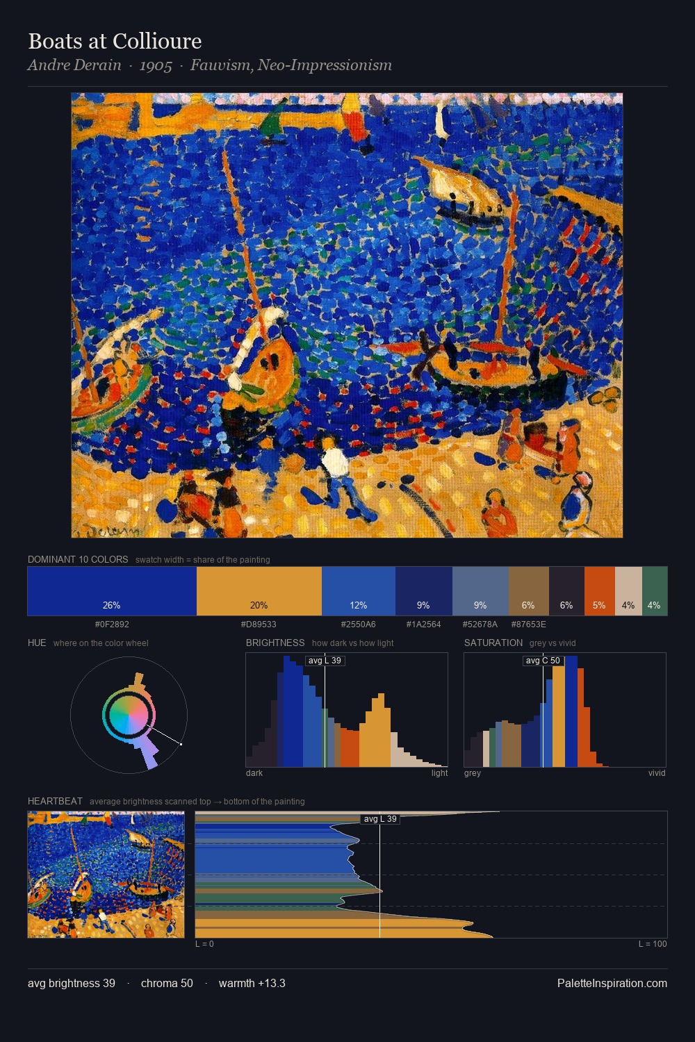
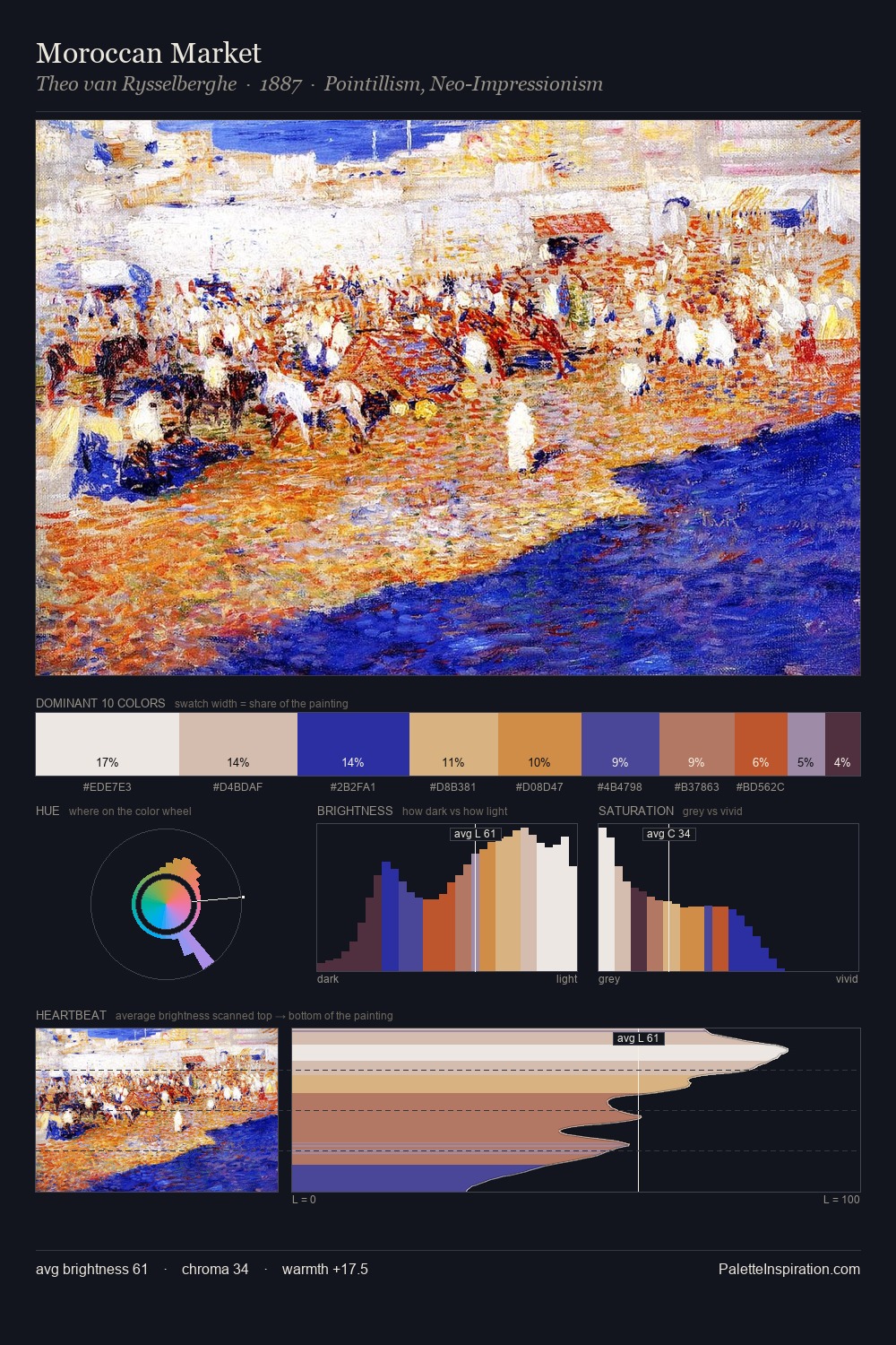
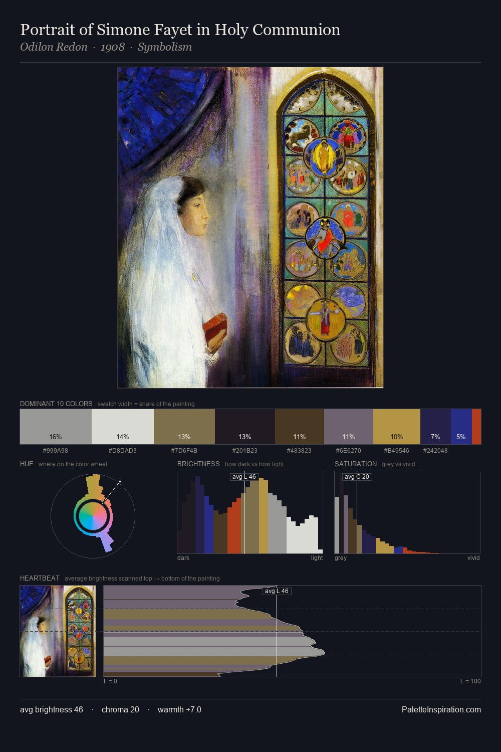
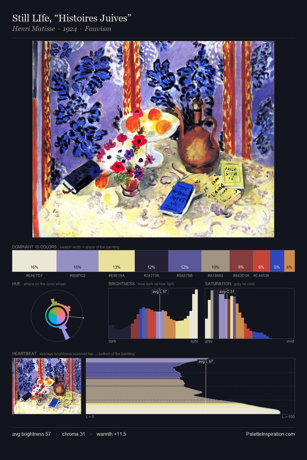
Nathan Altman occupies the comfortable middle of the value scale, avoiding both extremes to hold the eye in a sustained middle grey. Warm and cool tones are held in careful balance - neither family dominates, creating tension and resolution simultaneously. Chroma is held at a comfortable level - distinct colours, but no single hue is allowed to overwhelm. The most saturated colour, #D43C15, covers 28.6% of the surface: too much to call an accent, too strong to ignore. The value range spans 60 units across the palette, providing the full gamut from deep shadow to near-white and ensuring clear tonal hierarchy. Together these qualities point to the open-air Impressionist method: recording light rather than local colour. Palette 6 sits within the larger chromatic argument that Nathan Altman's complete body of work advances.
Example use cases
- publishing
- corporate identity
- consumer apps
- hospitality
- design agencies
I Love This!
Copy, export, or download for your project