Nathan Altman Palette 4
Palette Analysis
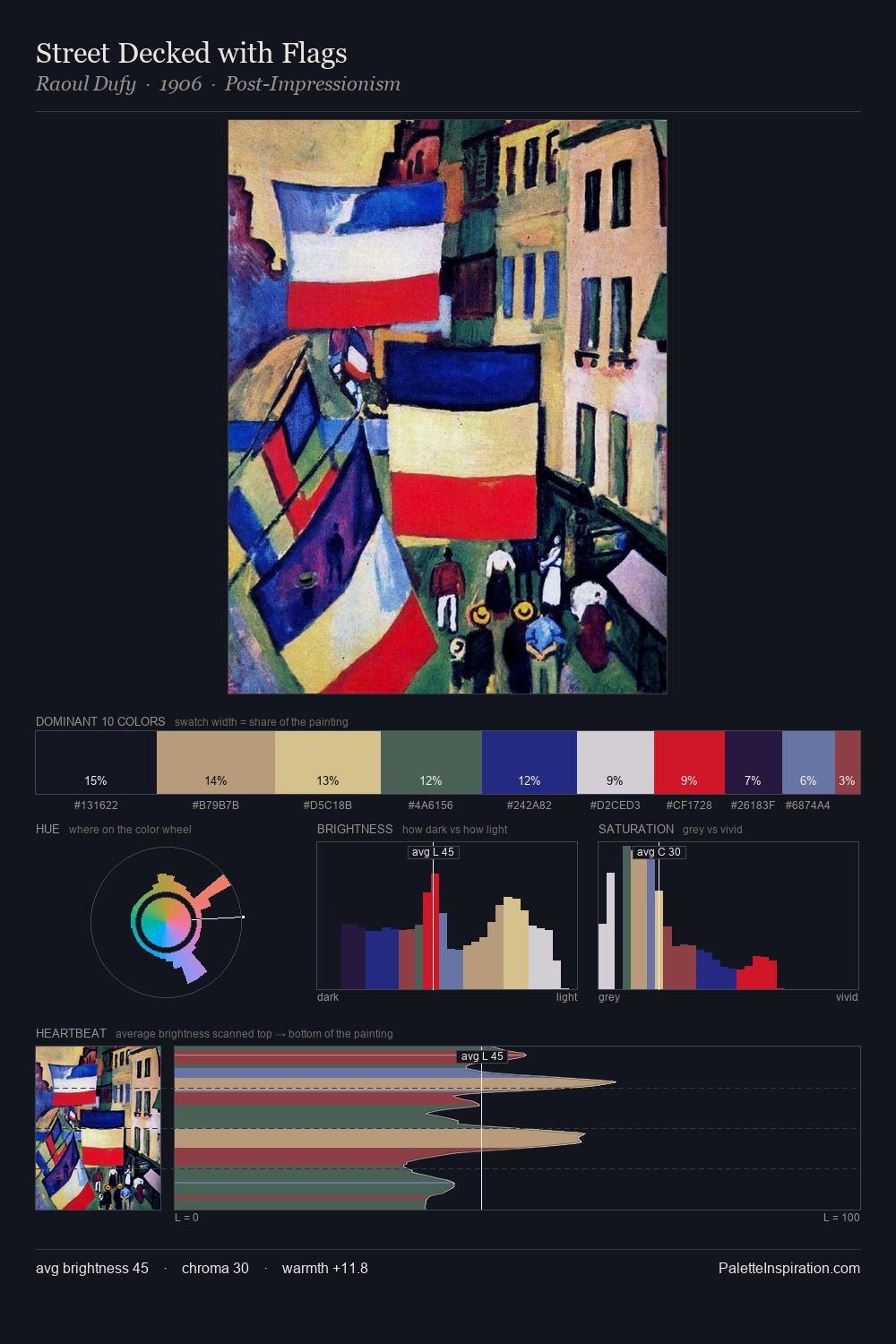
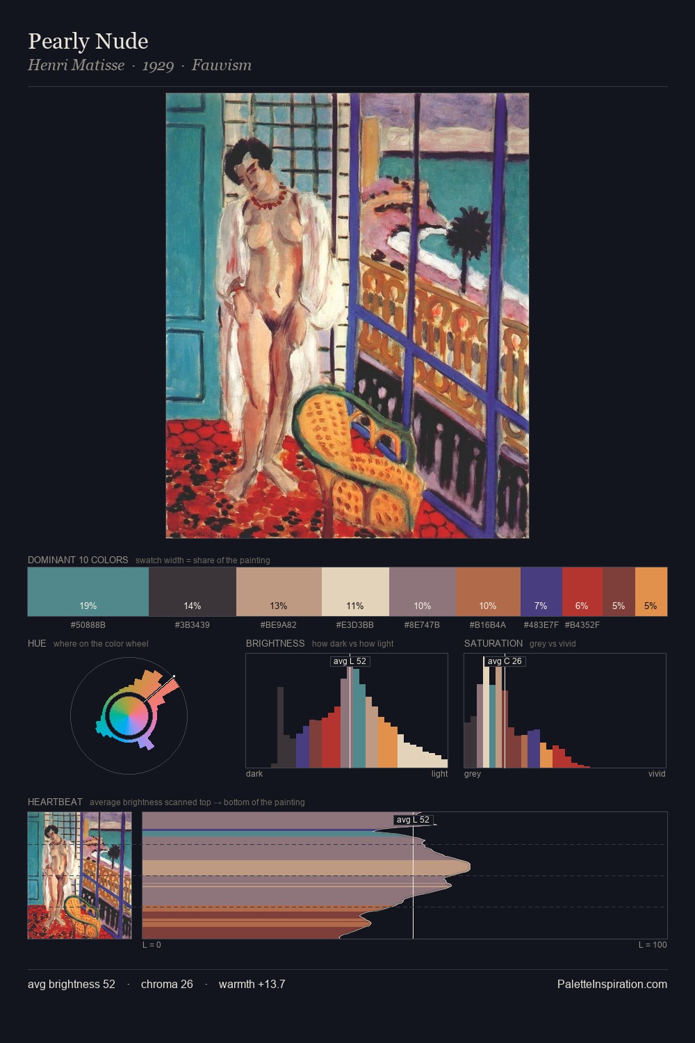
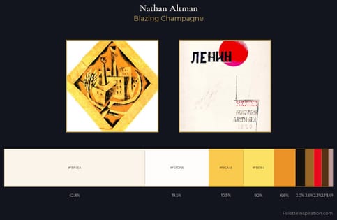
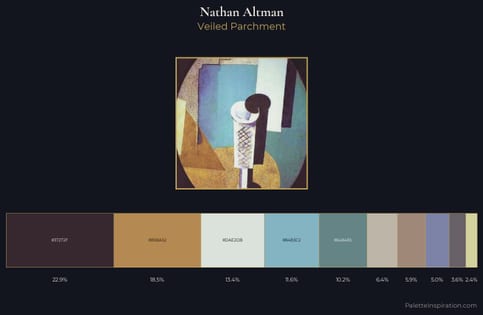
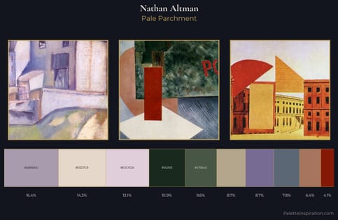
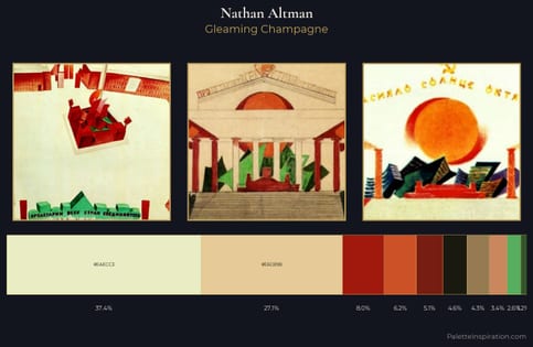
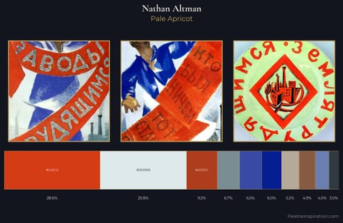
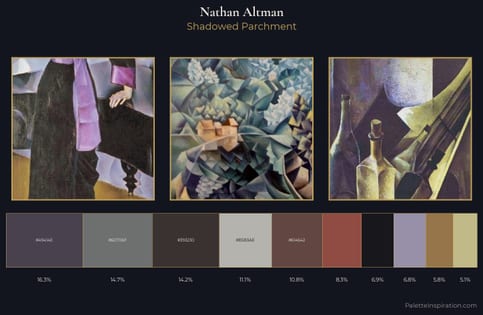
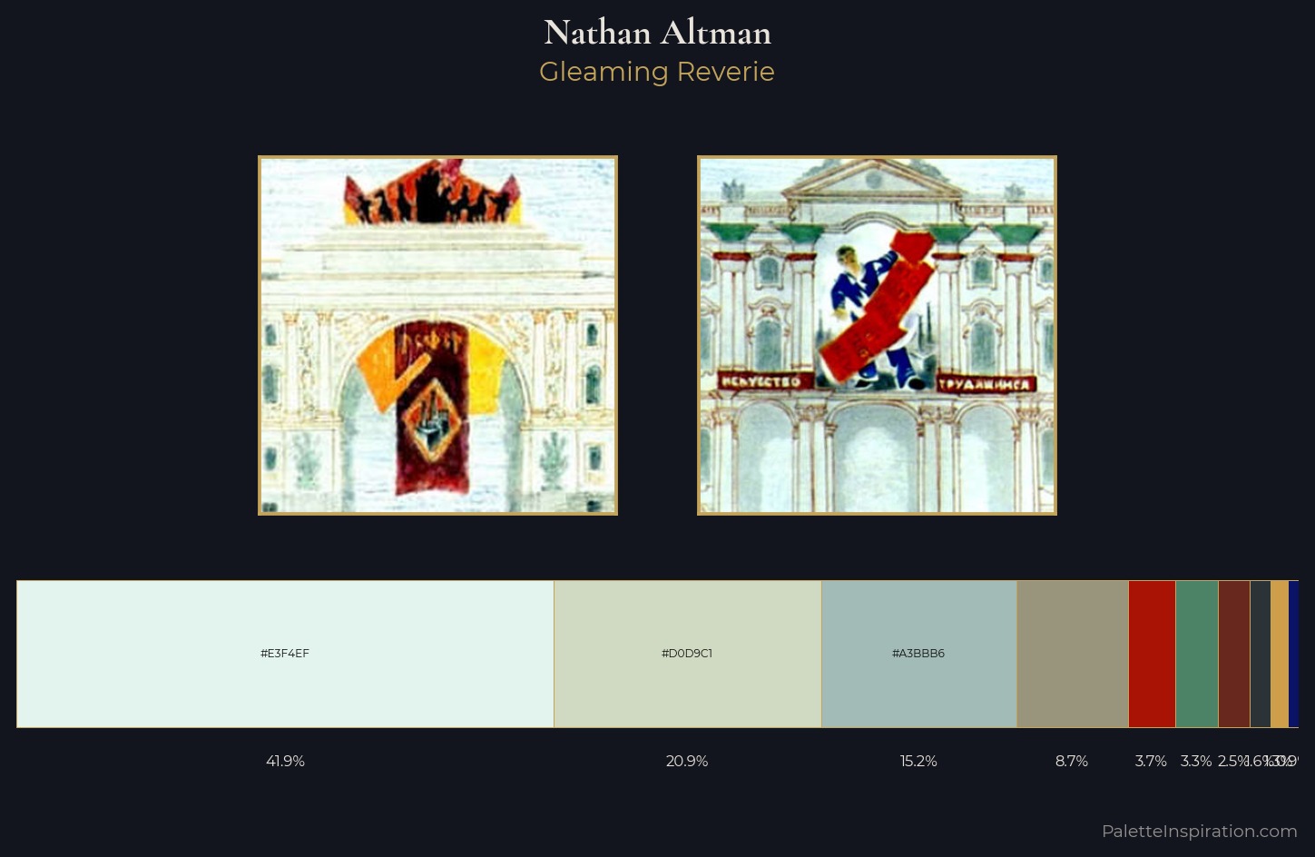
Nathan Altman is high-key - luminous, open, and weighted toward light. Cool hues prevail: blues, greens, and greys anchor the palette's emotional temperature. Chroma hovers near zero; colour declares itself through subtle shifts in hue rather than outright saturation. 41.9% of the palette belongs to #E3F4EF, a concentration that makes it the unmistakable visual centre. At 1.3%, #CF9E4A carries the palette's sharpest chromatic charge: an accent that earns its place precisely because it is withheld. The full value range is 69 units: broad enough to build convincing three-dimensional form. The mid-to-high key, cool bias, and moderate chroma point to outdoor observation - sky and diffused daylight as the dominant light source. Palette 4 sits within the larger chromatic argument that Nathan Altman's complete body of work advances.
Example use cases
- garden centers
- natural beauty
- park & rec design
- sustainable fashion
- sustainability
I Love This!
Copy, export, or download for your project