Nathan Altman Palette 5

Palette Analysis
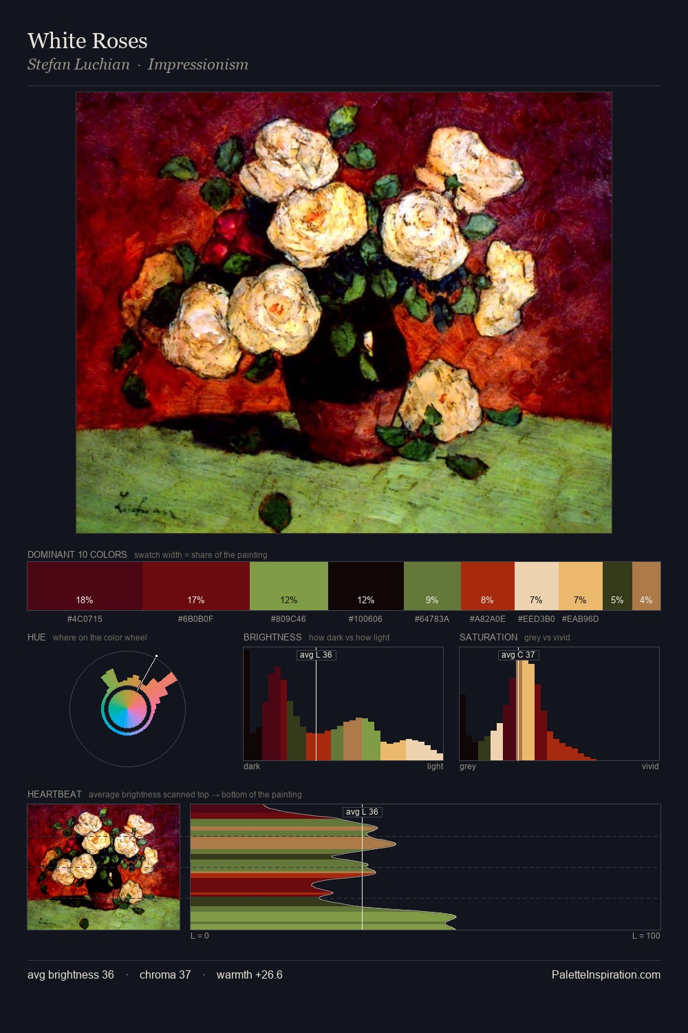
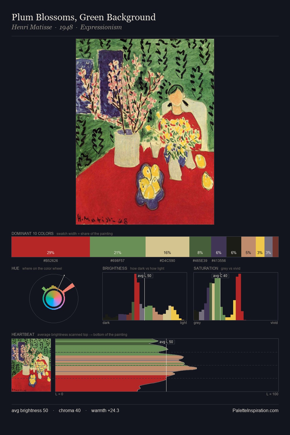
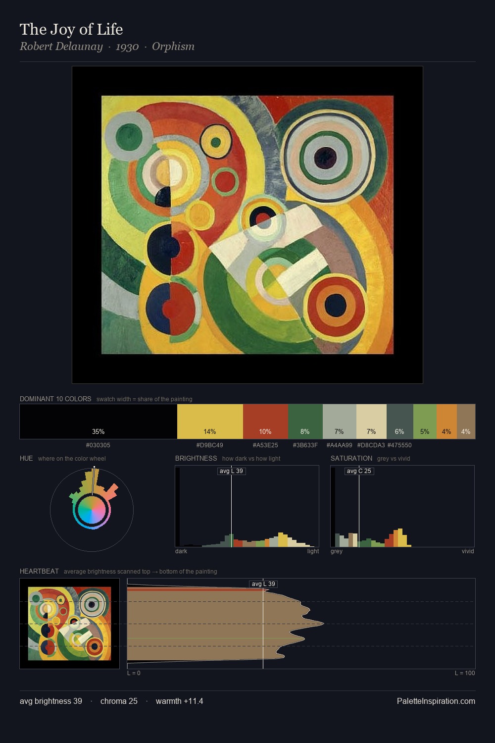
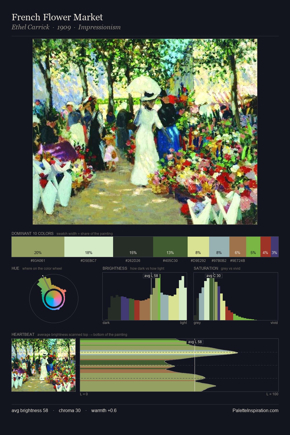
Light floods Nathan Altman; the palette keeps values pale and airy across its range. Cool tones set the register here - the blues and greens easily outweigh any warm accents. Saturation is measured and controlled, giving the palette presence without visual aggression. 37.4% of the palette belongs to #EAECC3, a concentration that makes it the unmistakable visual centre. The most saturated colour, #CA875D, is reserved to 3.4% of the surface, where it acts as a focal punctuation. The full value range is 72 units: broad enough to build convincing three-dimensional form. High luminosity and cool temperature suggest the plein-air condition: unfiltered daylight and open sky. Palette 5 sits within the larger chromatic argument that Nathan Altman's complete body of work advances.
Example use cases
- publishing
- corporate identity
- consumer apps
- hospitality
- design agencies
I Love This!
Copy, export, or download for your project