Natalia Goncharova Master Palette
Muted Caramel
Muted Deliberately desaturated - chroma pulled toward gray, the restraint of tonal painting.
Caramel Warm mid-brown - the color of cooked sugar, smooth and amber-toned.

Palette Analysis
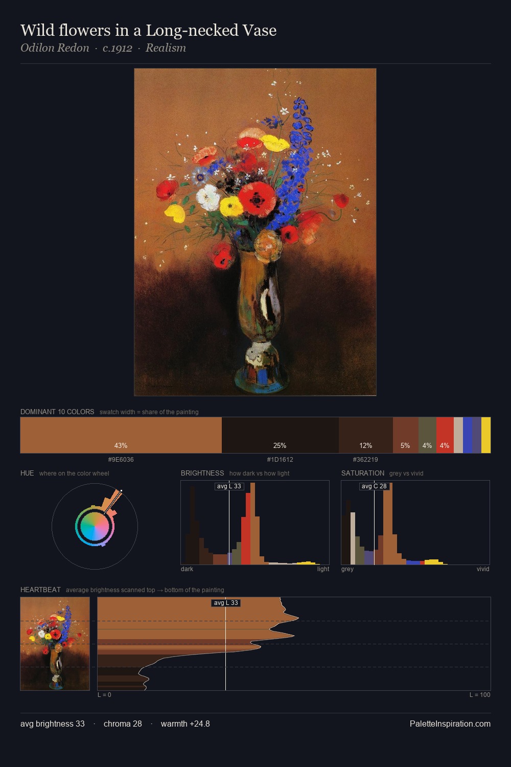
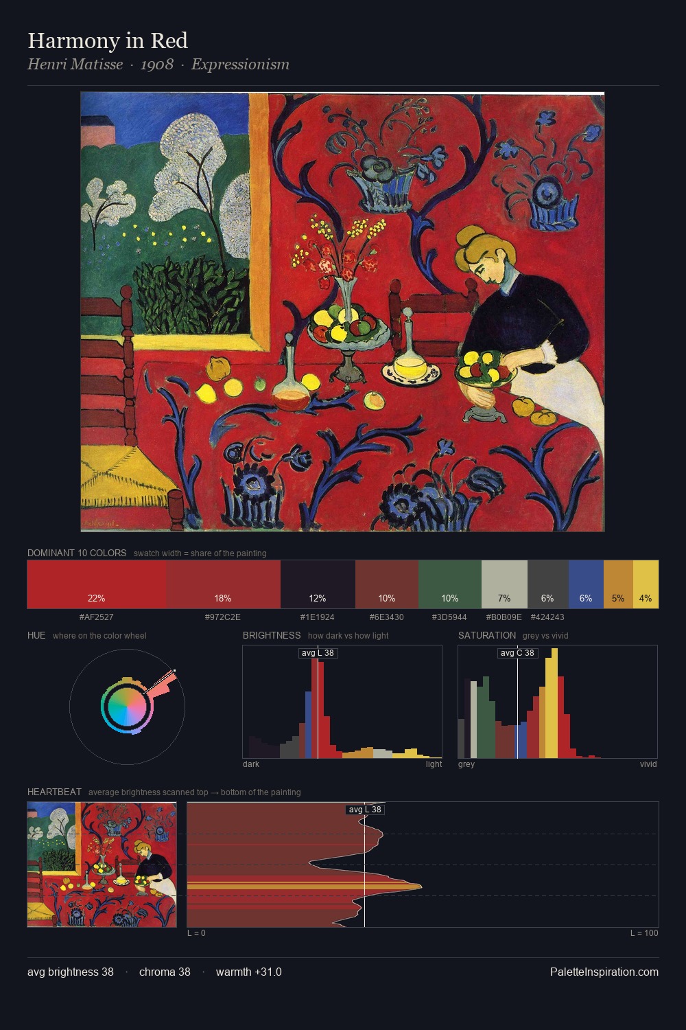
The value structure of Natalia Goncharova is mid-key: quiet, controlled, and cohesive. The palette achieves thermal balance - reds and blues, ochres and greens, each holding the other in check. Colours are neither washed out nor blazing; they occupy the productive middle ground of the chroma scale. #44308A delivers the chromatic peak at only 1.9% - a small shot of colour with outsized visual impact. 54 units of value spread create a palette that is varied but unified - contrast in the service of harmony. The palette reads as an Impressionist one - light-biased, chromatically direct, and built on temperature contrast rather than value opposition. This is the light Natalia Goncharova preferred, made measurable.
Example use cases
- ceramics & pottery
- boutique hospitality
- menswear
- heritage food brands
- craft & artisan brands
I Love This!
Use This Palette
Copy, export, or download for your project
Copy, export, or download for your project
Copy:
Download:
Share: