Natalia Goncharova Palette 8

Palette Analysis
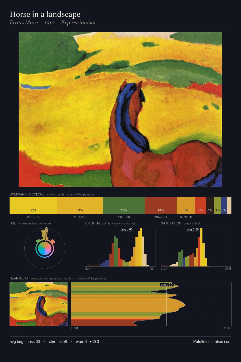
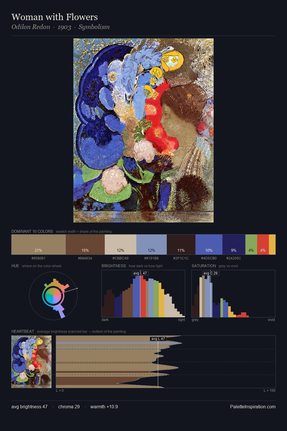
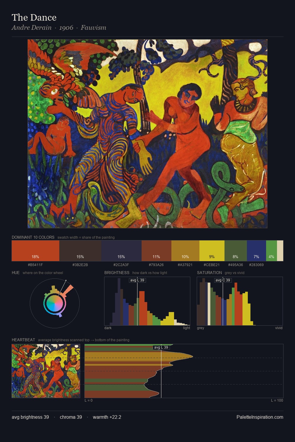
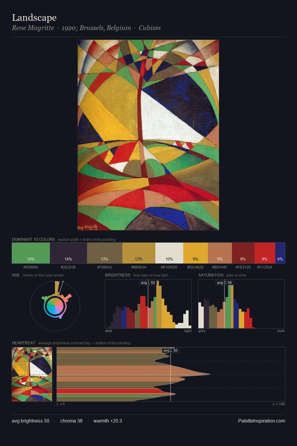
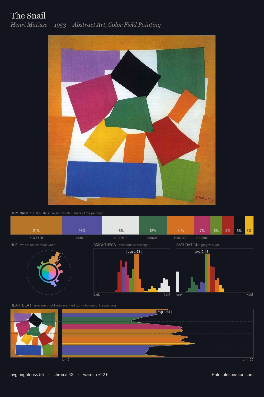
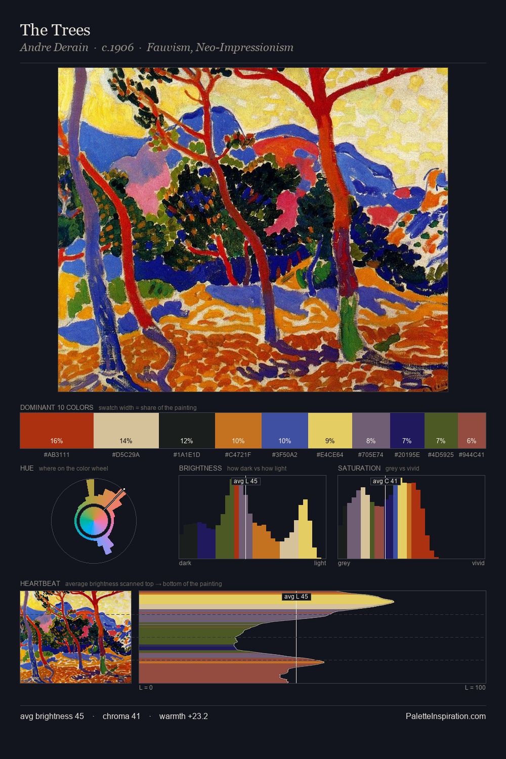
Values in Natalia Goncharova rest in the mid-range - neither dramatically lit nor steeped in shadow. Natalia Goncharova keeps warm and cool in parity, a balance that lends the work a perceptual shimmer. Chroma is held at a comfortable level - distinct colours, but no single hue is allowed to overwhelm. The most saturated colour, #627C17, is reserved to 3.9% of the surface, where it acts as a focal punctuation. 59 units of value range underpin the palette's structural clarity: the eye always knows where light falls. The combination of mid-to-high key, balanced temperature, and elevated chroma is characteristic of Impressionist observation: light broken into its component hues. Palette 8 sits within the larger chromatic argument that Natalia Goncharova's complete body of work advances.
Example use cases
- publishing
- corporate identity
- consumer apps
- hospitality
- design agencies
I Love This!
Copy, export, or download for your project