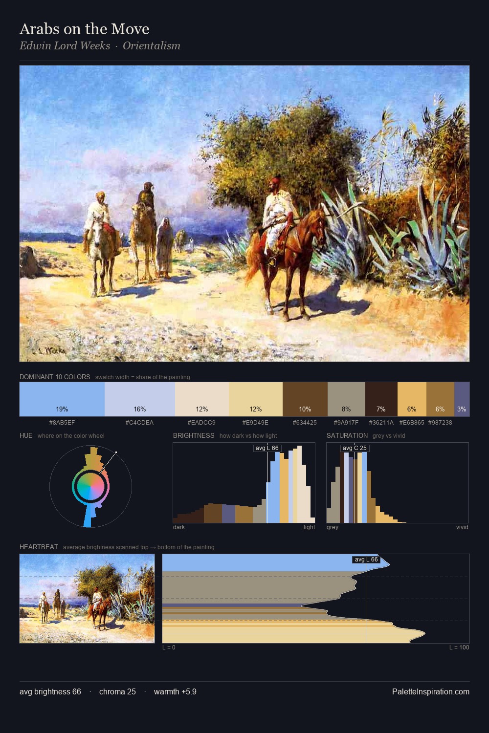
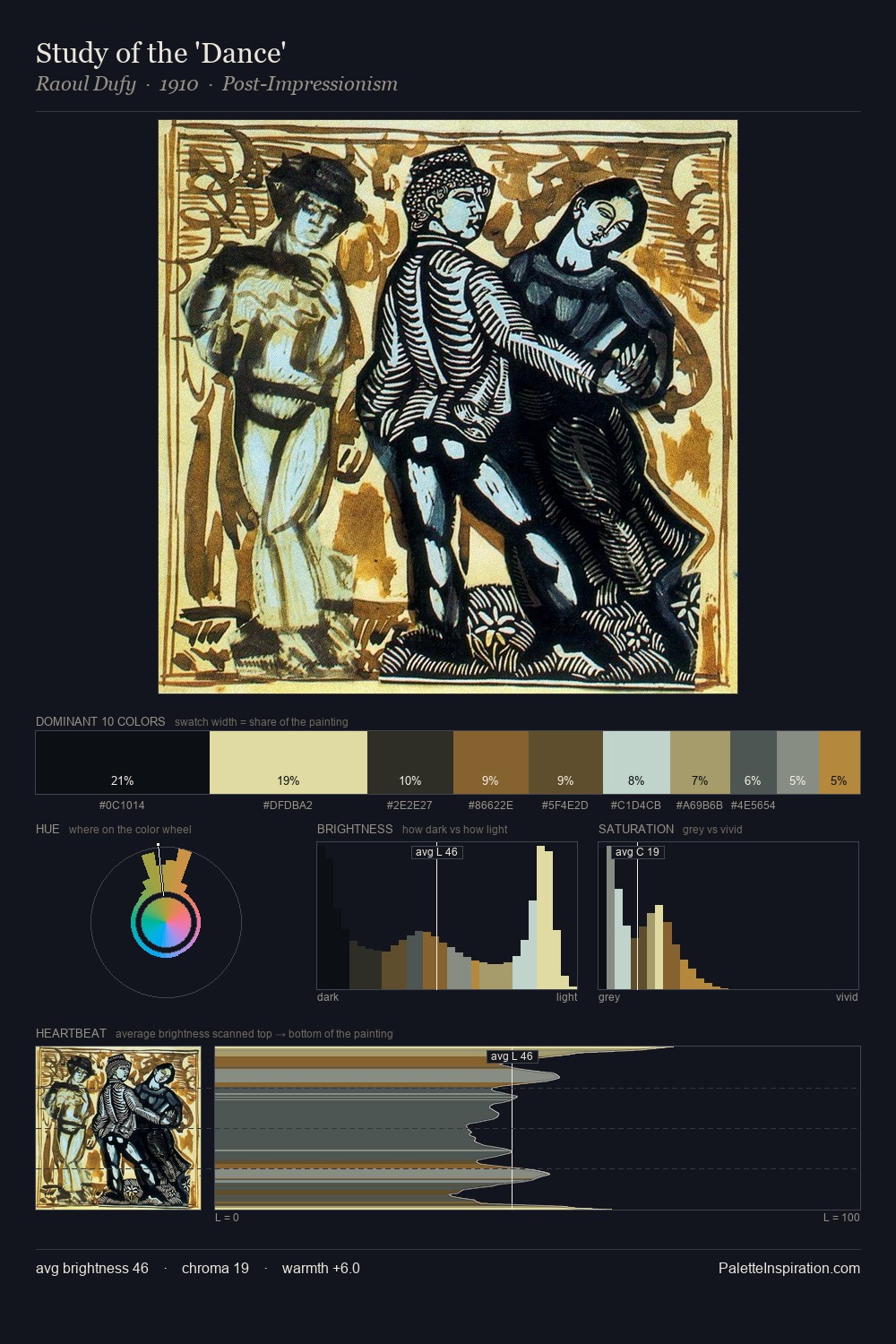
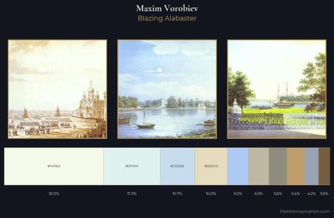
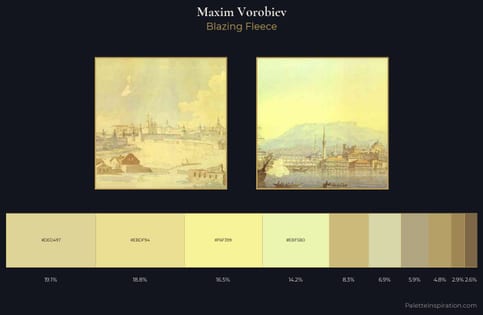
Maxim Vorobiev Master Palette
Palette Analysis
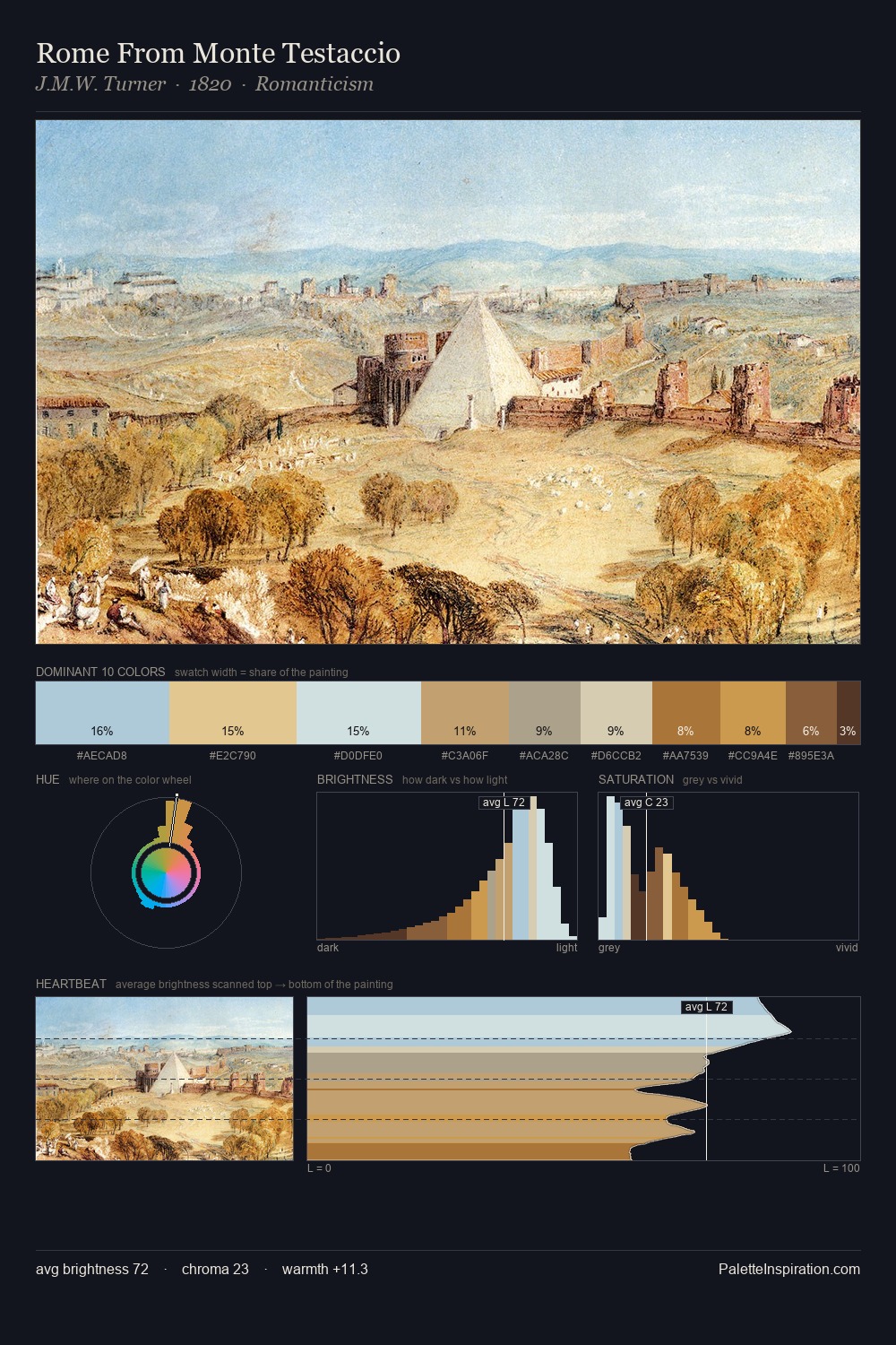
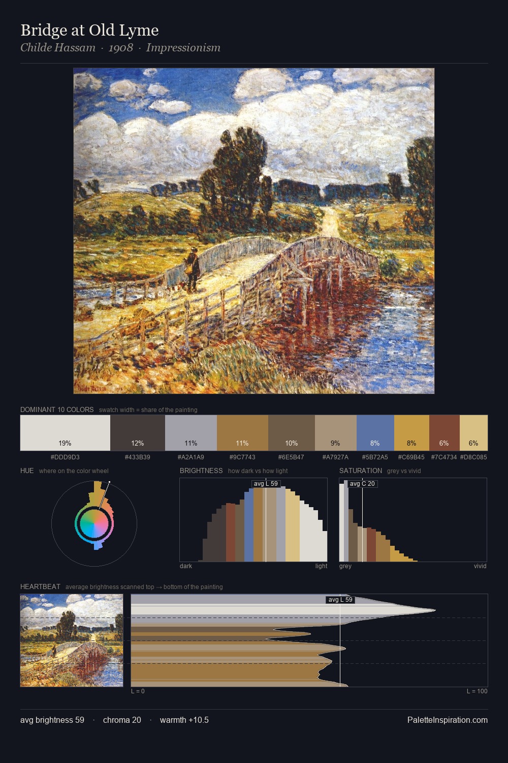
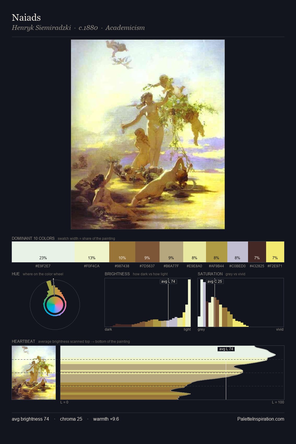
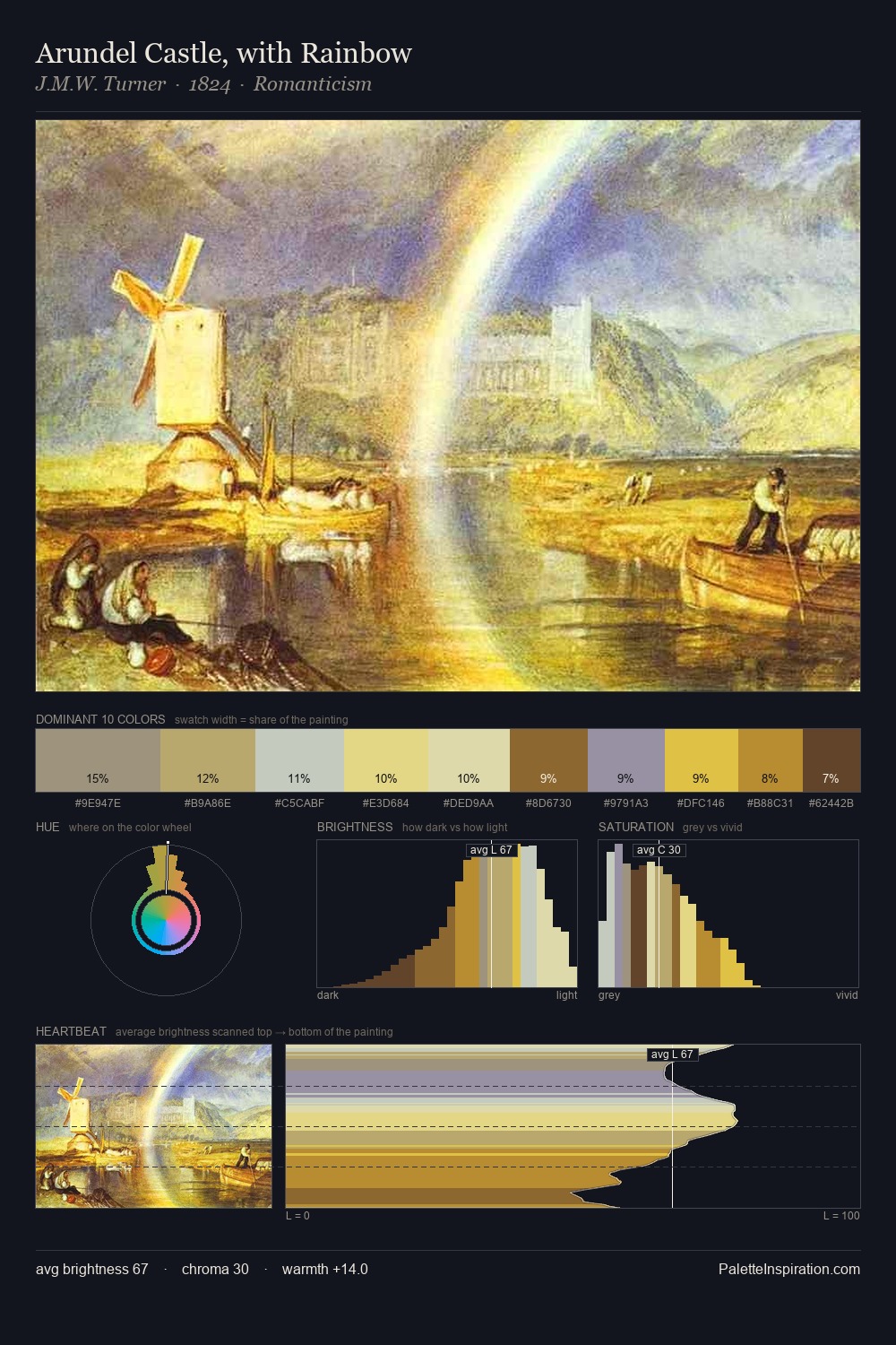
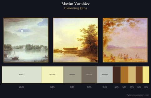
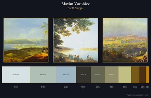
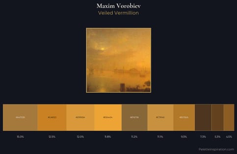
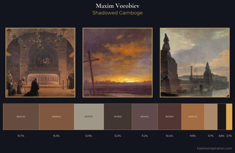
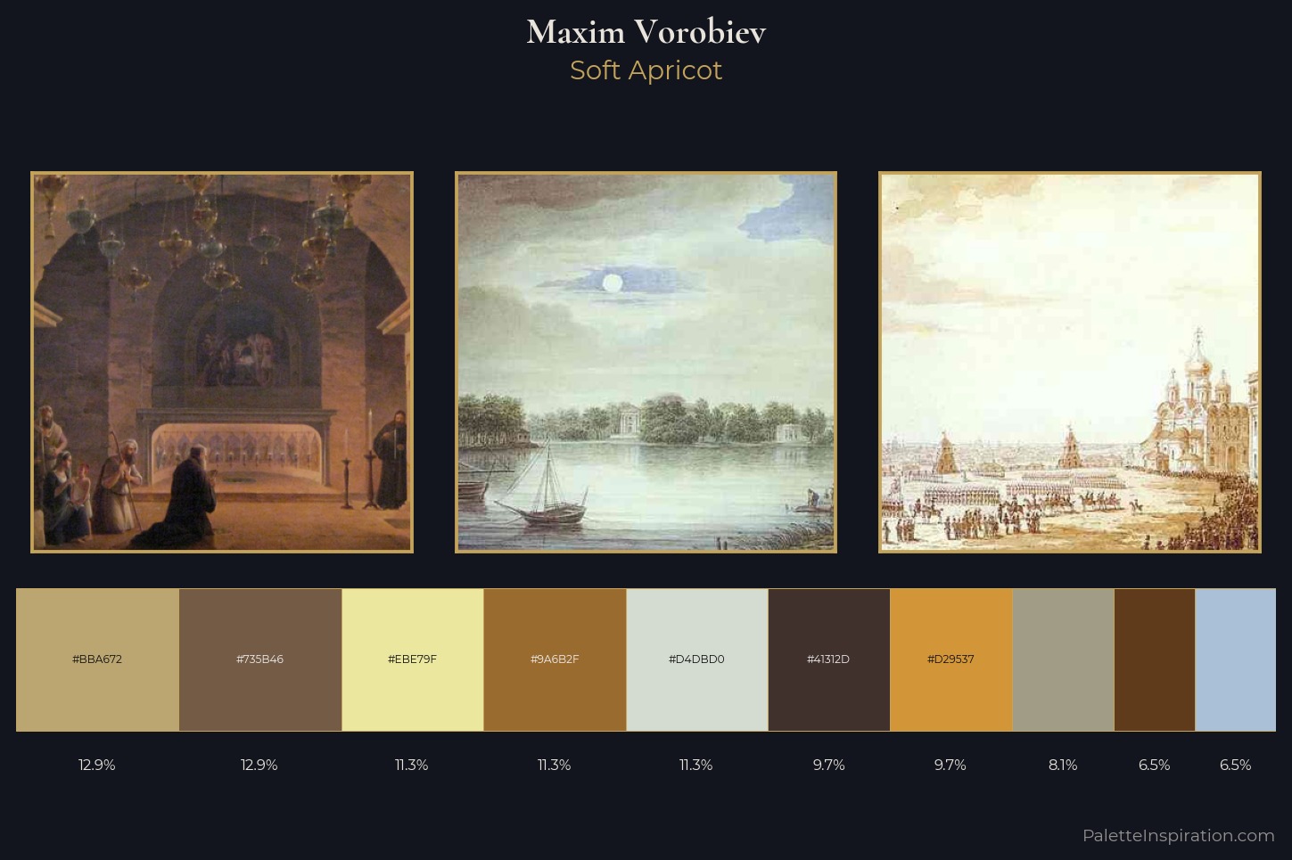
The high-key values of Maxim Vorobiev give it an effulgent, almost bleached quality. Neither warm nor cool has the upper hand here; the equilibrium between the two generates the palette's visual energy. Chroma is held at a comfortable level - distinct colours, but no single hue is allowed to overwhelm. The highest-chroma note - #9A6B2F - appears at just 11.3%, deployed as a precision accent against the quieter ground. The value range spans 58 units across the palette, providing the full gamut from deep shadow to near-white and ensuring clear tonal hierarchy. The palette reads as an Impressionist one - light-biased, chromatically direct, and built on temperature contrast rather than value opposition. This is the light Maxim Vorobiev preferred, made measurable.
Example use cases
- ceramics & pottery
- boutique hospitality
- menswear
- heritage food brands
- craft & artisan brands
I Love This!
Copy, export, or download for your project