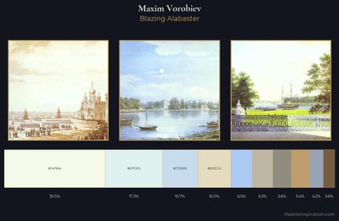
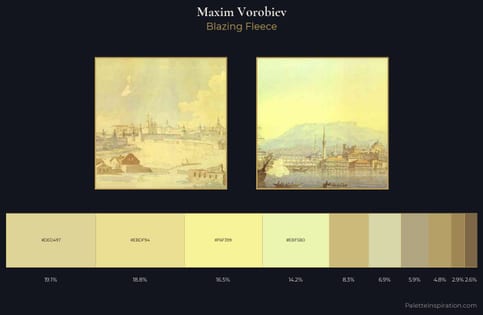
Maxim Vorobiev Palette 4
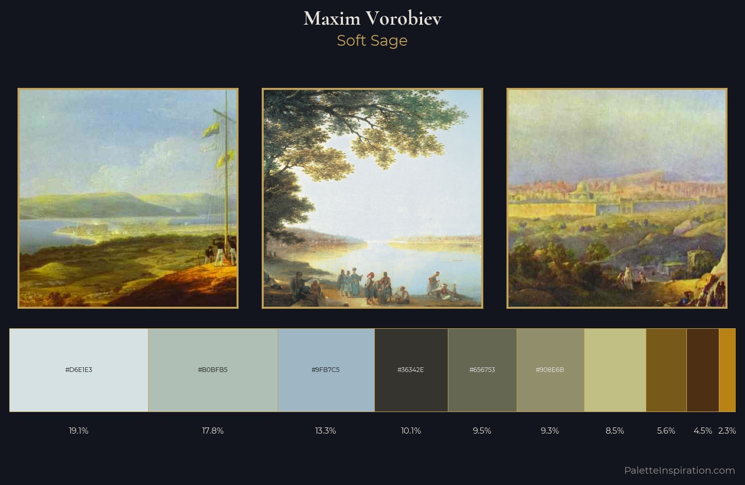
Palette Analysis
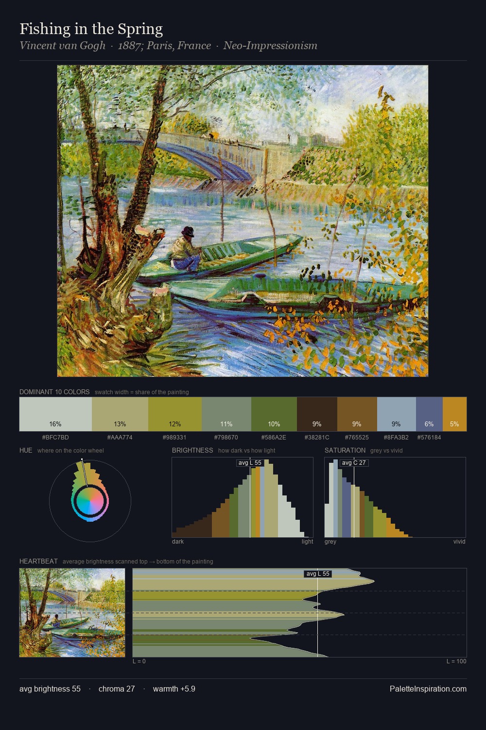
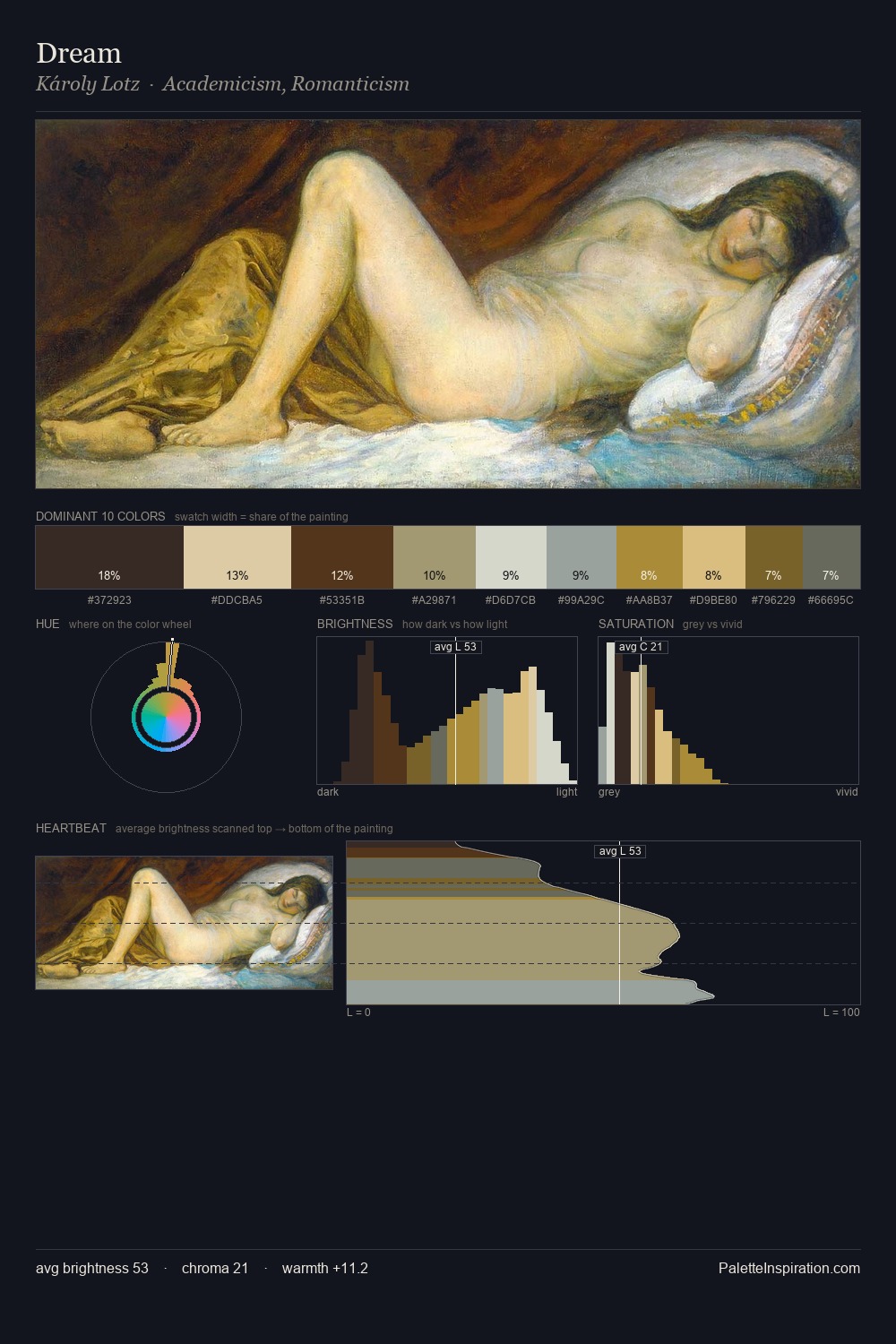
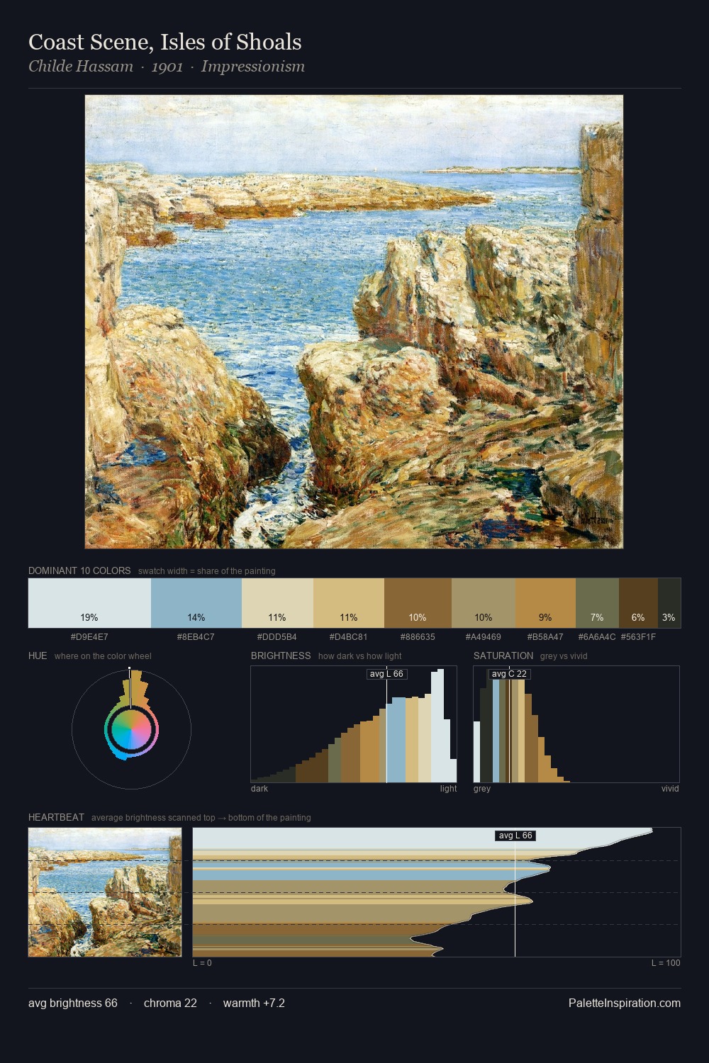
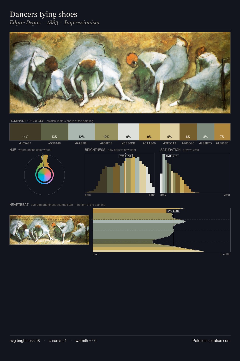
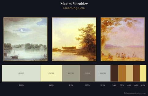
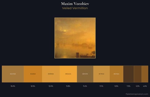
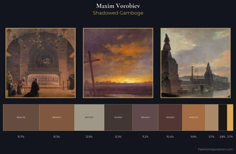
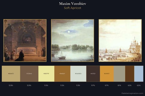
Values in Maxim Vorobiev tilt decisively toward white, giving the palette its luminous character. Cool tones set the register here - the blues and greens easily outweigh any warm accents. Every colour is desaturated; the palette proceeds through near-neutrals and gently-coloured greys. Only 4.5% is devoted to #4D3013, yet that small allocation delivers the palette's entire chromatic tension. From deepest dark to palest light, the palette traverses 57 units of the value scale - a span that creates natural depth. The mid-to-high key, cool bias, and moderate chroma point to outdoor observation - sky and diffused daylight as the dominant light source. This is palette 4 of Maxim Vorobiev's sequence - a single chapter in a chromatic story told across many works.
Example use cases
- ceramics & pottery
- boutique hospitality
- menswear
- heritage food brands
- craft & artisan brands
I Love This!
Copy, export, or download for your project