Max Pietschmann Palette 9
Shadowed Caramel
Shadowed Low-key - values weighted toward shadow, the palette of dim interiors and overcast skies.
Caramel Warm mid-brown - the color of cooked sugar, smooth and amber-toned.
Palette Analysis
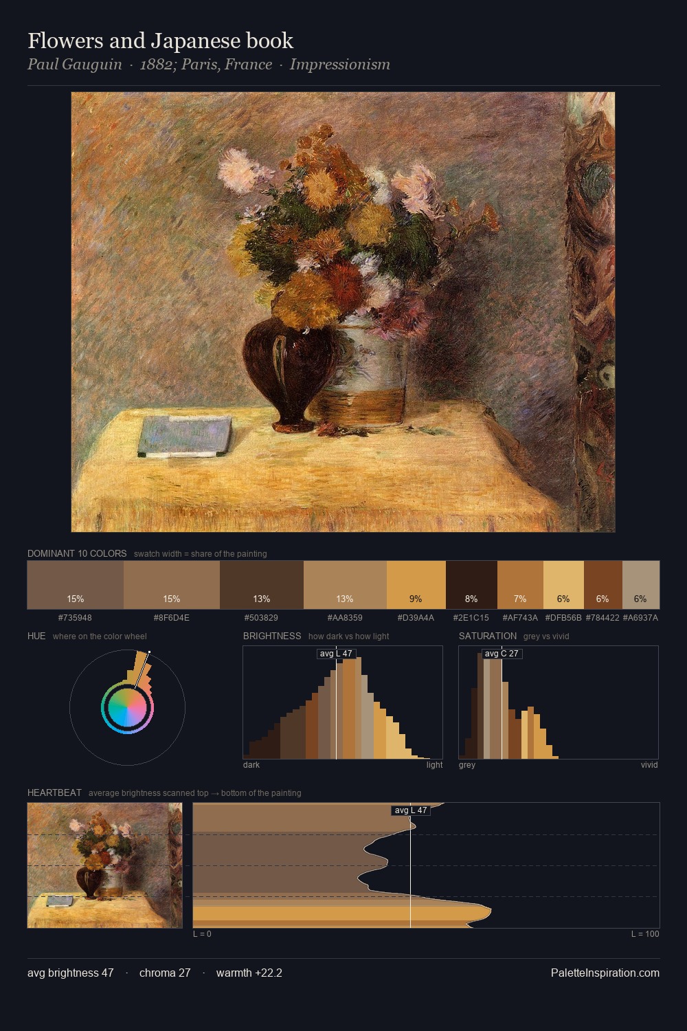
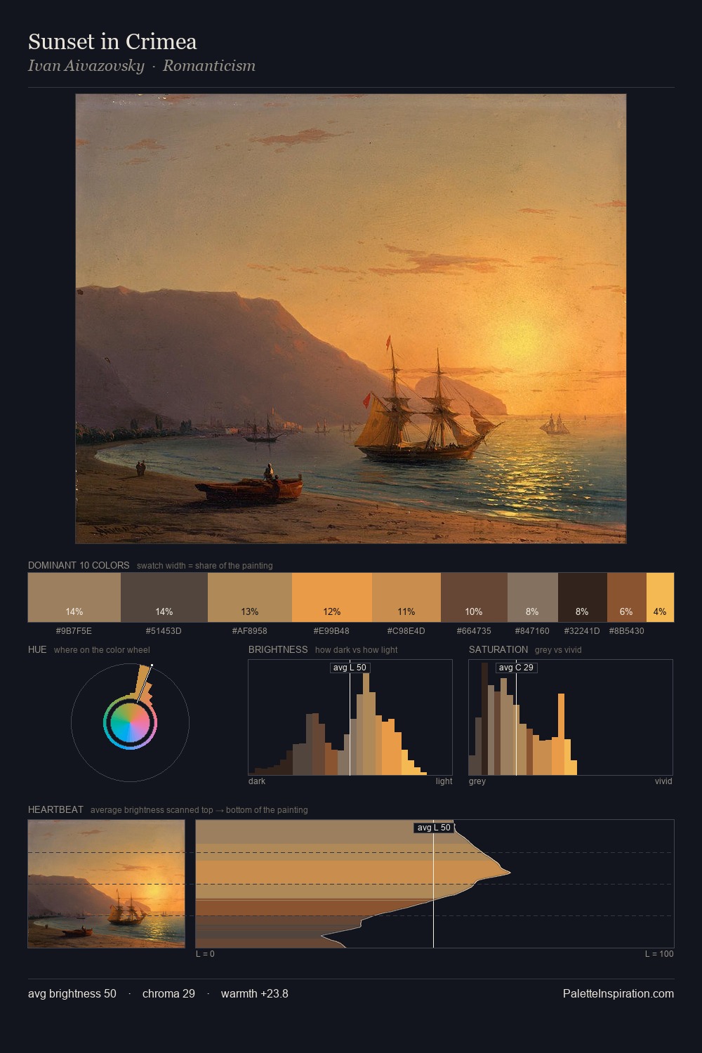
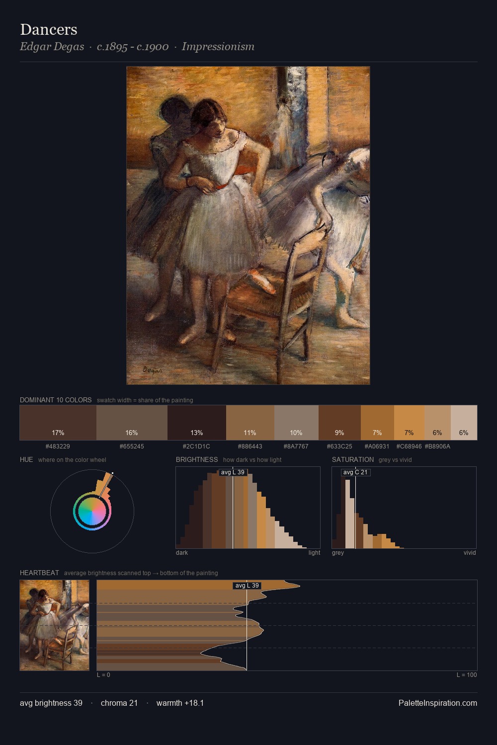
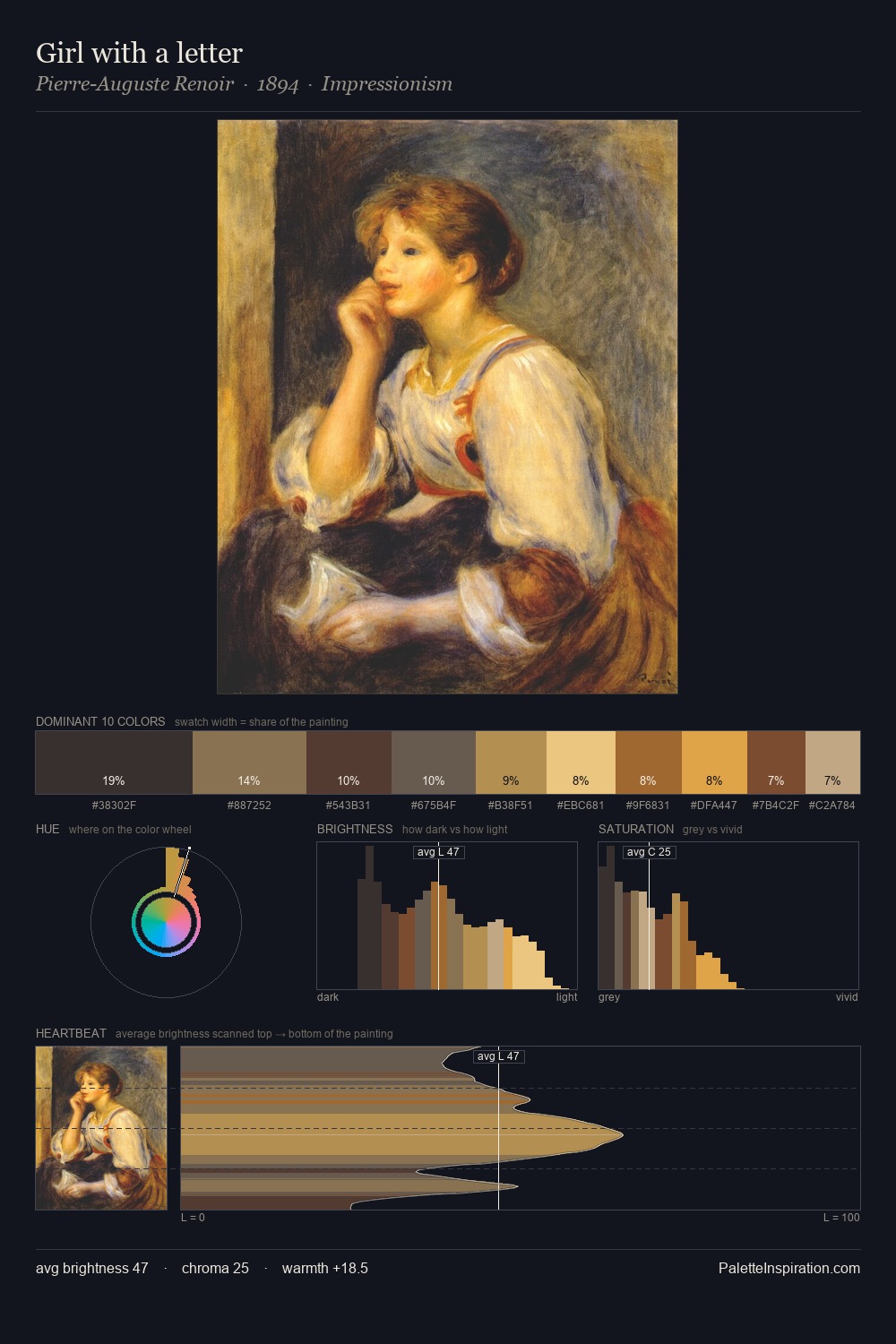
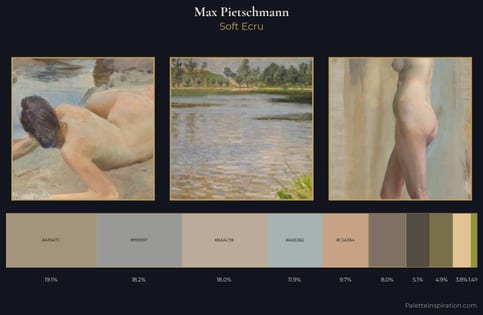
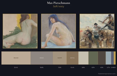
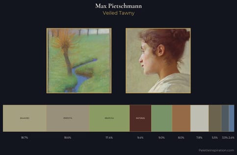
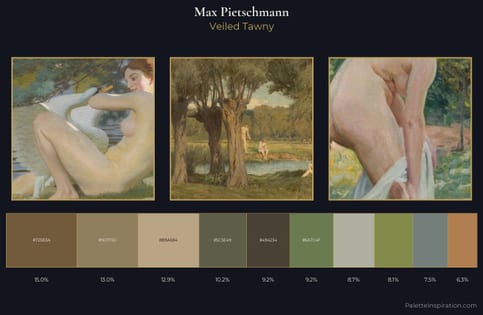
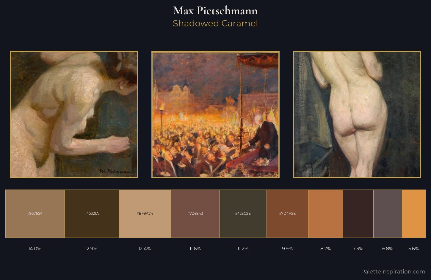
Max Pietschmann keeps values measured and balanced, a hallmark of tonal restraint. The dominant temperature is warm, with earth tones and fire-hues setting the emotional key. All colours lean toward grey, building depth through value rather than colour punch. The saturated accent, #B87140, registers at 8.2% - sparse enough to feel like a deliberate surprise. 45 units of value spread create a palette that is varied but unified - contrast in the service of harmony. Max Pietschmann's palette 9 carries its own internal logic while remaining in conversation with the artist's broader colour intelligence.
Example use cases
- theater design
- jewelry brands
- tobacco-adjacent retail
- event branding
- film & entertainment
I Love This!
Use This Palette
Copy, export, or download for your project
Copy, export, or download for your project
Copy:
Download:
Share: