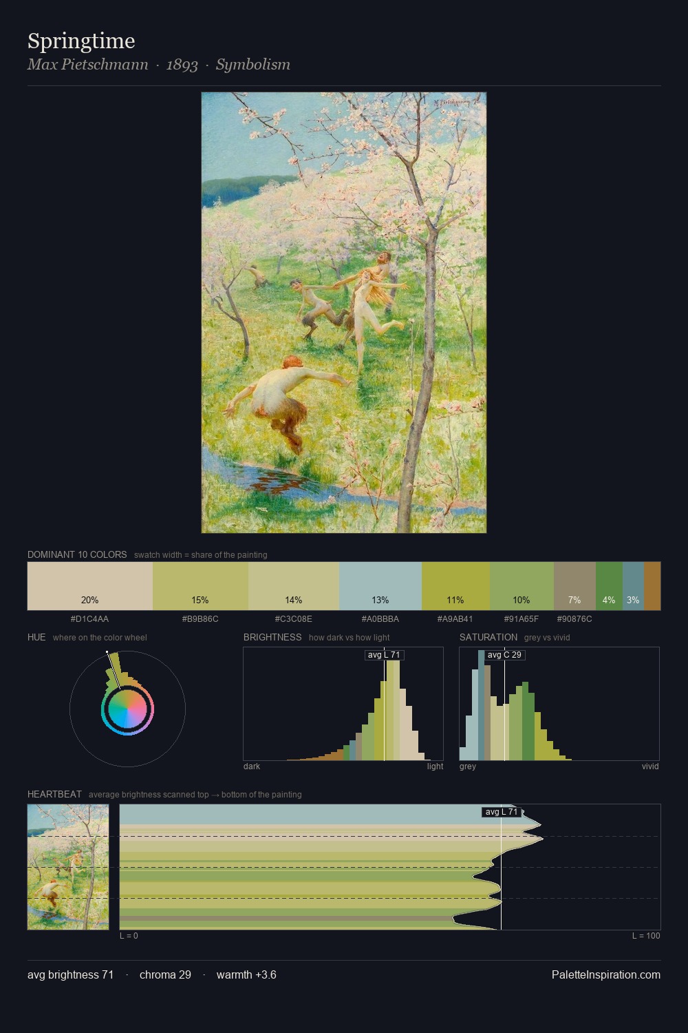
Max Pietschmann Palette 2
Gleaming Calico
Gleaming Bright and polished - high-key, often warm, suggesting reflective or luminous surfaces.
Calico Warm speckled neutral - the color of unbleached cotton, mottled and soft.

Palette Analysis
Values in Max Pietschmann tilt decisively toward white, giving the palette its luminous character. Cool hues prevail: blues, greens, and greys anchor the palette's emotional temperature. Chroma is held at a comfortable level - distinct colours, but no single hue is allowed to overwhelm. The chromatic peak belongs to #B8B973, and at 12.0% it dominates, not decorates. Value range is moderate at 43 units - enough contrast for legibility, not so much as to fragment the tonal unity. High luminosity and cool temperature suggest the plein-air condition: unfiltered daylight and open sky. Max Pietschmann's palette 2 carries its own internal logic while remaining in conversation with the artist's broader colour intelligence.
Example use cases
- ceramics & pottery
- boutique hospitality
- menswear
- heritage food brands
- craft & artisan brands
I Love This!
Use This Palette
Copy, export, or download for your project
Copy, export, or download for your project
Copy:
Download:
Share: