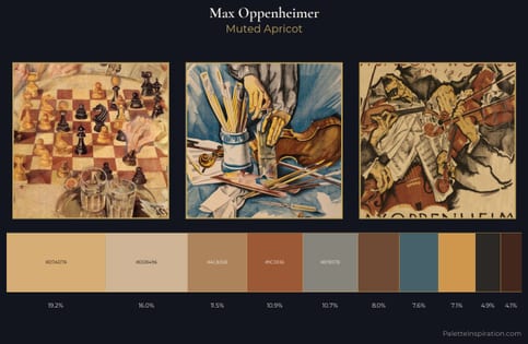
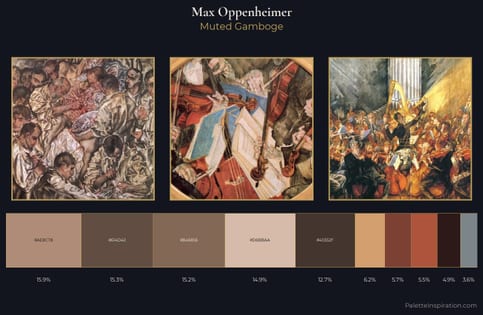
Max Oppenheimer Master Palette
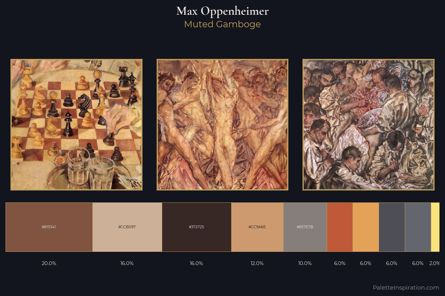
Muted Gamboge
Muted Deliberately desaturated - chroma pulled toward gray, the restraint of tonal painting.
Gamboge Deep golden yellow - a traditional warm pigment, rich amber-gold.
Palette Analysis
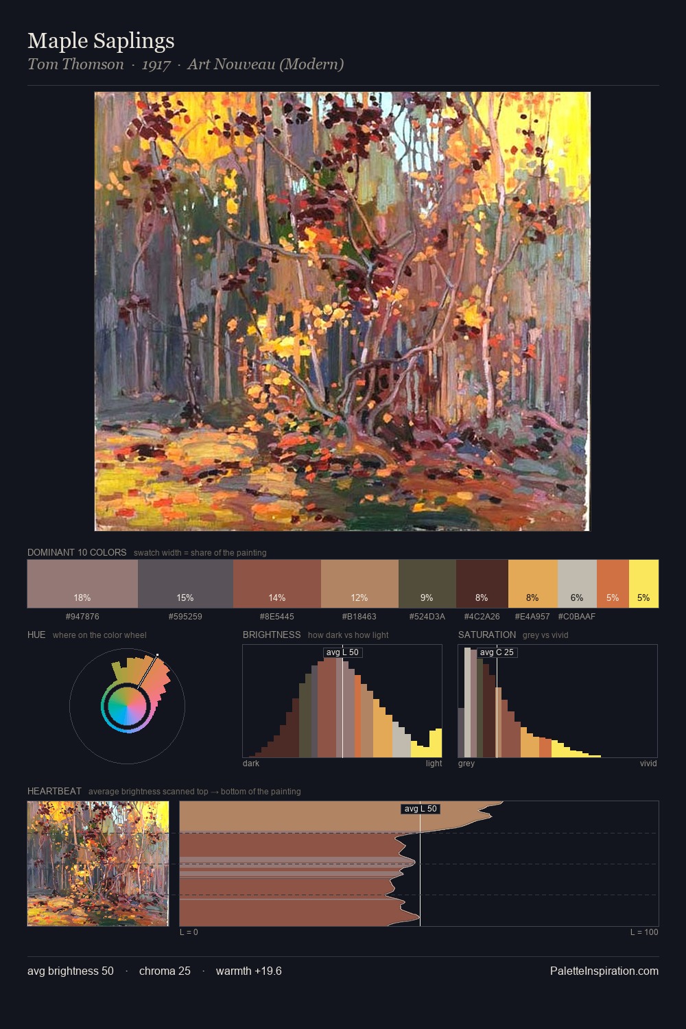
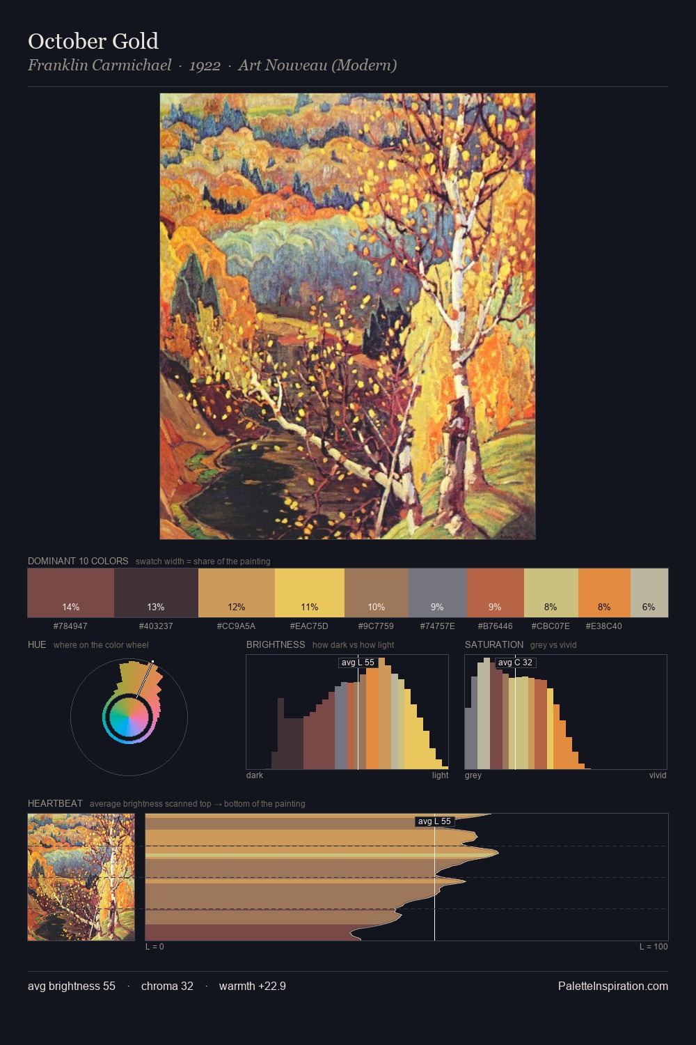
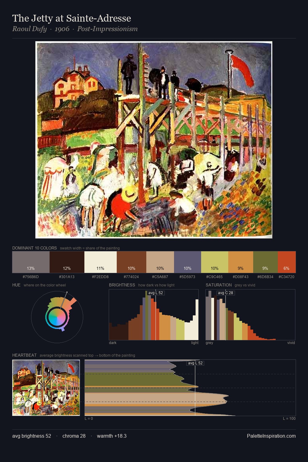
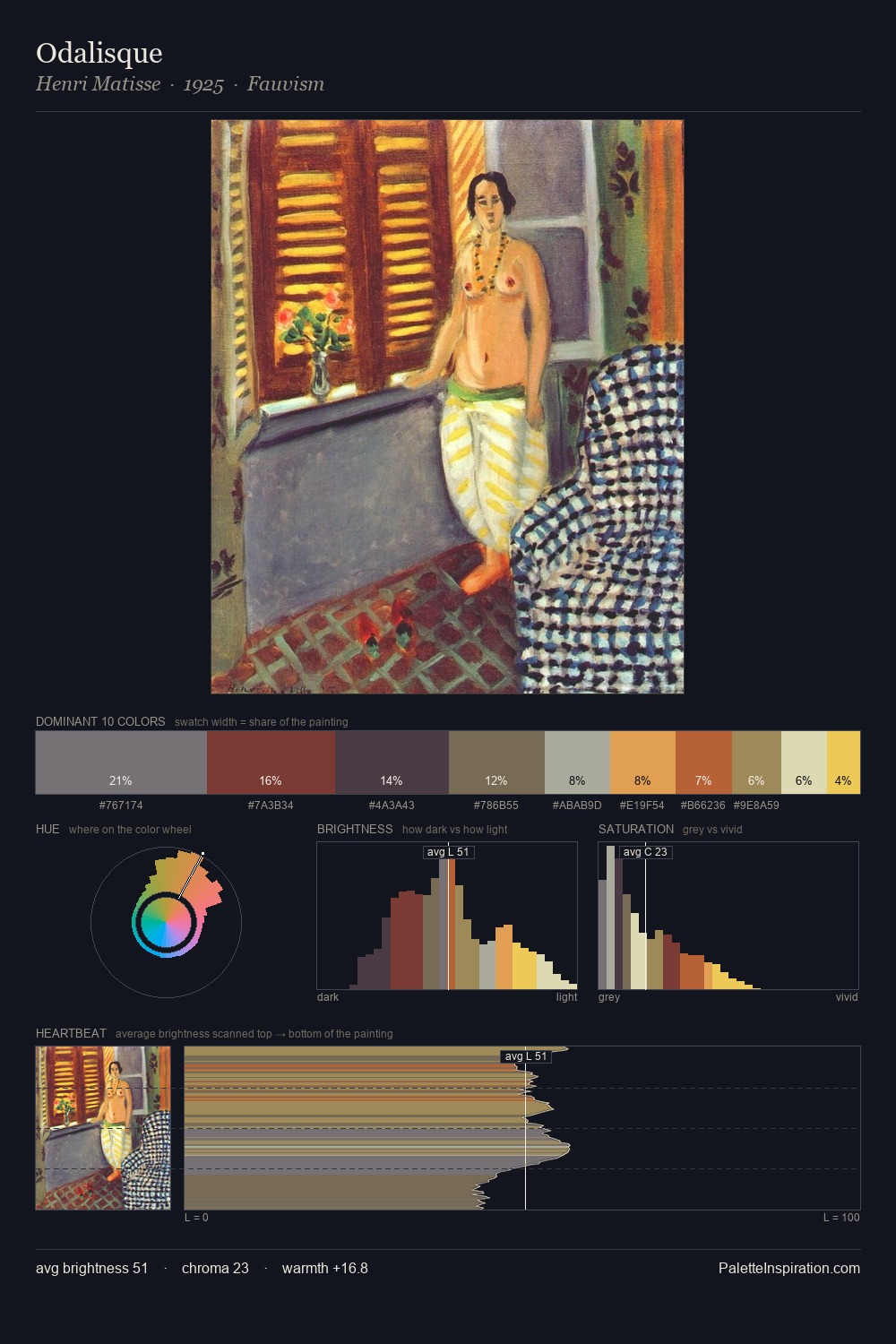
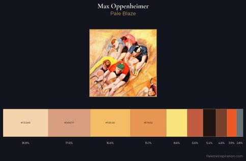
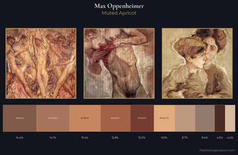
Max Oppenheimer distributes its values across the middle register, creating harmony without high contrast. Warm hues command this palette; Max Oppenheimer favours the reds, oranges, and yellows of firelight and earth. Saturation is deliberately withheld - the beauty here lies in the near-monochromatic gradations rather than colour difference. At 6.0%, #E3A257 carries the palette's sharpest chromatic charge: an accent that earns its place precisely because it is withheld. A value spread of 62 units gives the palette both depth and air - shadows are genuinely dark, lights genuinely light. This is the light Max Oppenheimer preferred, made measurable.
Example use cases
- food packaging
- leather accessories
- travel & outdoor
- natural cosmetics
- interior design
I Love This!
Use This Palette
Copy, export, or download for your project
Copy, export, or download for your project
Copy:
Download:
Share: