Max Oppenheimer Palette 2
Muted Apricot
Muted Deliberately desaturated - chroma pulled toward gray, the restraint of tonal painting.
Apricot Soft warm orange - peach-adjacent, the color of ripe stone fruit.

Palette Analysis
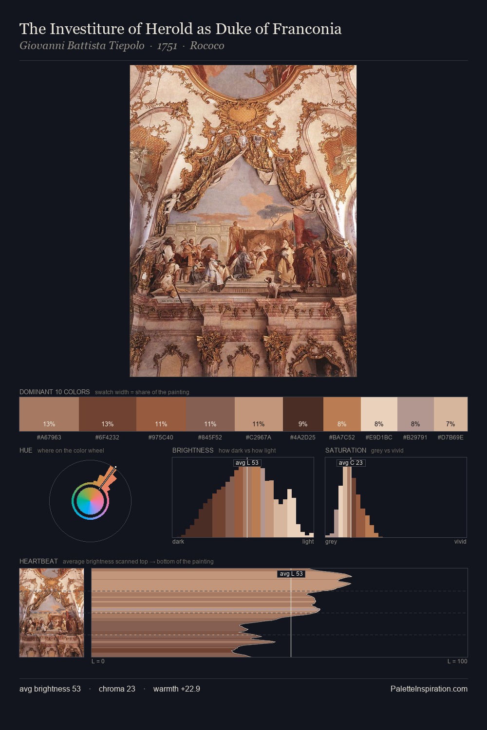
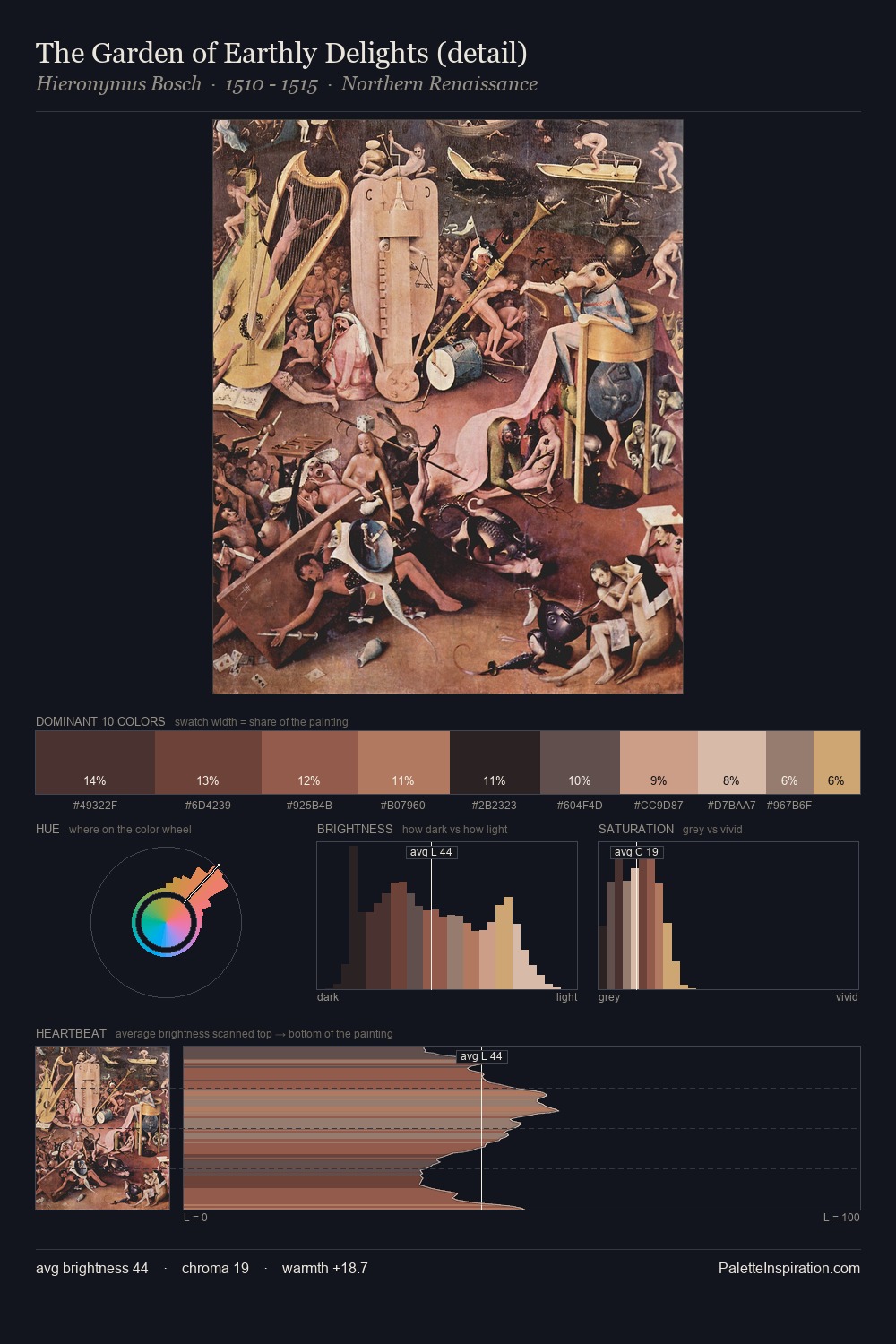
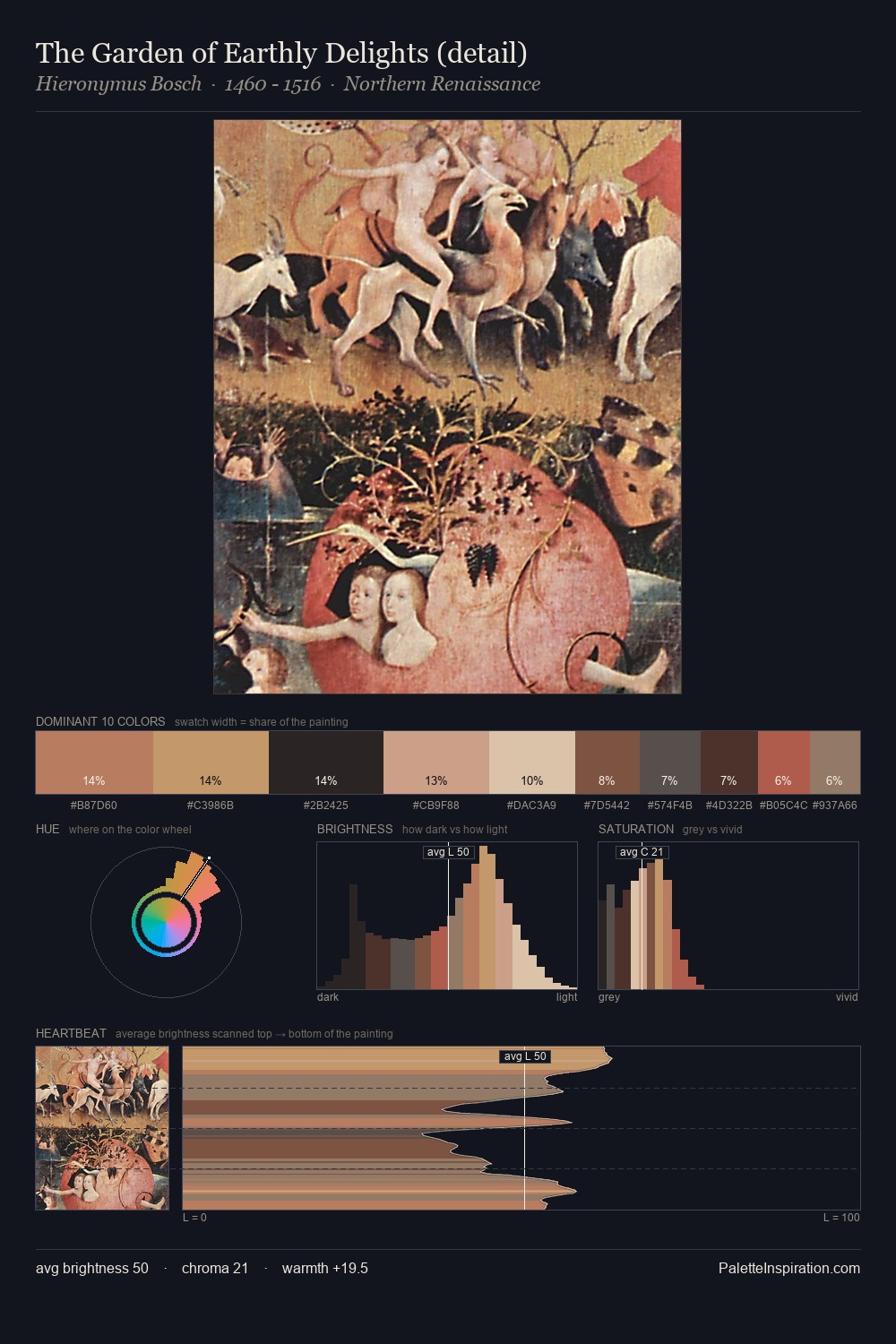
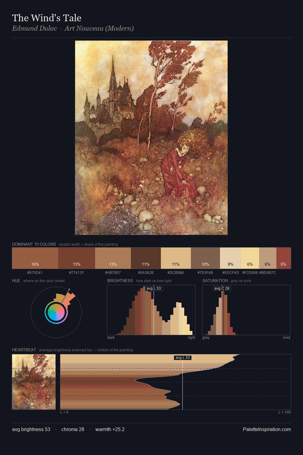
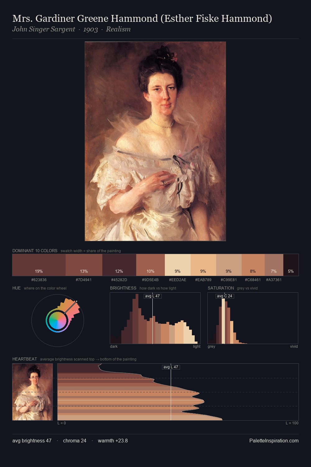
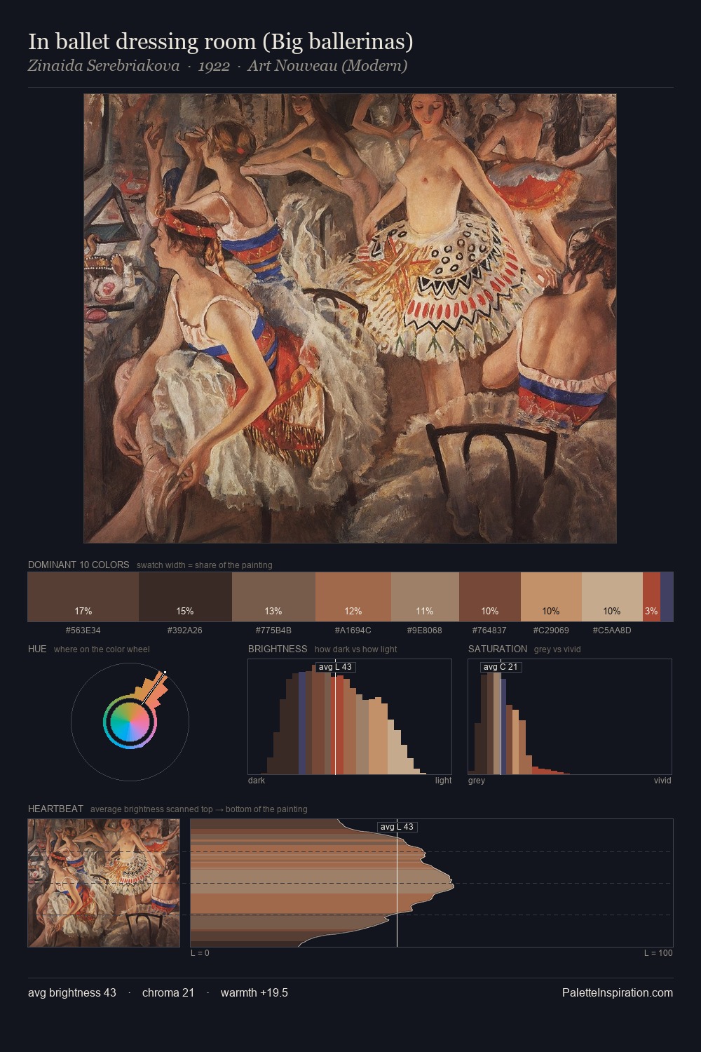
Max Oppenheimer occupies the comfortable middle of the value scale, avoiding both extremes to hold the eye in a sustained middle grey. Warmth dominates - the palette of Max Oppenheimer leans heavily on the yellow-orange-red arc of the colour wheel. A restrained, mid-chroma palette: every hue is present and legible, but nothing shouts. #753D31 functions as the palette's exclamation mark: highest chroma, lowest percentage (10.2%). The value range of 48 units sits in the comfortable middle: enough depth, enough light, neither extreme. This is palette 2 of Max Oppenheimer's sequence - a single chapter in a chromatic story told across many works.
Example use cases
- craft & artisan brands
- specialty coffee
- home goods
- lifestyle retail
- ceramics & pottery
I Love This!
Use This Palette
Copy, export, or download for your project
Copy, export, or download for your project
Copy:
Download:
Share: