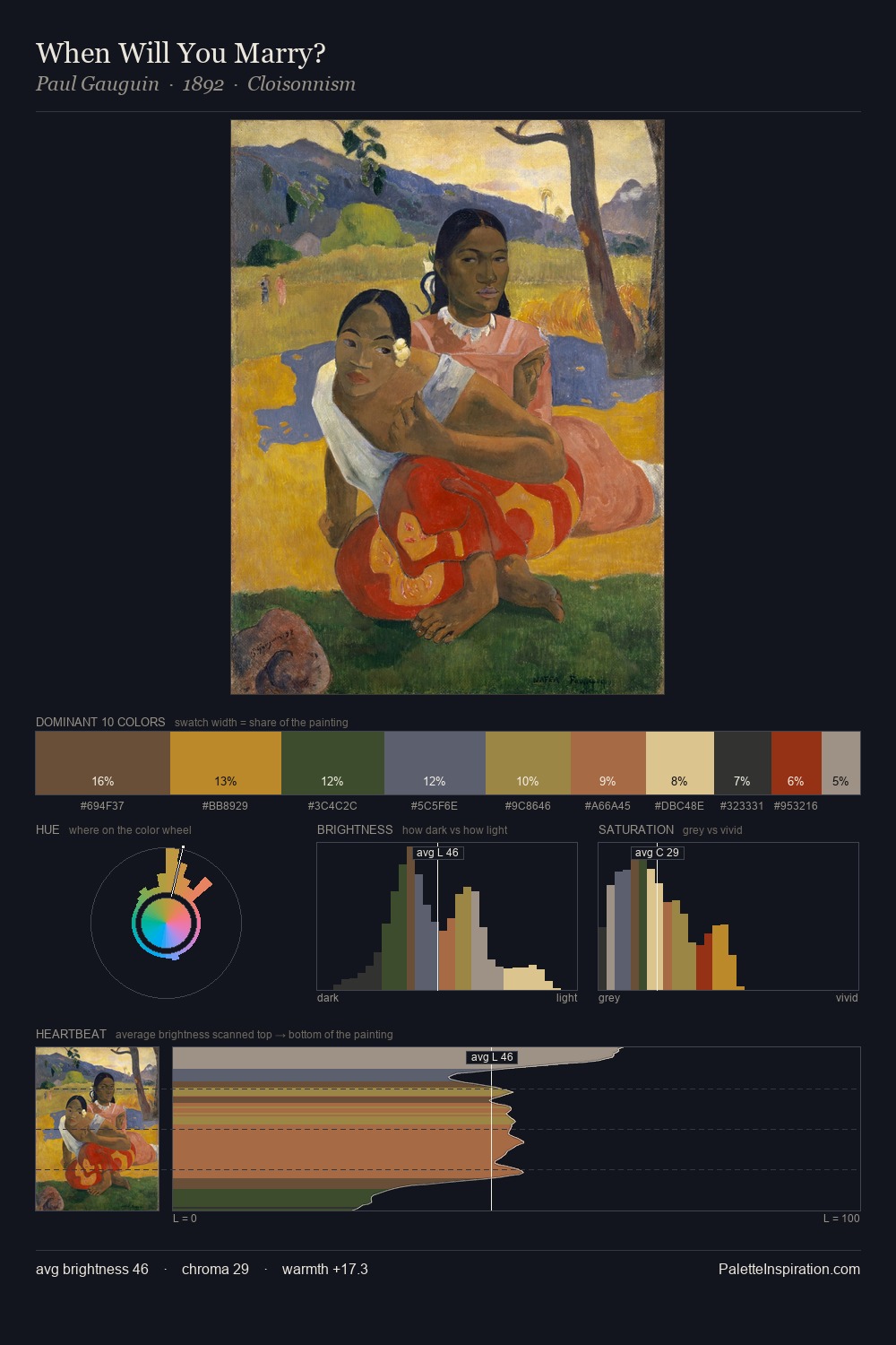
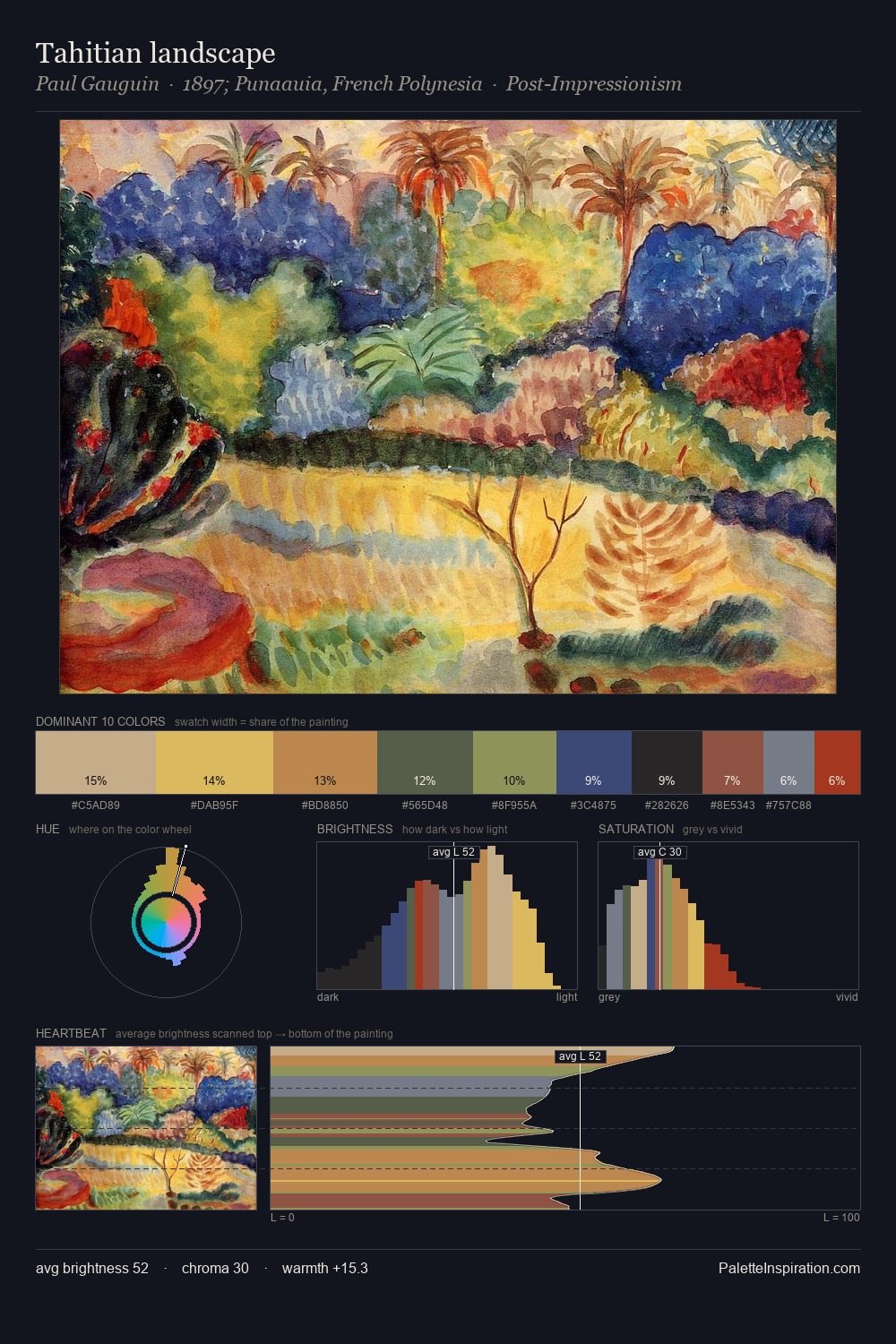
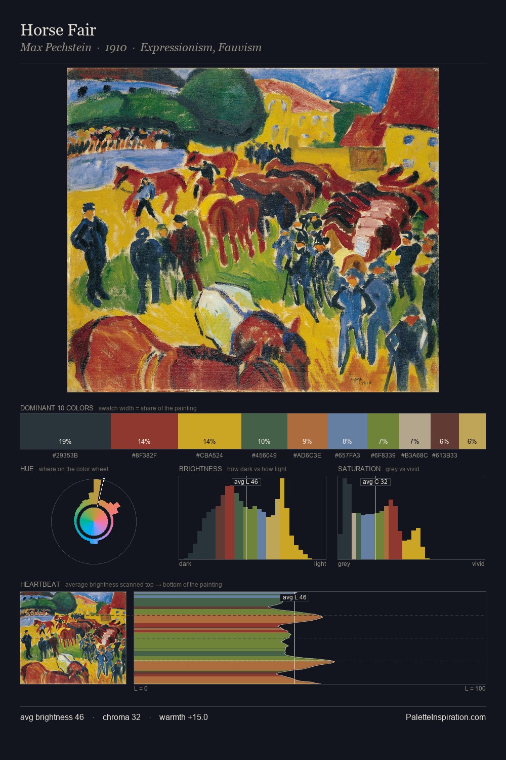
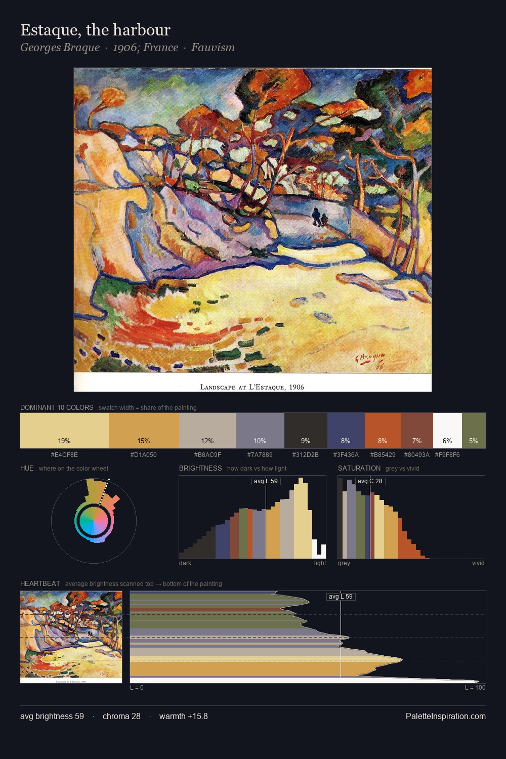
Matthew Smith Master Palette

Palette Analysis
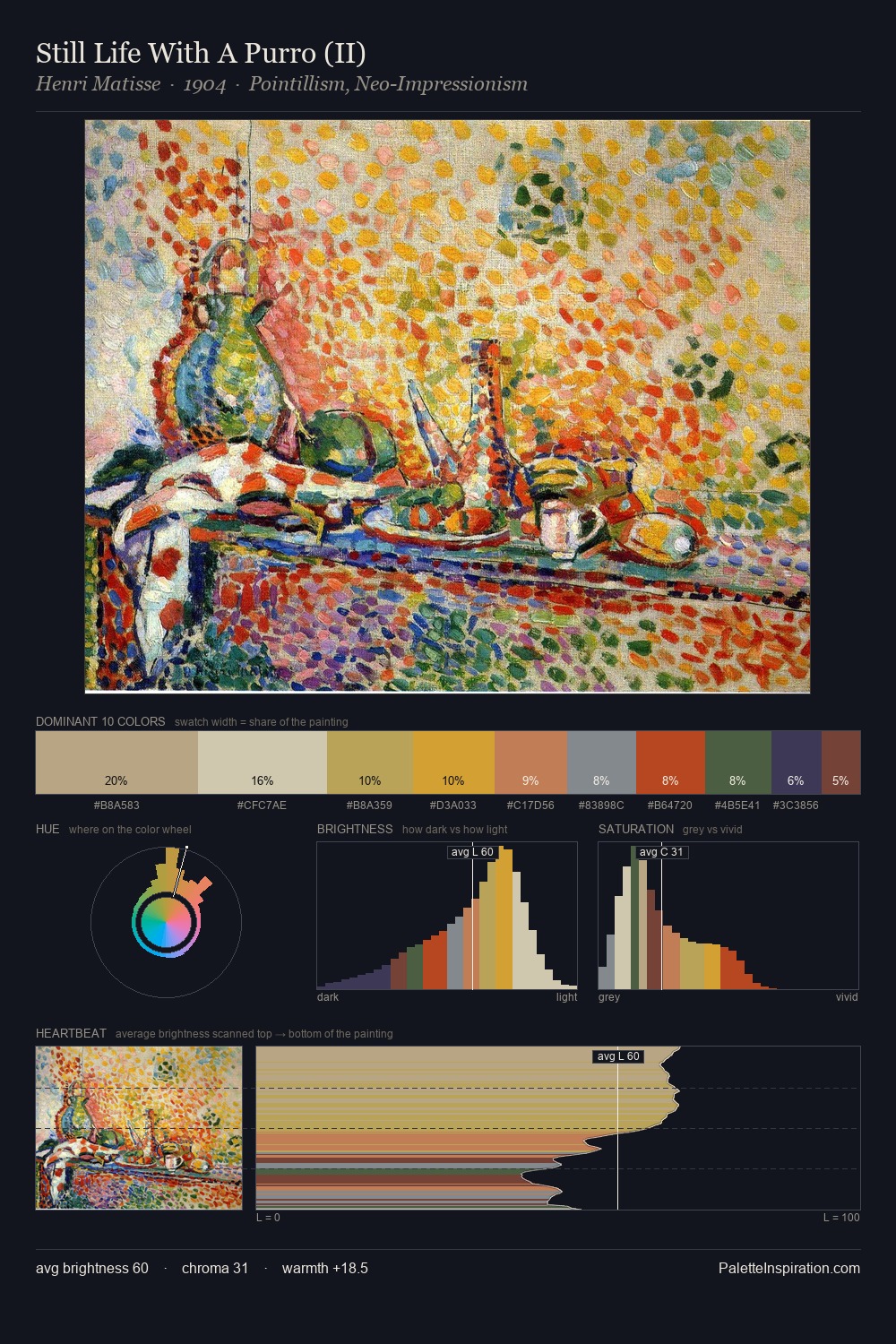
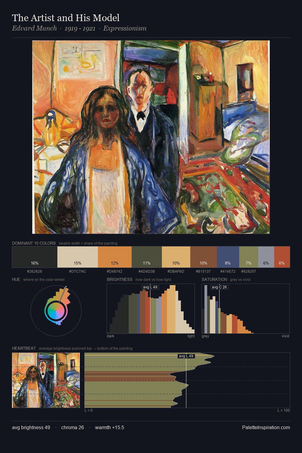
Mid-key values give Matthew Smith its characteristic quietness - nothing blazes, nothing disappears. Blues and teal-greys govern the palette, lending it an aquatic or atmospheric quality. Chroma is moderate: colours carry enough saturation to be read as colour, but the palette stops well short of garish intensity. The saturated accent, #A43828, registers at 9.5% - sparse enough to feel like a deliberate surprise. Value range is moderate at 50 units - enough contrast for legibility, not so much as to fragment the tonal unity. The mid-to-high key, cool bias, and moderate chroma point to outdoor observation - sky and diffused daylight as the dominant light source. The palette is a signature: Matthew Smith's particular sense of value, warmth, and colour weight made legible.
Example use cases
- food packaging
- leather accessories
- travel & outdoor
- natural cosmetics
- interior design
I Love This!
Copy, export, or download for your project