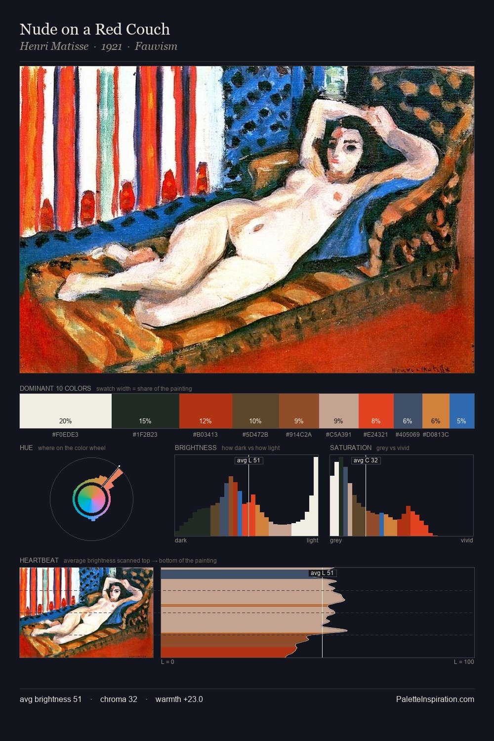
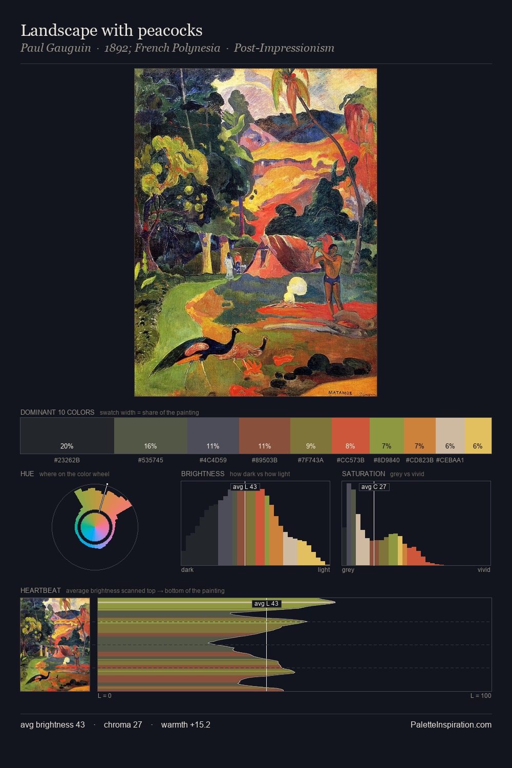
Matthew Smith Palette 7

Palette Analysis
Mid-key values give Matthew Smith its characteristic quietness - nothing blazes, nothing disappears. Cool hues prevail: blues, greens, and greys anchor the palette's emotional temperature. Saturation is deliberately withheld - the beauty here lies in the near-monochromatic gradations rather than colour difference. The dominant colour, #2A2926, takes 32.6% of the total area, establishing the overall mood before any other hue is introduced. The highest-chroma note - #1E3D62 - appears at just 8.0%, deployed as a precision accent against the quieter ground. The palette spans 52 value units: a measured range that delivers coherence over drama. High luminosity and cool temperature suggest the plein-air condition: unfiltered daylight and open sky. Matthew Smith's palette 7 carries its own internal logic while remaining in conversation with the artist's broader colour intelligence.
Example use cases
- interior design
- furniture brands
- cookbook publishing
- wine & spirits
- food packaging
I Love This!
Copy, export, or download for your project