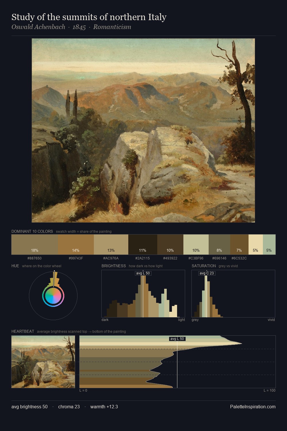
Luminism Palette 2
Soft Apricot
Soft Low-contrast, gentle chroma - mid-key values and low saturation, approachable and calm.
Apricot Soft warm orange - peach-adjacent, the color of ripe stone fruit.

Palette Analysis
Luminism is high in key: pale, luminous, and filled with optical air. Built on cool foundations: the palette favours the blue-cyan-green arc. All colours lean toward grey, building depth through value rather than colour punch. Only 4.8% is devoted to #AD8240, yet that small allocation delivers the palette's entire chromatic tension. The full value range is 70 units: broad enough to build convincing three-dimensional form. The palette has the character of outdoor light: cool, mid-bright, with colour rendered faithfully rather than expressively.
Example use cases
- publishing
- corporate identity
- consumer apps
- hospitality
- design agencies
I Love This!
Use This Palette
Copy, export, or download for your project
Copy, export, or download for your project
Copy:
Download:
Share: