Leon Spilliaert Palette 5

Palette Analysis
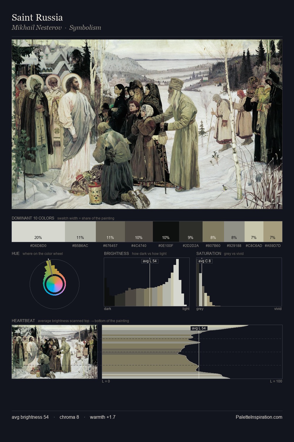
Leon Spilliaert occupies the comfortable middle of the value scale, avoiding both extremes to hold the eye in a sustained middle grey. Yellow, ochre, sienna: warm hues that Leon Spilliaert deploys as the palette's primary energy. Chroma hovers near zero; colour declares itself through subtle shifts in hue rather than outright saturation. #231D1E at 27.3% of the palette: an overwhelming presence that pulls all other colours into its gravitational field. Only 3.1% is devoted to #DBD0B5, yet that small allocation delivers the palette's entire chromatic tension. The full value range is 71 units: broad enough to build convincing three-dimensional form. This is palette 5 of Leon Spilliaert's sequence - a single chapter in a chromatic story told across many works.
Example use cases
- theater design
- jewelry brands
- tobacco-adjacent retail
- event branding
- film & entertainment
I Love This!
Copy, export, or download for your project