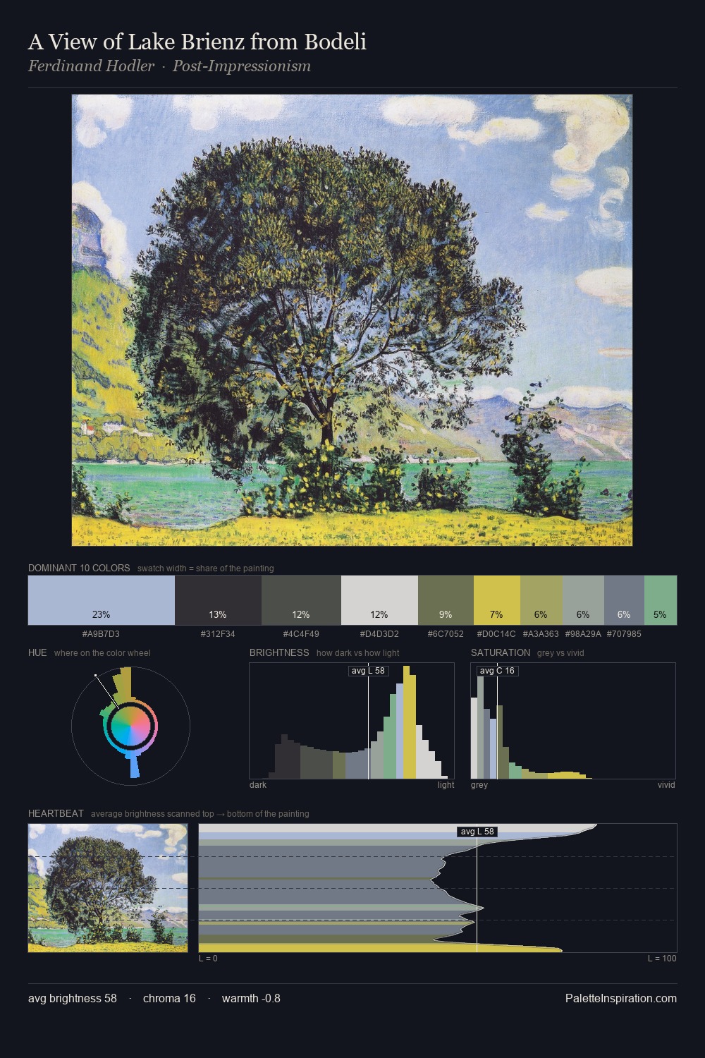
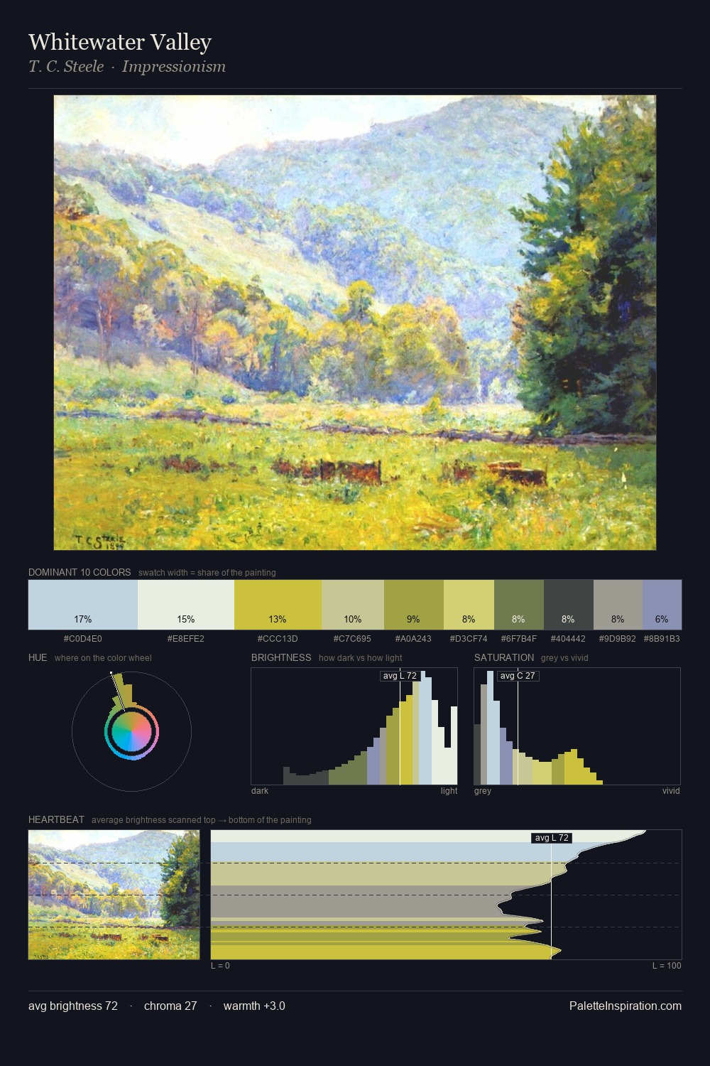
Leon Spilliaert Palette 1

Palette Analysis
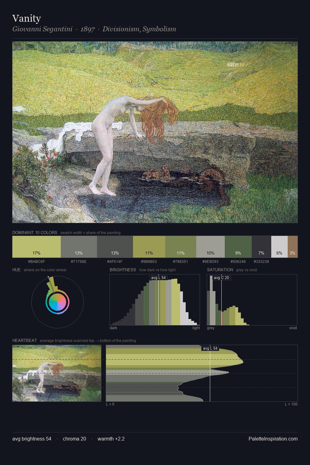
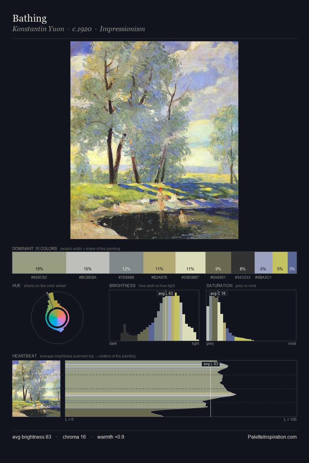
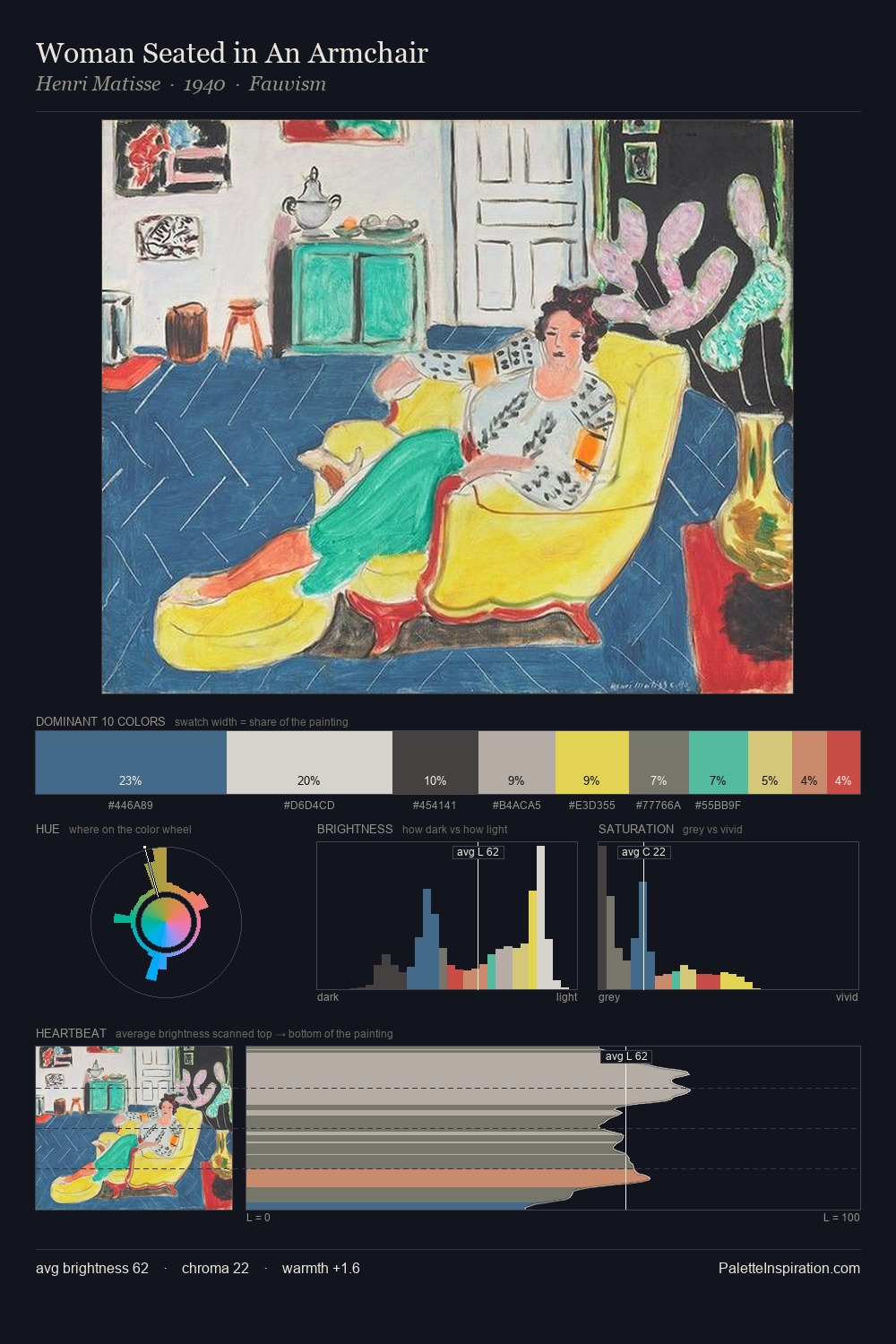
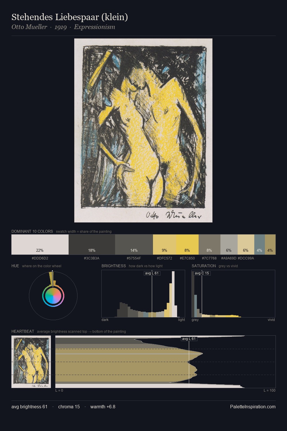
Leon Spilliaert is high-key - luminous, open, and weighted toward light. Leon Spilliaert builds on cool foundations: the palette favours the blue-cyan-green arc. Chroma is kept low across all colours, producing the soft, enveloping quality that characterises tonal painting. Leon Spilliaert gives 30.6% of the composition to a single #DADDD8 - a decisive chromatic anchor. The saturated accent, #B7C083, registers at 2.7% - sparse enough to feel like a deliberate surprise. From deepest dark to palest light, the palette traverses 58 units of the value scale - a span that creates natural depth. High luminosity and cool temperature suggest the plein-air condition: unfiltered daylight and open sky. Palette 1 sits within the larger chromatic argument that Leon Spilliaert's complete body of work advances.
Example use cases
- print magazines
- beauty brands
- real estate
- high-end packaging
- editorial design
I Love This!
Copy, export, or download for your project