Leon Spilliaert Palette 3

Palette Analysis
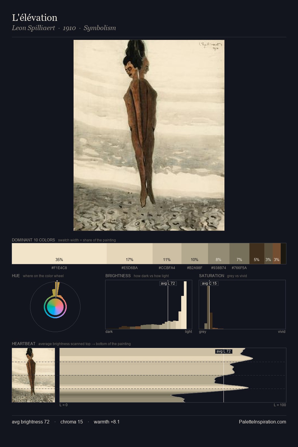
Leon Spilliaert is strongly light-biased - shadow is suggested rather than declared. Temperature is cool-dominant, with blue and green families claiming the largest areas. Saturation is deliberately withheld - the beauty here lies in the near-monochromatic gradations rather than colour difference. 35.2% of the palette belongs to #F2E4C9, a concentration that makes it the unmistakable visual centre. At 4.1%, #54402B carries the palette's sharpest chromatic charge: an accent that earns its place precisely because it is withheld. The full value range is 72 units: broad enough to build convincing three-dimensional form. The palette has the character of outdoor light: cool, mid-bright, with colour rendered faithfully rather than expressively. This is palette 3 of Leon Spilliaert's sequence - a single chapter in a chromatic story told across many works.
Example use cases
- ceramics & pottery
- boutique hospitality
- menswear
- heritage food brands
- craft & artisan brands
I Love This!
Copy, export, or download for your project