Laura Knight Palette 4

Palette Analysis
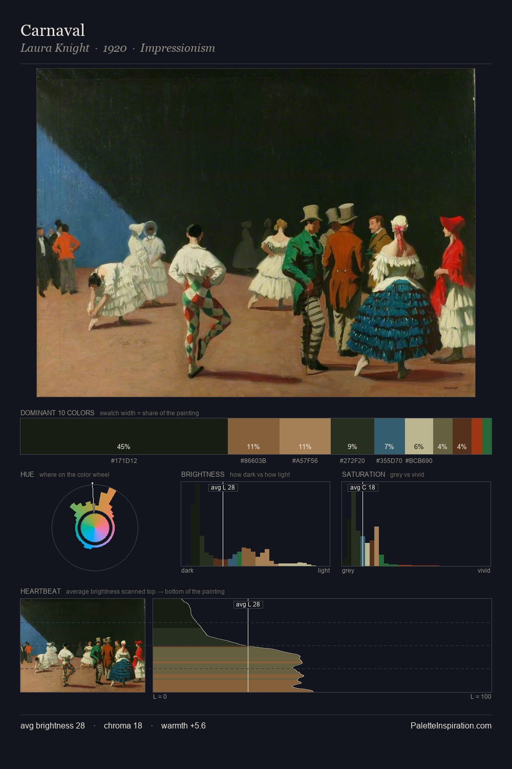
Mid-key values give Laura Knight its characteristic quietness - nothing blazes, nothing disappears. Laura Knight builds on cool foundations: the palette favours the blue-cyan-green arc. Saturation is deliberately withheld - the beauty here lies in the near-monochromatic gradations rather than colour difference. A single dominant - #171E13 at 43.7% - sets the character of the whole composition. The most saturated colour, #29673A, is reserved to 1.1% of the surface, where it acts as a focal punctuation. 59 units of value range underpin the palette's structural clarity: the eye always knows where light falls. The palette has the character of outdoor light: cool, mid-bright, with colour rendered faithfully rather than expressively. In the context of Laura Knight's full range of palettes, group 4 represents one movement in an ongoing chromatic dialogue.
Example use cases
- theater design
- jewelry brands
- tobacco-adjacent retail
- event branding
- film & entertainment
I Love This!
Copy, export, or download for your project