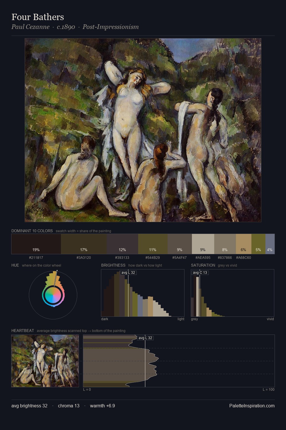
Landscape Palette 27
Tenebrous Sienna
Tenebrous Dark and murky - low-key values with obscured form, Baroque in temperament.
Sienna Warm red-brown earth - named after the Sienese pigment, a fundamental artist earth color.

Palette Analysis
landscape occupies the comfortable middle of the value scale, avoiding both extremes to hold the eye in a sustained middle grey. The artist keeps warm and cool in parity, a balance that lends the work a perceptual shimmer. Saturation is deliberately withheld - the beauty here lies in the near-monochromatic gradations rather than colour difference. Only 4.1% is devoted to #A0854D, yet that small allocation delivers the palette's entire chromatic tension. 59 units of value range underpin the palette's structural clarity: the eye always knows where light falls.
Example use cases
- theater design
- jewelry brands
- tobacco-adjacent retail
- event branding
- film & entertainment
I Love This!
Use This Palette
Copy, export, or download for your project
Copy, export, or download for your project
Copy:
Download:
Share: