Landscape Palette 2
Gleaming Ivory
Gleaming Bright and polished - high-key, often warm, suggesting reflective or luminous surfaces.
Ivory Warm creamy white - the color of natural ivory, warmer than pure white.
Palette Analysis
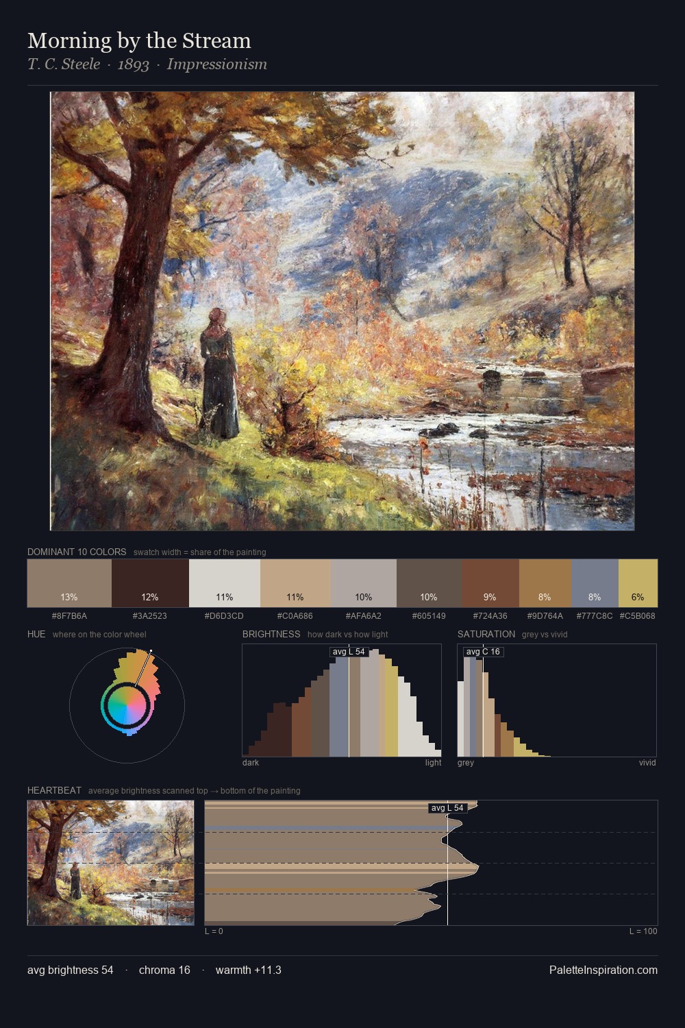
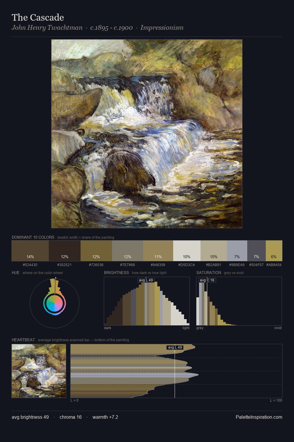
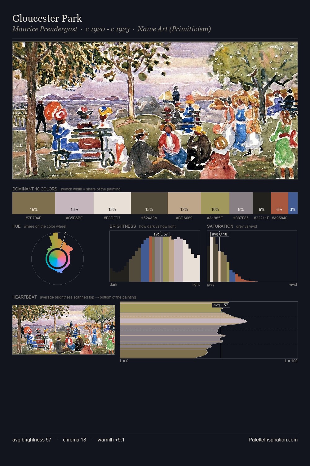
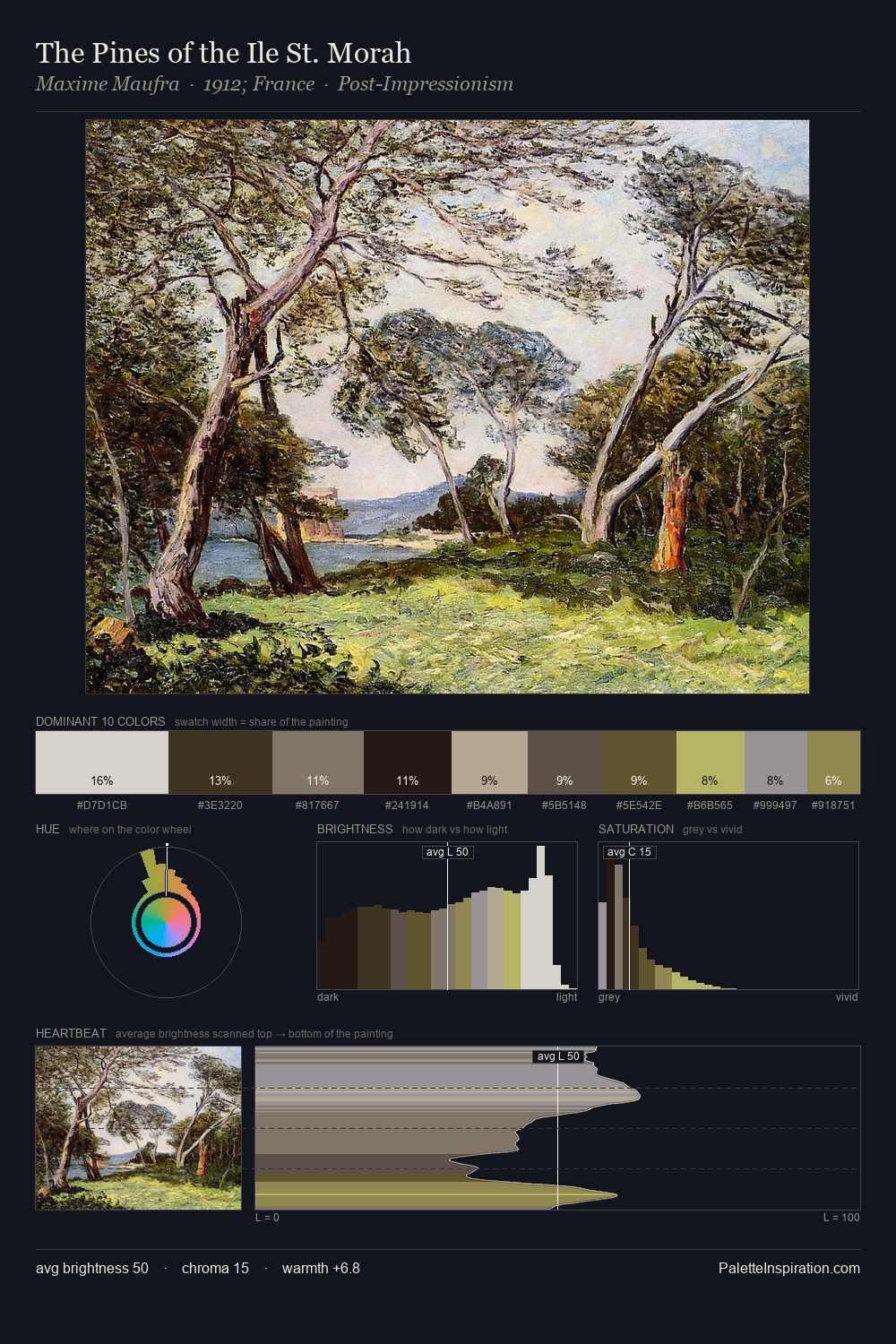
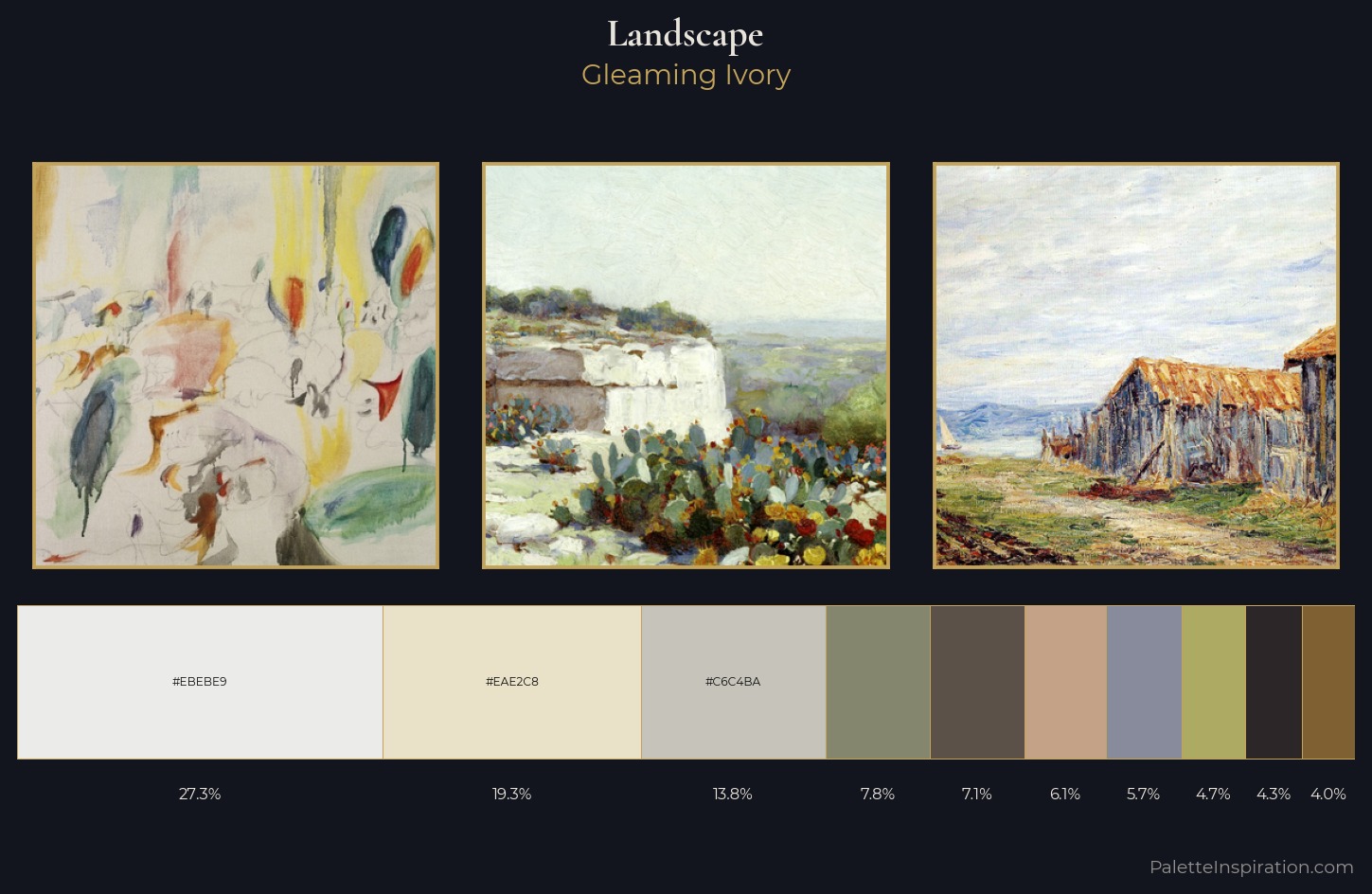
landscape is high in key: pale, luminous, and filled with optical air. Blues and teal-greys govern the palette, lending it an aquatic or atmospheric quality. Chroma hovers near zero; colour declares itself through subtle shifts in hue rather than outright saturation. The dominant colour, #EBEBE9, takes 27.3% of the total area, establishing the overall mood before any other hue is introduced. The saturated accent, #ADAA64, registers at 4.7% - sparse enough to feel like a deliberate surprise. A value spread of 66 units gives the palette both depth and air - shadows are genuinely dark, lights genuinely light. High luminosity and cool temperature suggest the plein-air condition: unfiltered daylight and open sky.
Example use cases
- florist branding
- event design
- real estate
- jewelry retail
- hospitality branding
I Love This!
Use This Palette
Copy, export, or download for your project
Copy, export, or download for your project
Copy:
Download:
Share: