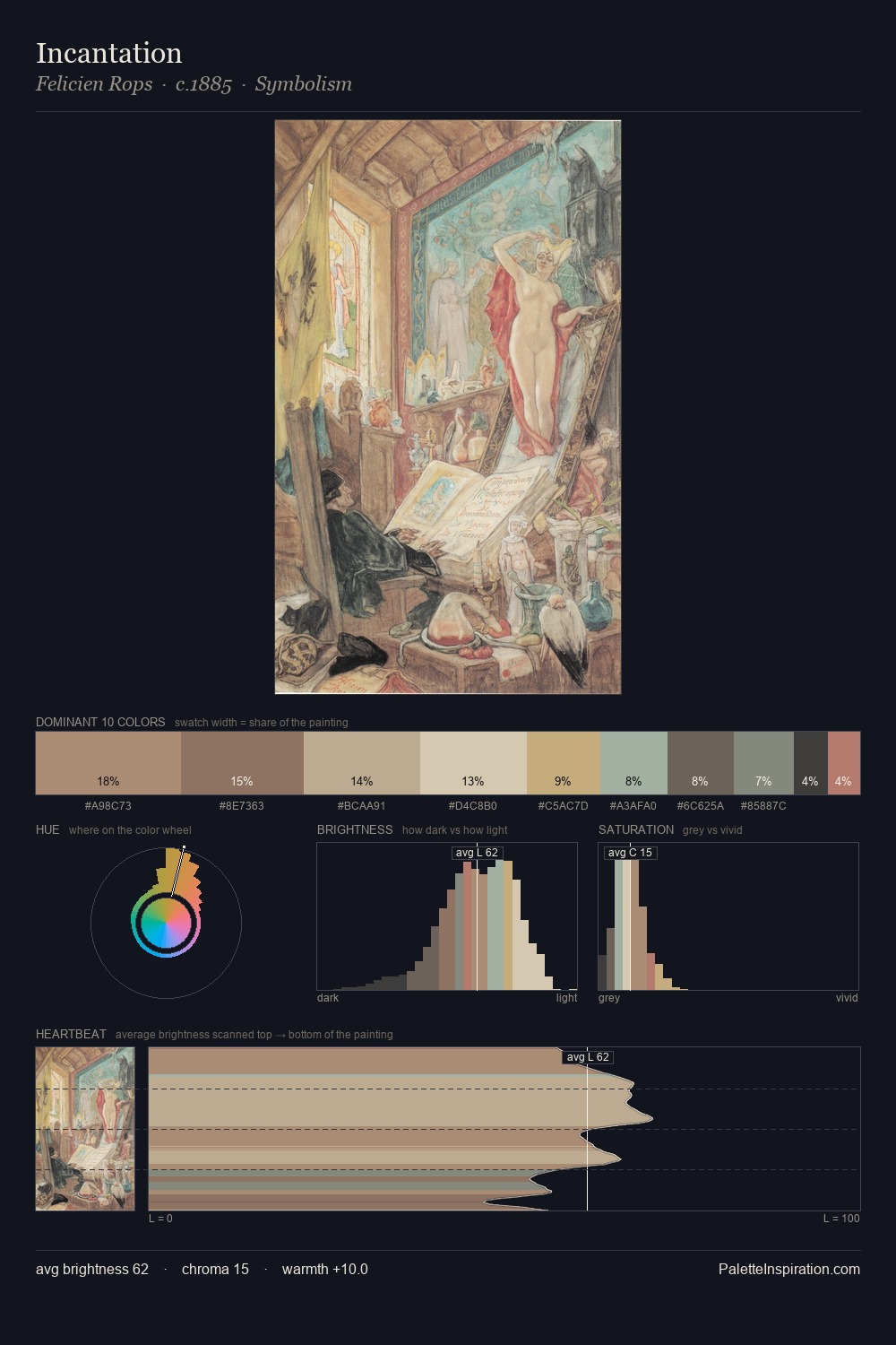
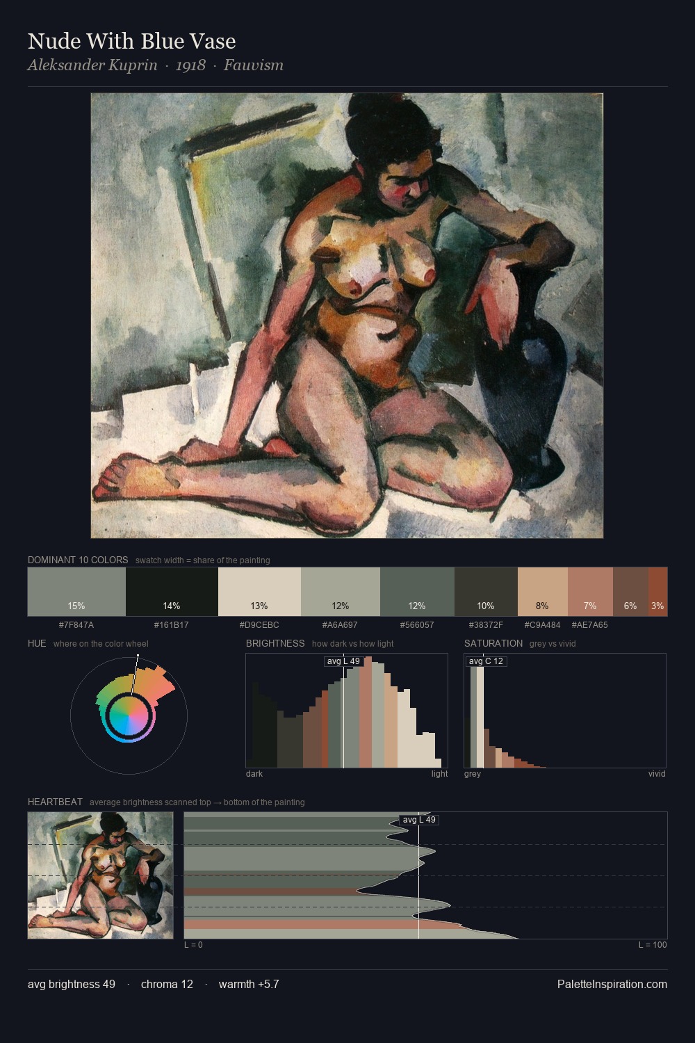
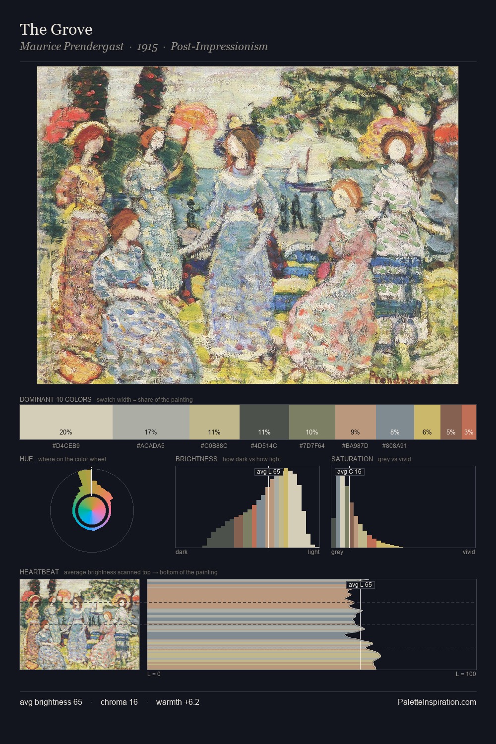
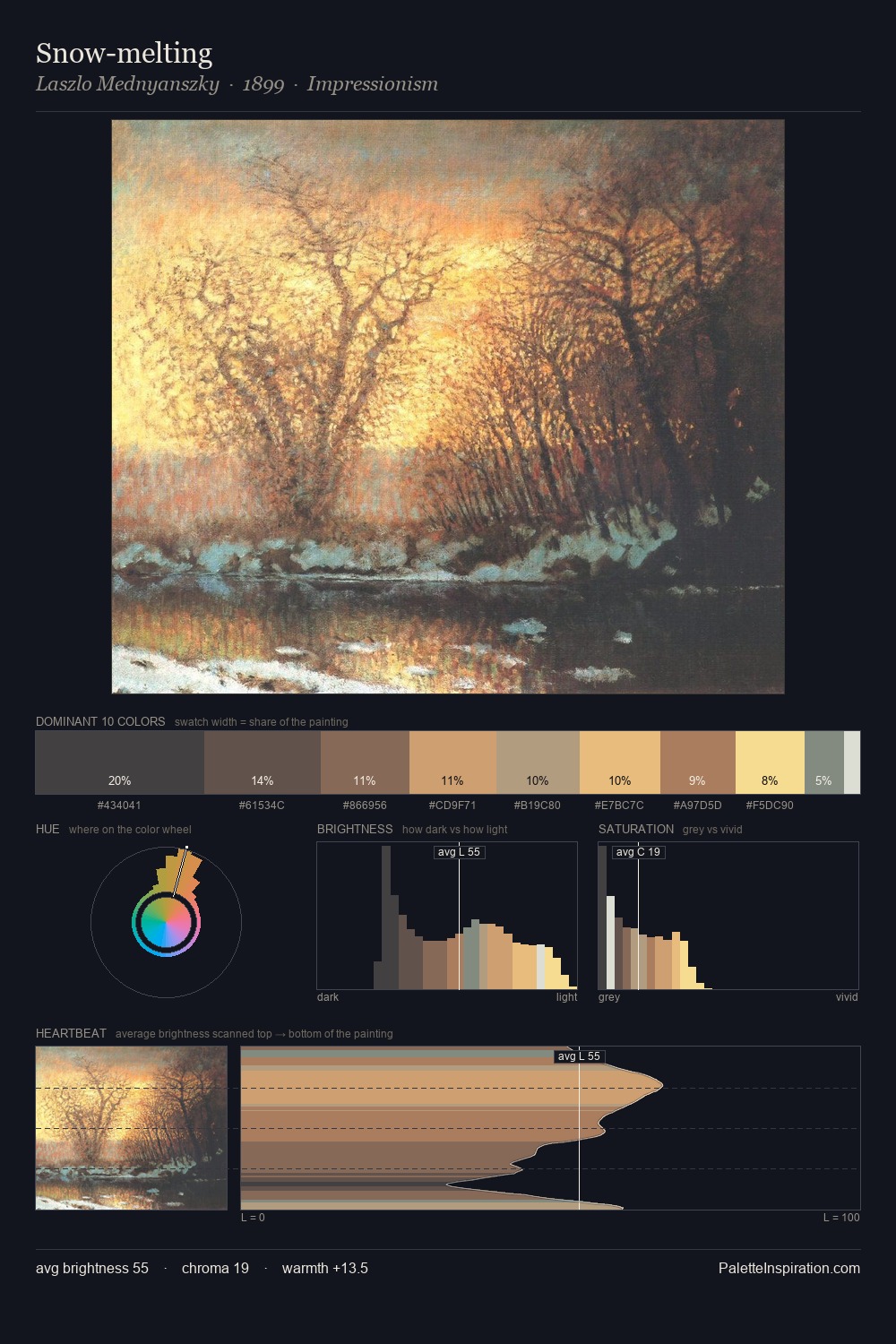
Keisai Eisen Palette 4

Palette Analysis
The high-key values of Keisai Eisen give it an effulgent, almost bleached quality. Keisai Eisen tilts toward cool - blues and silver-greys carry the structural weight. All colours lean toward grey, building depth through value rather than colour punch. #D6C6AD claims 27.1% of the surface, functioning as the work's tonal foundation. Only 7.9% is devoted to #B49776, yet that small allocation delivers the palette's entire chromatic tension. At 50 units across the value scale, the palette keeps contrast readable without letting it dominate. The palette has the character of outdoor light: cool, mid-bright, with colour rendered faithfully rather than expressively. Palette 4 sits within the larger chromatic argument that Keisai Eisen's complete body of work advances.
Example use cases
- ceramics & pottery
- boutique hospitality
- menswear
- heritage food brands
- craft & artisan brands
I Love This!
Copy, export, or download for your project