Elias Pieter van Bommel Palette 2
Veiled Tawny
Veiled Partially obscured light - mid-dark with a hazy, scrim-filtered quality.
Tawny Warm orange-brown - a traditional term for the color of tanned leather or lion fur.

Palette Analysis
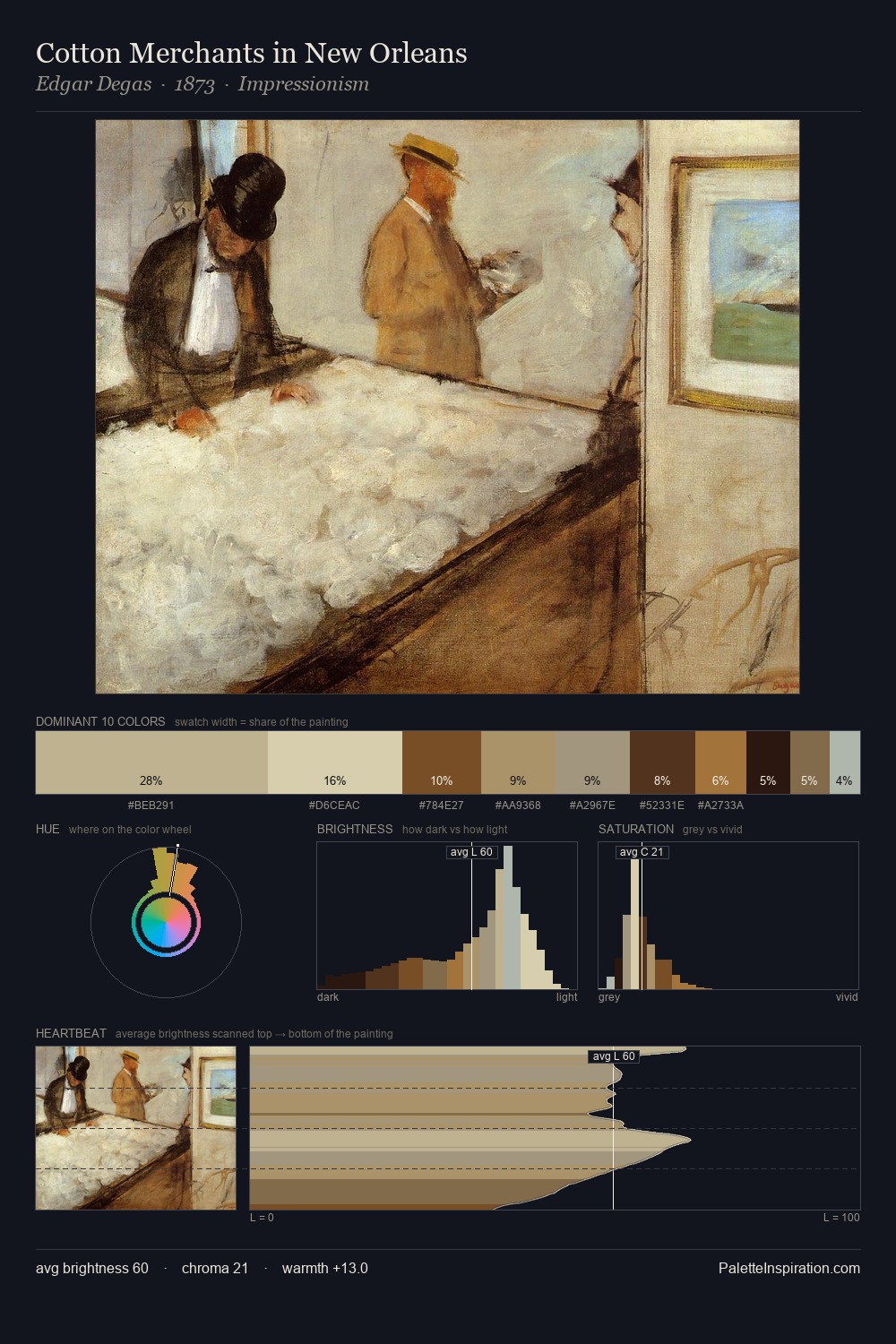
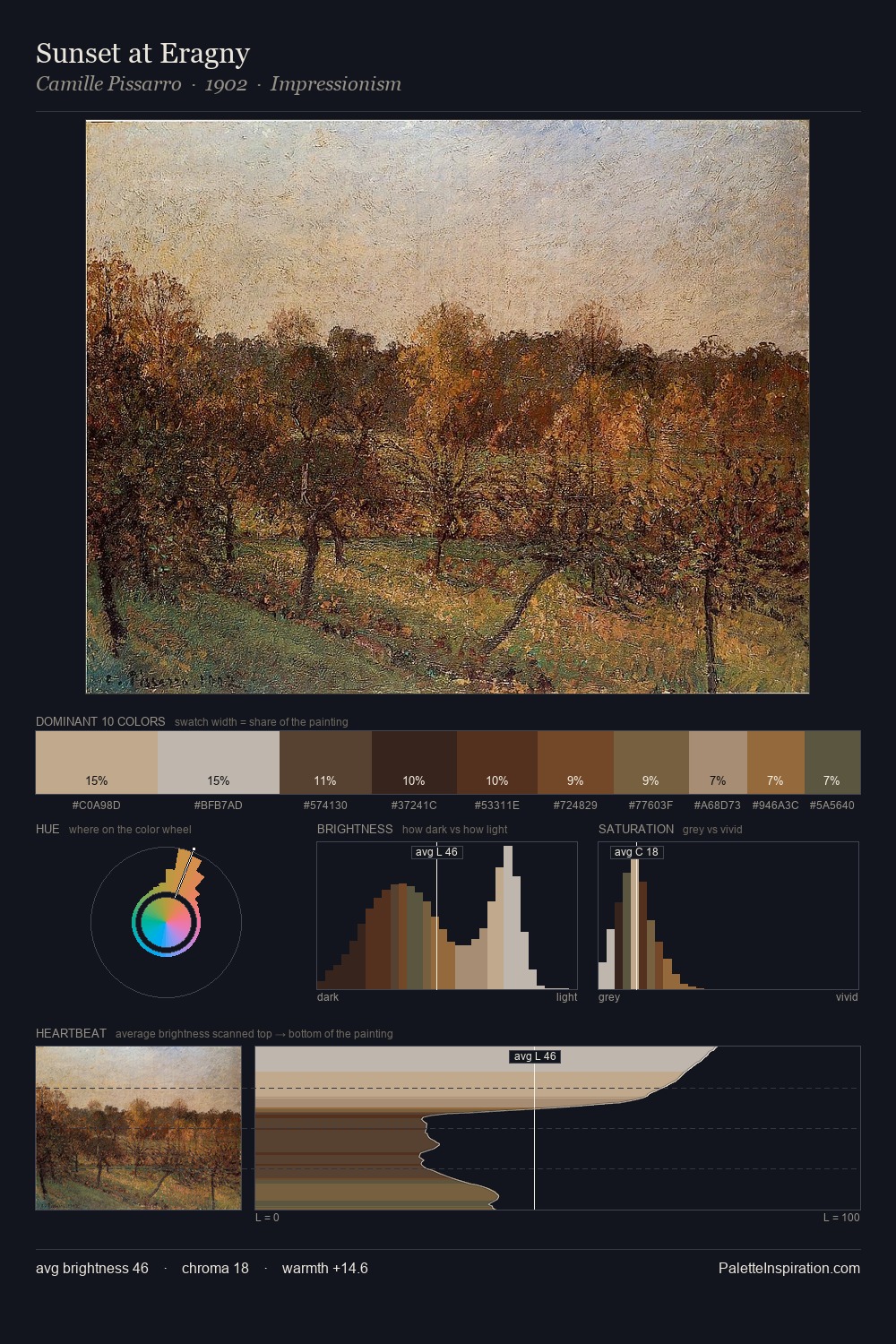
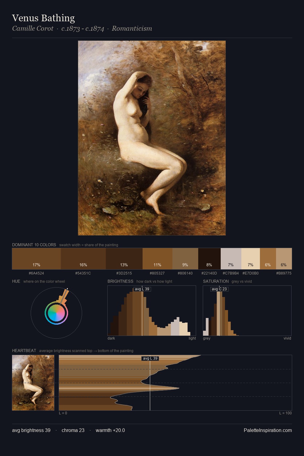
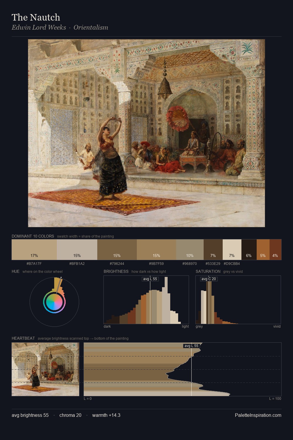
Elias Pieter van Bommel sits in the centre of the value range, lending the palette a sense of even, sustained light. Warm hues command this palette; Elias Pieter van Bommel favours the reds, oranges, and yellows of firelight and earth. Every colour is desaturated; the palette proceeds through near-neutrals and gently-coloured greys. The highest-chroma note - #91652D - appears at just 3.6%, deployed as a precision accent against the quieter ground. Spanning 54 units on the value axis, the palette achieves the balance between tonal flatness and fragmentation. This is palette 2 of Elias Pieter van Bommel's sequence - a single chapter in a chromatic story told across many works.
Example use cases
- ceramics & pottery
- boutique hospitality
- menswear
- heritage food brands
- craft & artisan brands
I Love This!
Use This Palette
Copy, export, or download for your project
Copy, export, or download for your project
Copy:
Download:
Share:
![[Unkown] palette card](/cards/0014172.jpg)