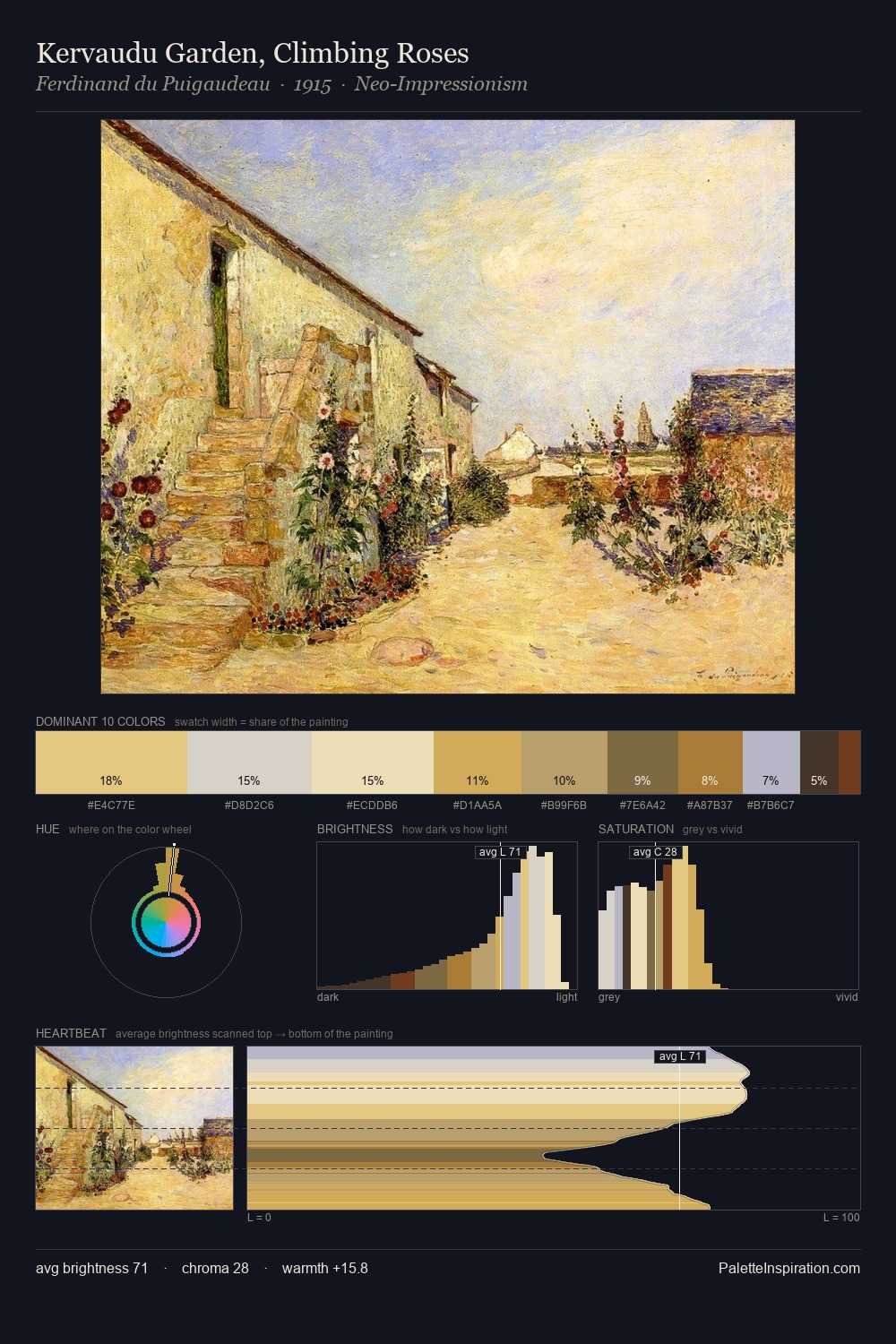
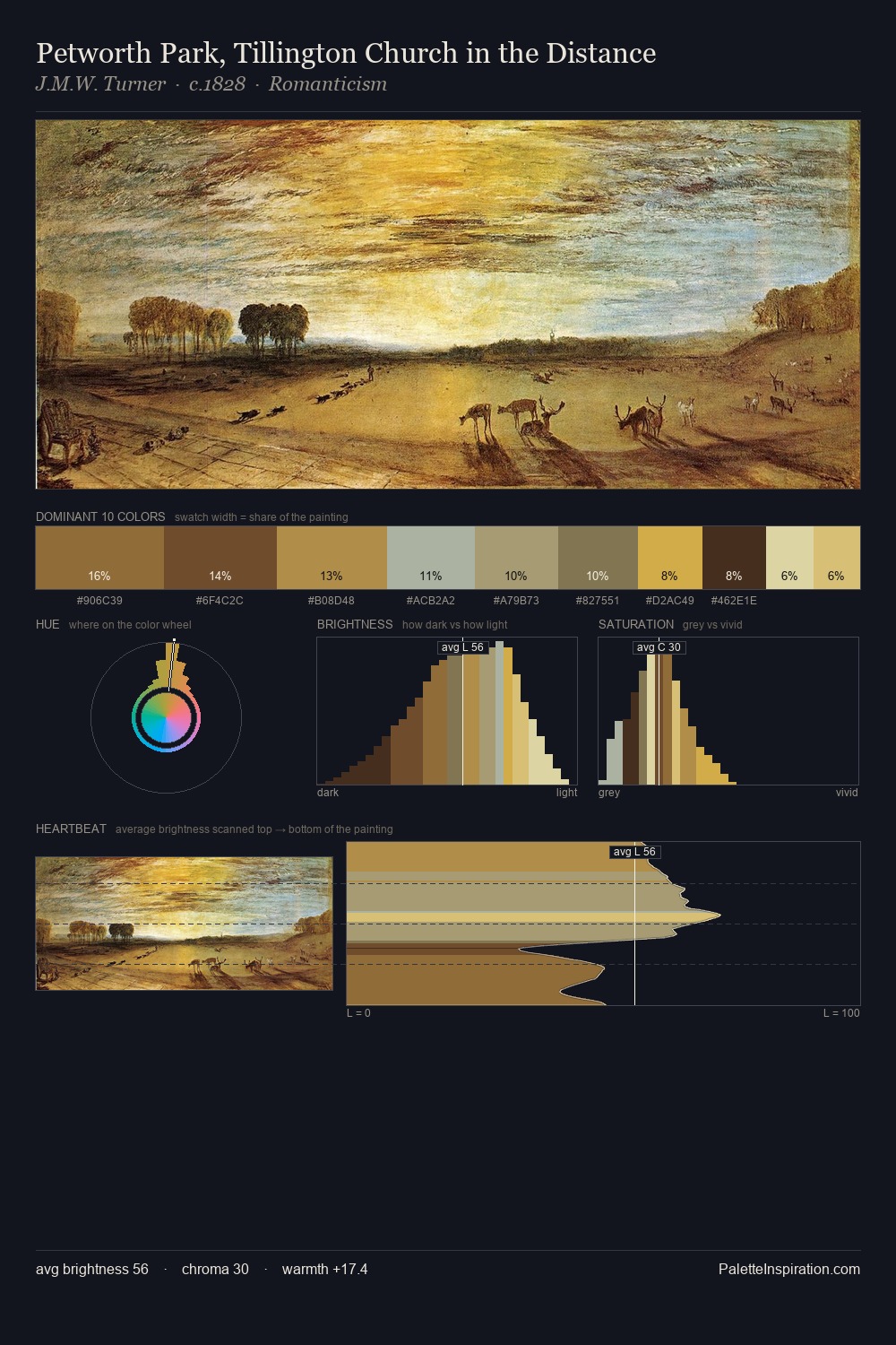
Elias Pieter van Bommel Palette 1

Palette Analysis
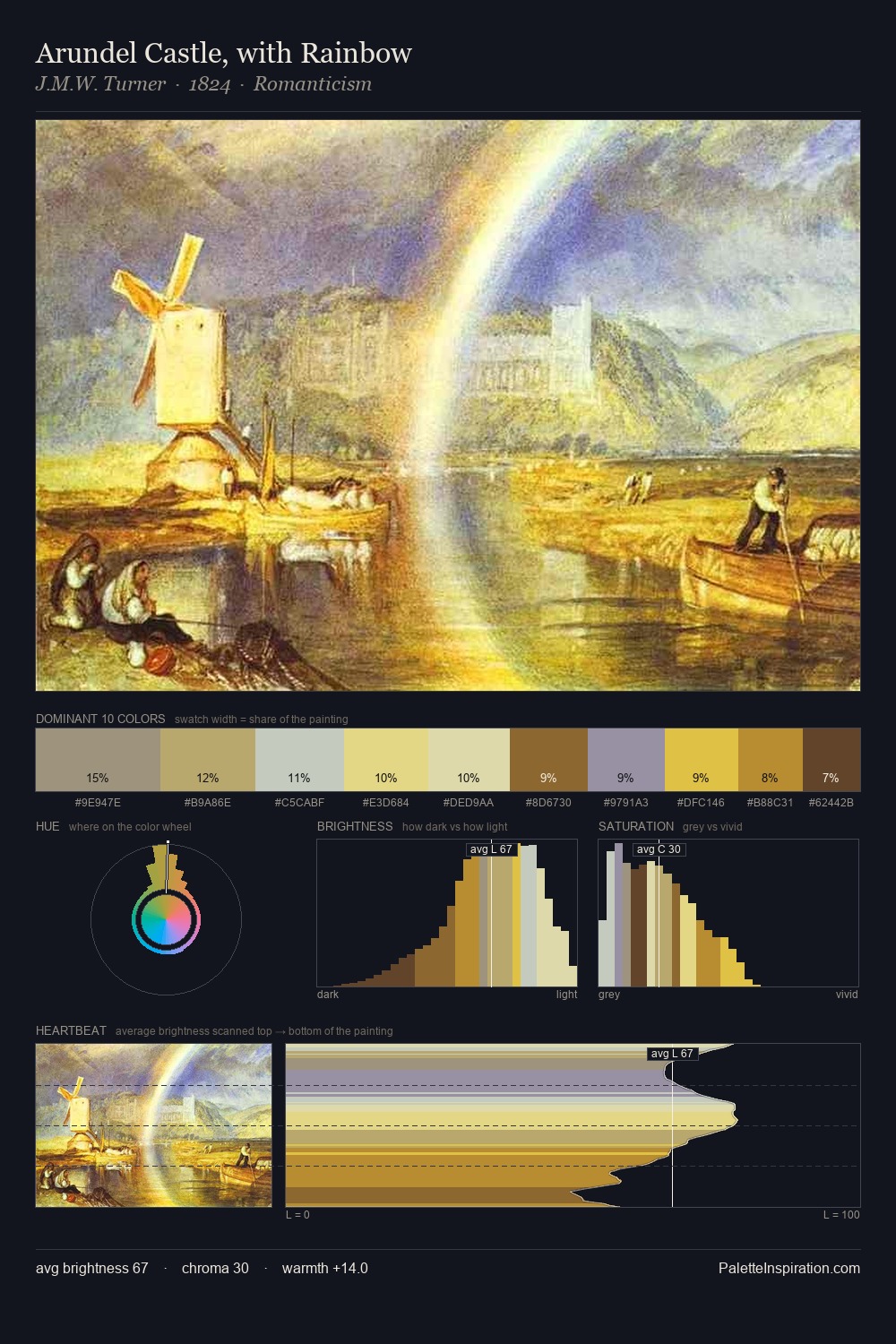
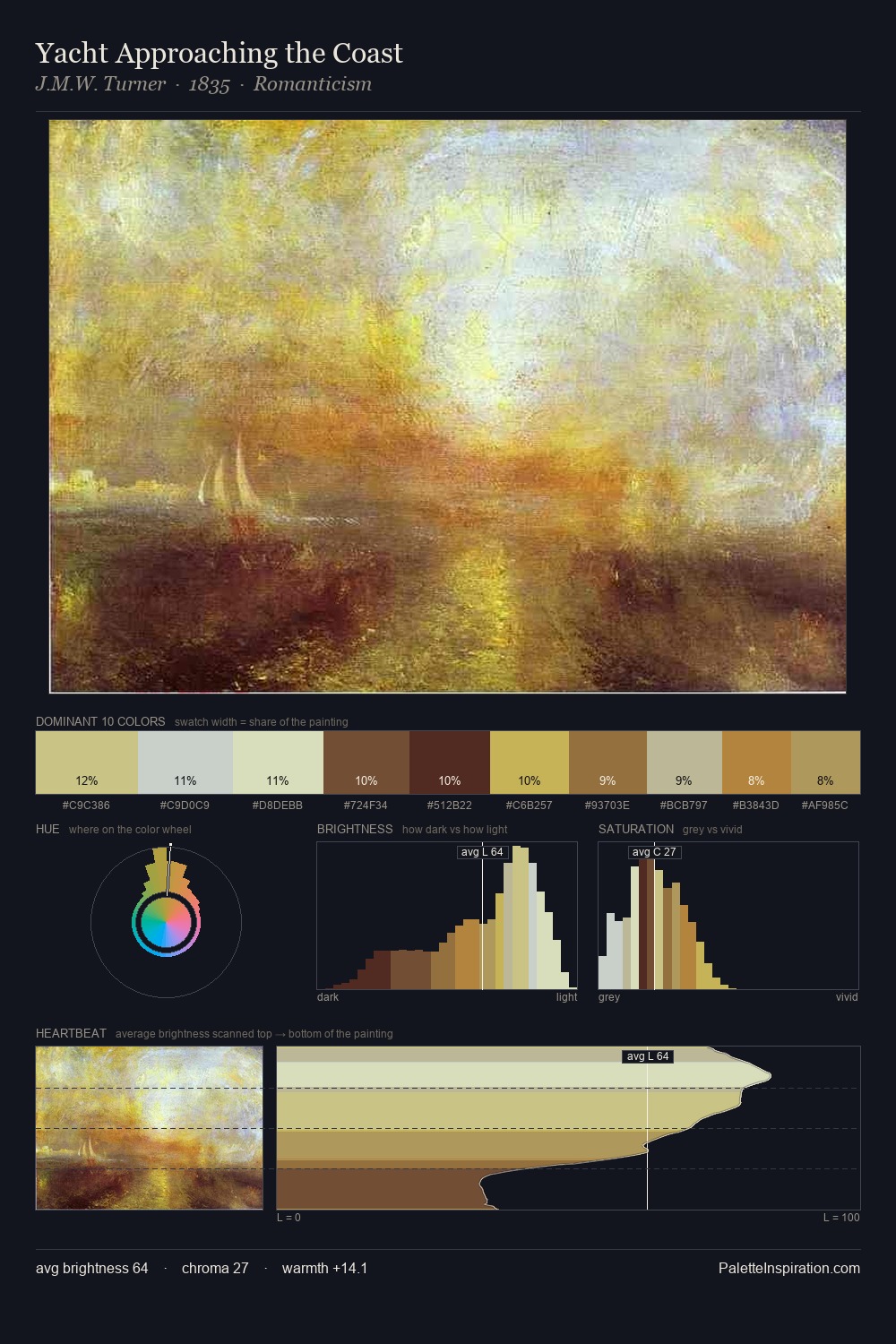
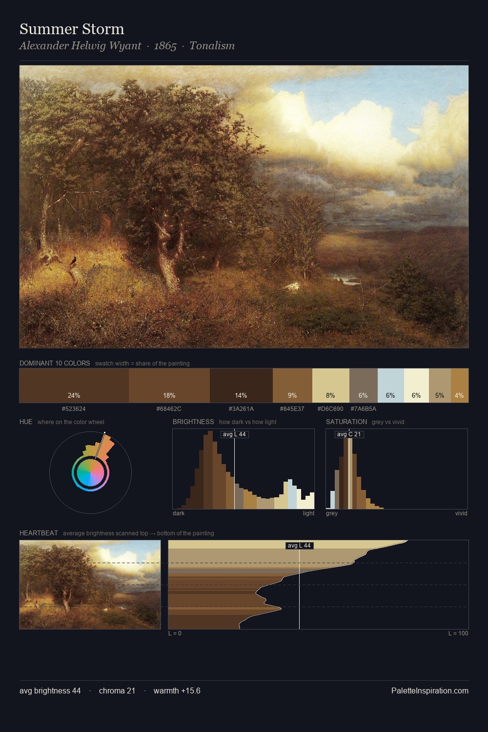
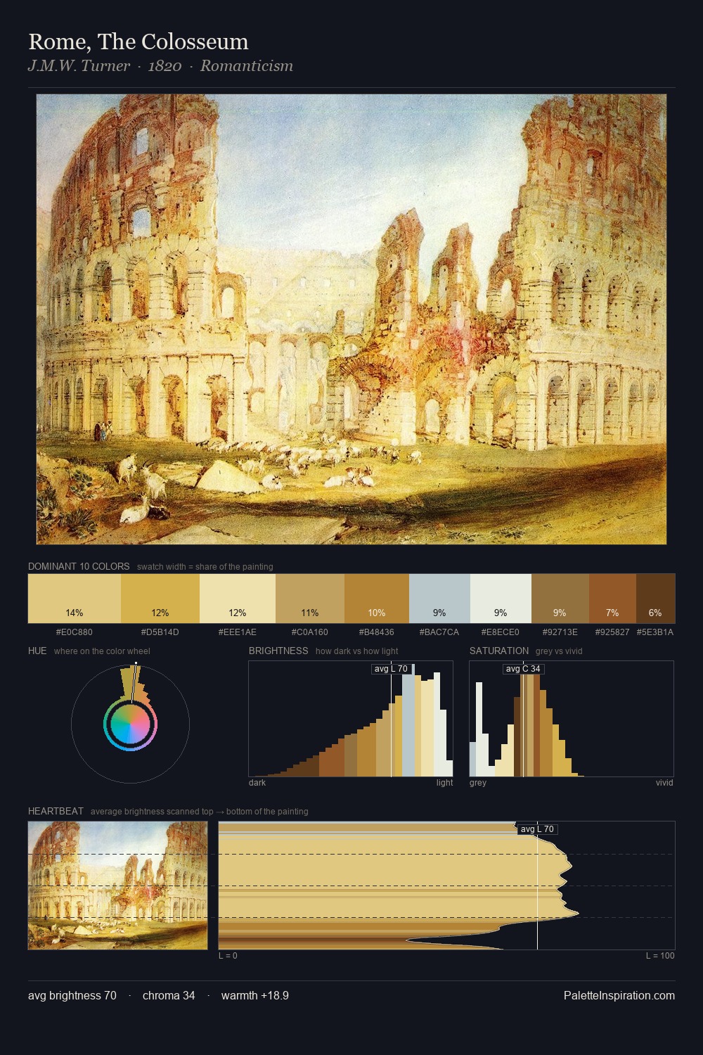
Elias Pieter van Bommel is strongly light-biased - shadow is suggested rather than declared. Temperature is cool-dominant, with blue and green families claiming the largest areas. Mid-saturation across the board: the palette has colour character without chromatic excess. At 4.4%, #B8843E carries the palette's sharpest chromatic charge: an accent that earns its place precisely because it is withheld. From deepest dark to palest light, the palette traverses 57 units of the value scale - a span that creates natural depth. High luminosity and cool temperature suggest the plein-air condition: unfiltered daylight and open sky. Elias Pieter van Bommel's palette 1 carries its own internal logic while remaining in conversation with the artist's broader colour intelligence.
Example use cases
- publishing
- corporate identity
- consumer apps
- hospitality
- design agencies
I Love This!
Copy, export, or download for your project