Kazimir Malevich Palette 3

Palette Analysis
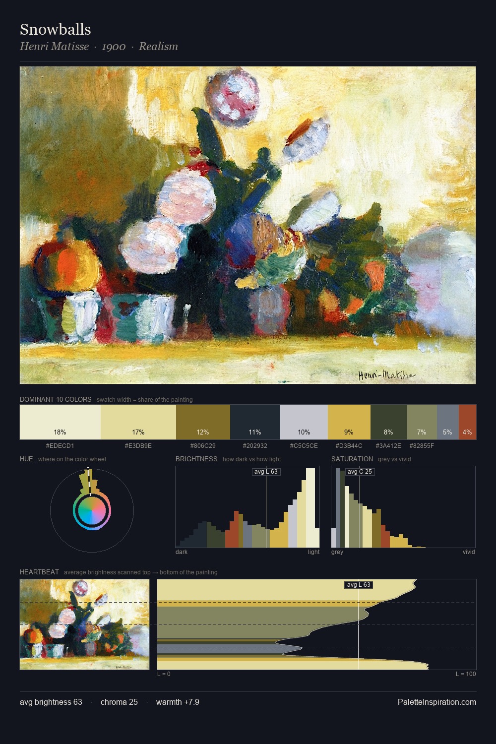
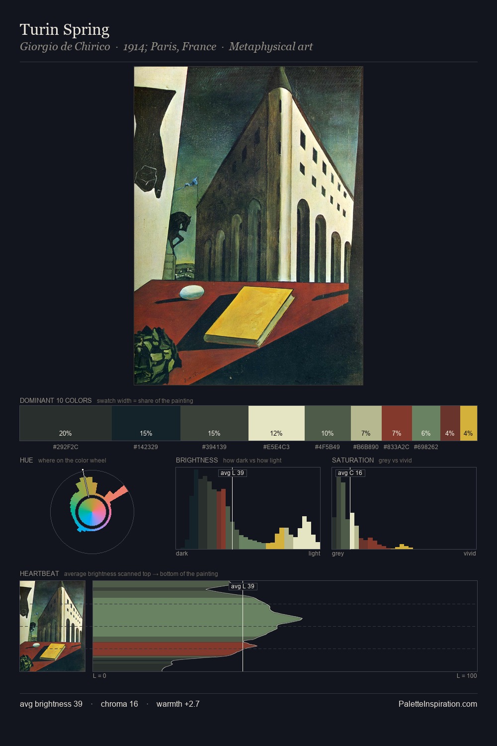
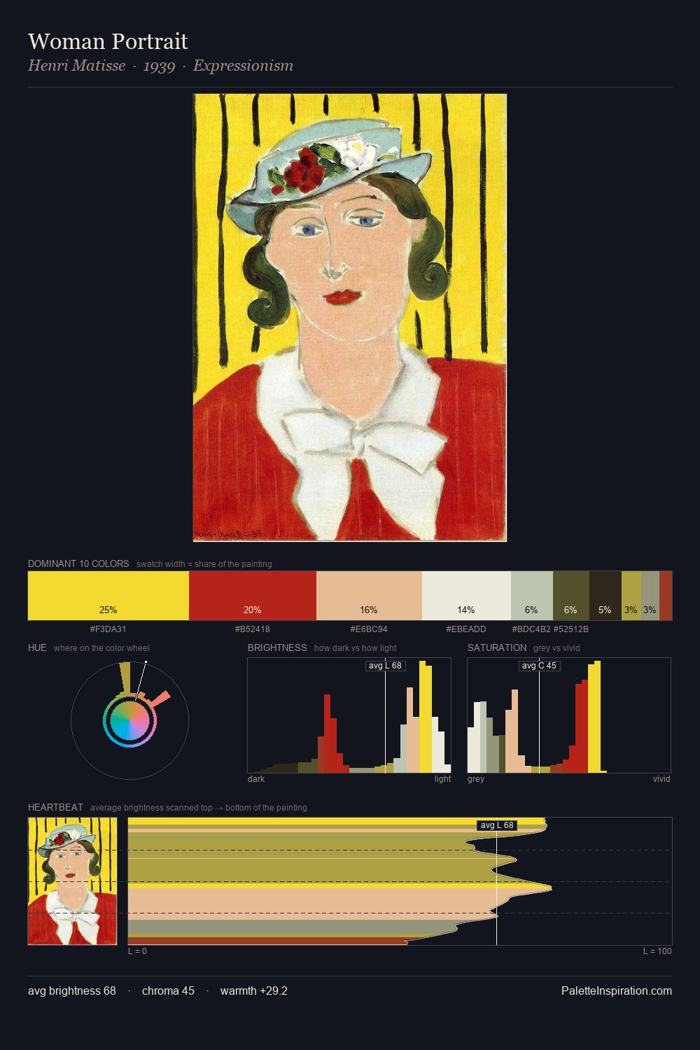
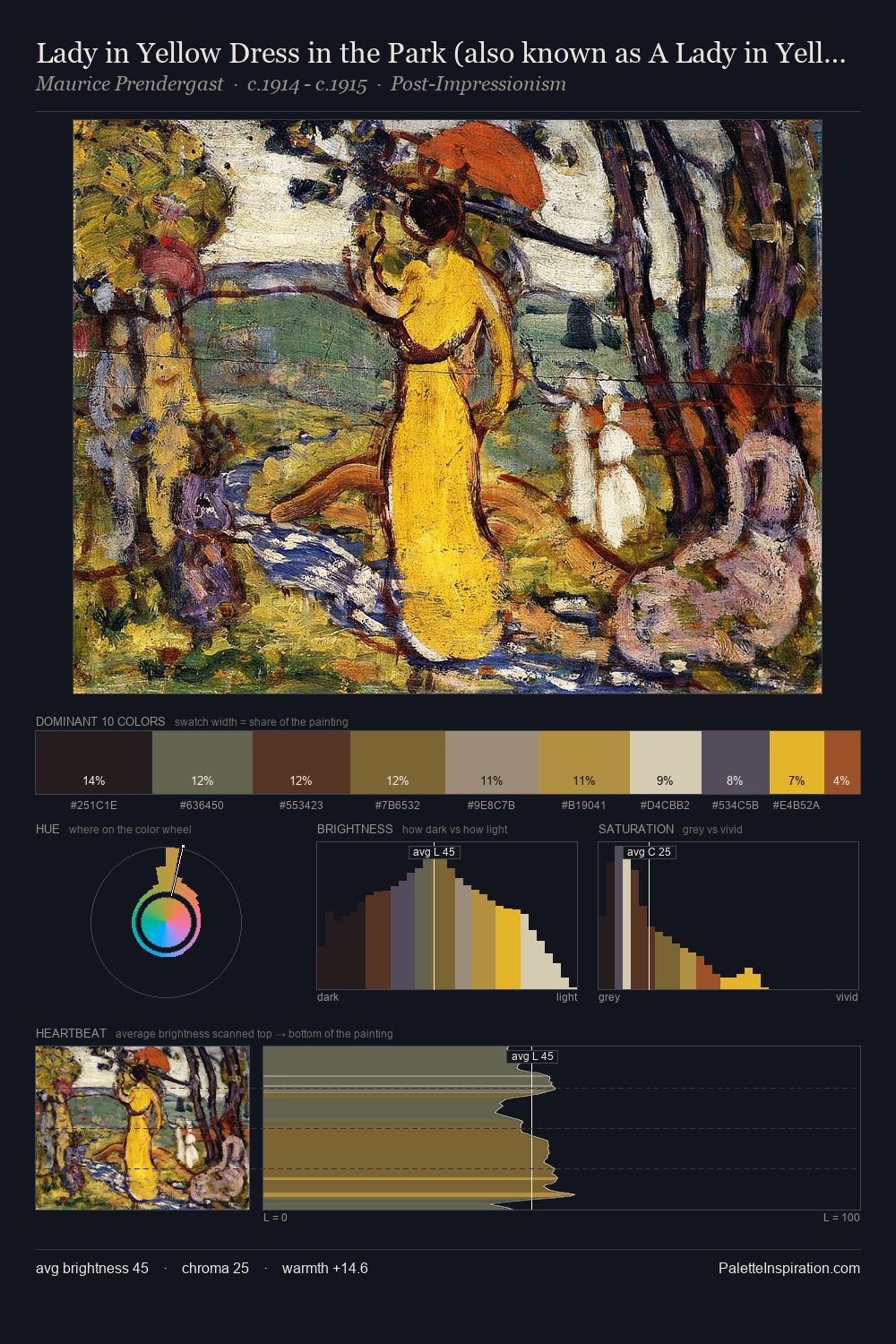
Values in Kazimir Malevich tilt decisively toward white, giving the palette its luminous character. Cool tones set the register here - the blues and greens easily outweigh any warm accents. Chroma hovers near zero; colour declares itself through subtle shifts in hue rather than outright saturation. 40.4% of the palette belongs to #D5D3B9, a concentration that makes it the unmistakable visual centre. #9C371F functions as the palette's exclamation mark: highest chroma, lowest percentage (3.1%). A value spread of 66 units gives the palette both depth and air - shadows are genuinely dark, lights genuinely light. The mid-to-high key, cool bias, and moderate chroma point to outdoor observation - sky and diffused daylight as the dominant light source. Kazimir Malevich's palette 3 carries its own internal logic while remaining in conversation with the artist's broader colour intelligence.
Example use cases
- publishing
- corporate identity
- consumer apps
- hospitality
- design agencies
I Love This!
Copy, export, or download for your project