Kazimir Malevich Palette 2

Palette Analysis
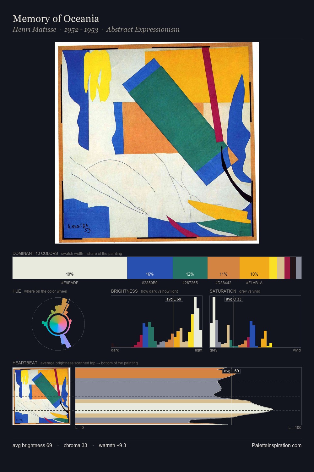
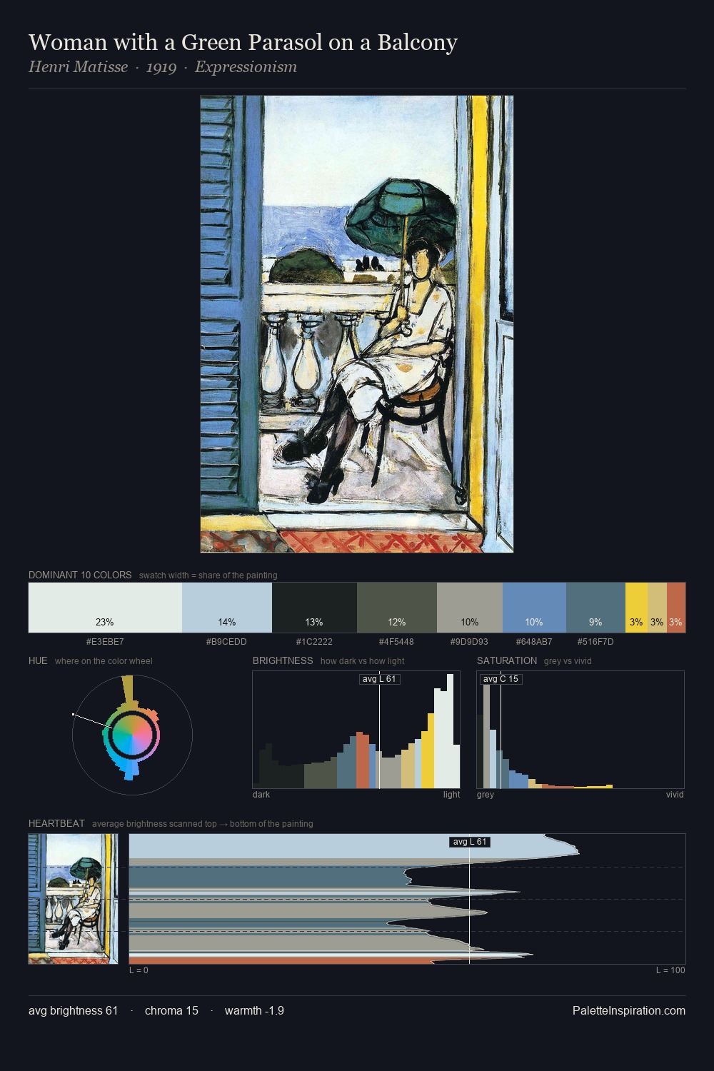
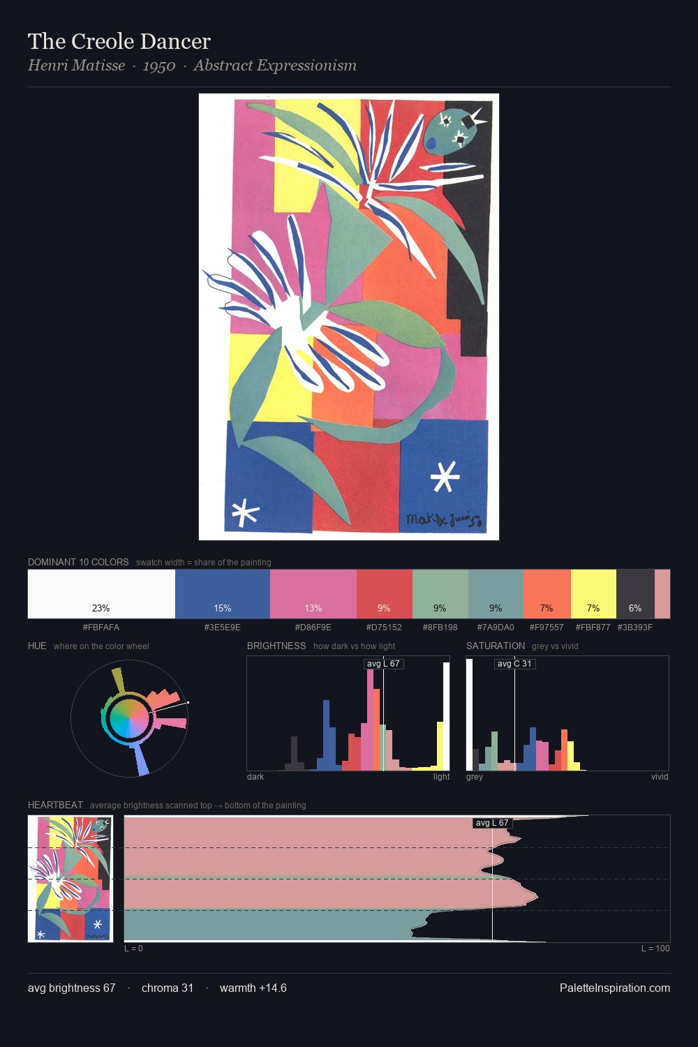
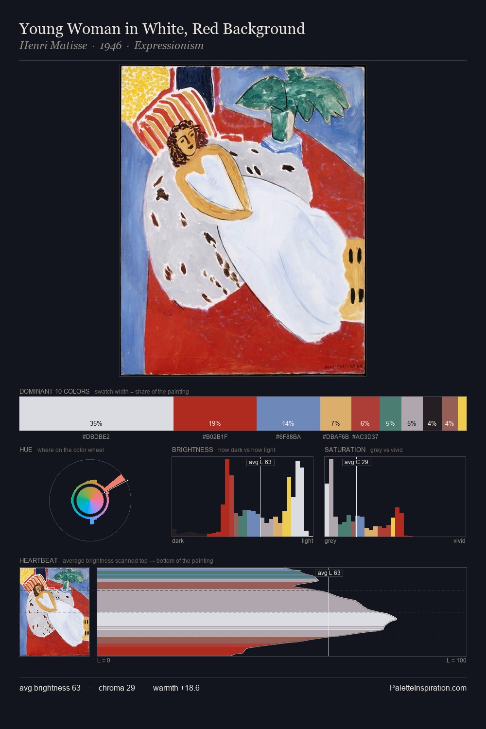
Kazimir Malevich works in the upper reaches of the value scale, creating an atmosphere of brightness and expansiveness. Kazimir Malevich tilts toward cool - blues and silver-greys carry the structural weight. Saturation is deliberately withheld - the beauty here lies in the near-monochromatic gradations rather than colour difference. The dominant colour, #EBE3D4, takes 58.5% of the total area, establishing the overall mood before any other hue is introduced. #FBE71C functions as the palette's exclamation mark: highest chroma, lowest percentage (0.8%). 73 units of value range underpin the palette's structural clarity: the eye always knows where light falls. The mid-to-high key, cool bias, and moderate chroma point to outdoor observation - sky and diffused daylight as the dominant light source. Kazimir Malevich's palette 2 carries its own internal logic while remaining in conversation with the artist's broader colour intelligence.
Example use cases
- ceramics & pottery
- boutique hospitality
- menswear
- heritage food brands
- craft & artisan brands
I Love This!
Copy, export, or download for your project