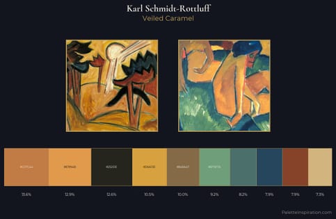
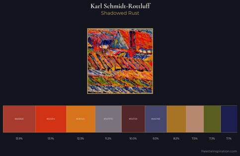
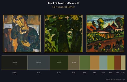
Karl Schmidt-Rottluff Master Palette
Muted Caramel
Muted Deliberately desaturated - chroma pulled toward gray, the restraint of tonal painting.
Caramel Warm mid-brown - the color of cooked sugar, smooth and amber-toned.
Palette Analysis
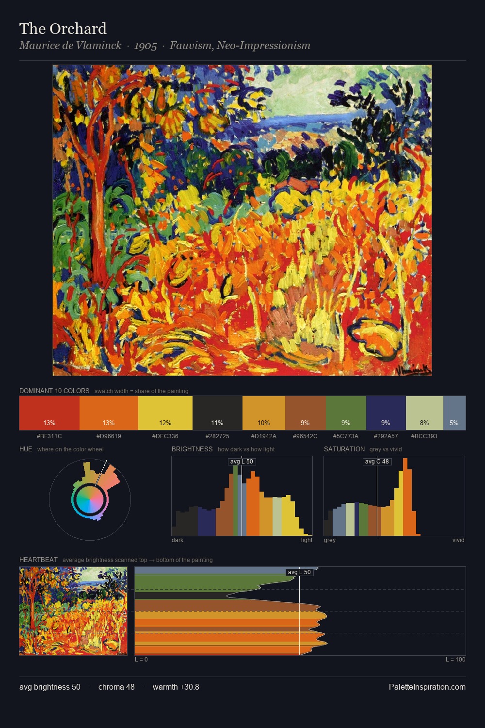
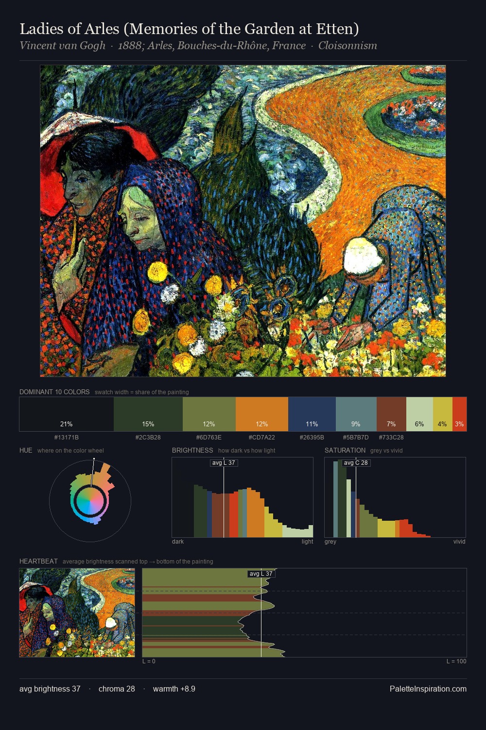
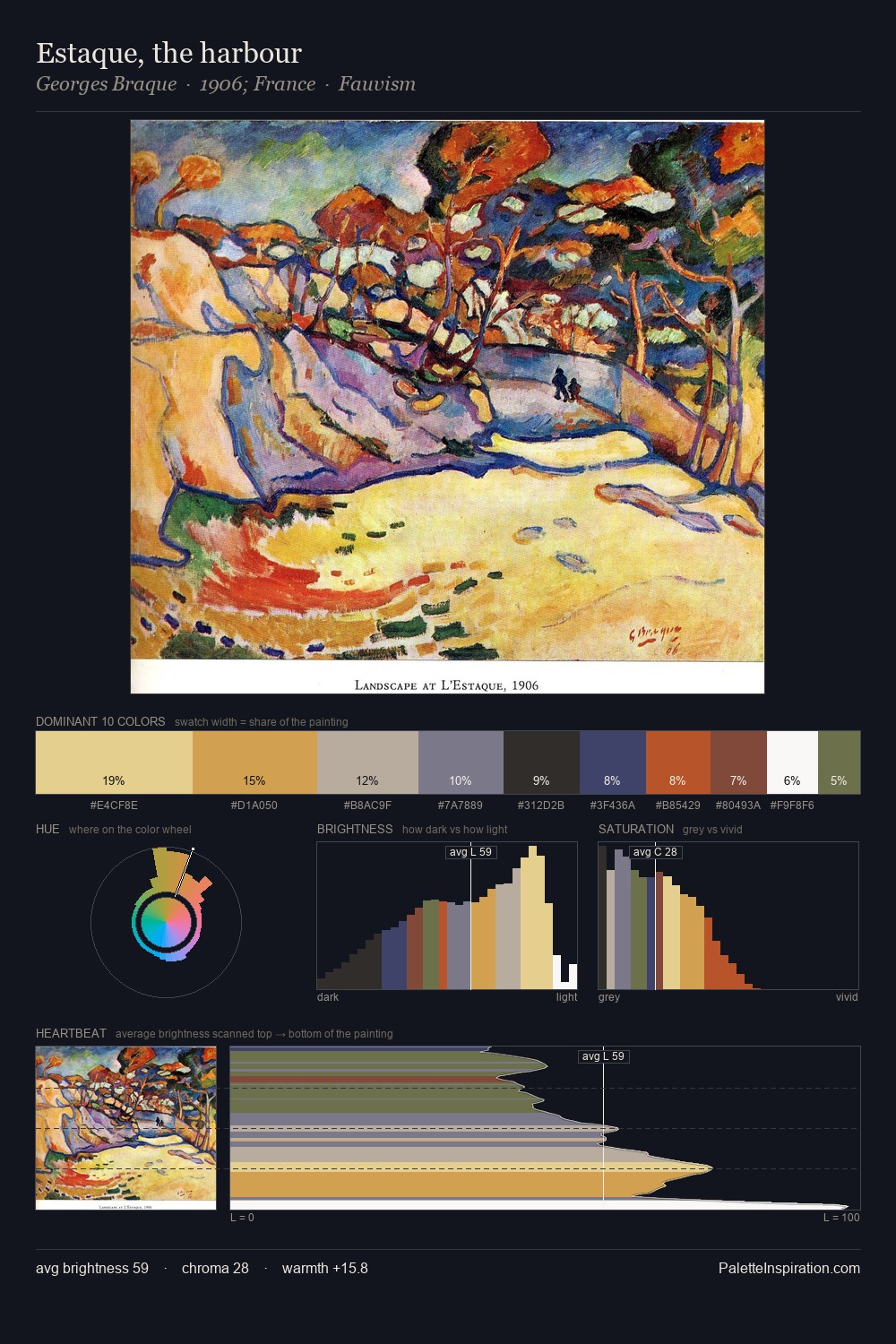
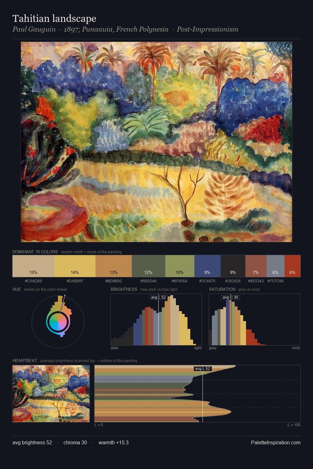
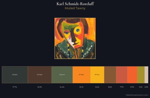
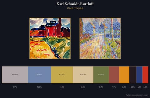
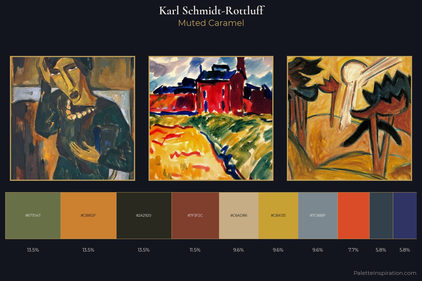
Karl Schmidt-Rottluff distributes its values across the middle register, creating harmony without high contrast. Blues and teal-greys govern the palette, lending it an aquatic or atmospheric quality. Mid-range chroma keeps the palette grounded - colourful but not strident. #DA4C27 functions as the palette's exclamation mark: highest chroma, lowest percentage (7.7%). At 48 units across the value scale, the palette keeps contrast readable without letting it dominate. High luminosity and cool temperature suggest the plein-air condition: unfiltered daylight and open sky. Taken together, these qualities constitute Karl Schmidt-Rottluff's chromatic voice - distinctive enough to be read across an entire body of work.
Example use cases
- food packaging
- leather accessories
- travel & outdoor
- natural cosmetics
- interior design
I Love This!
Use This Palette
Copy, export, or download for your project
Copy, export, or download for your project
Copy:
Download:
Share: