Karl Schmidt-Rottluff Palette 3
Palette Analysis
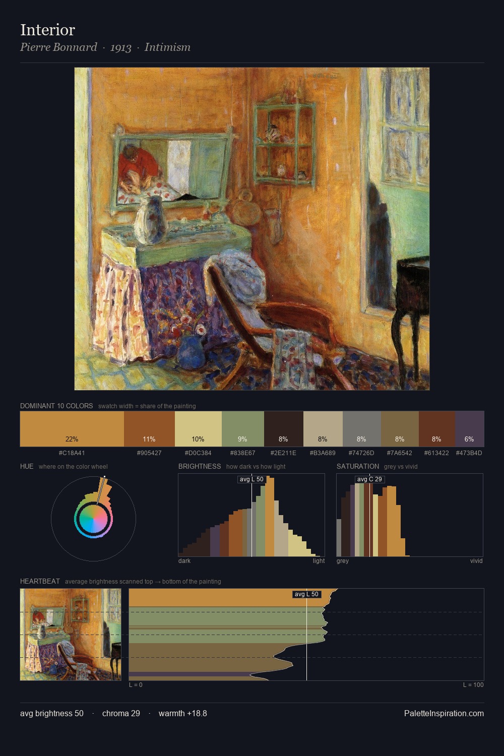
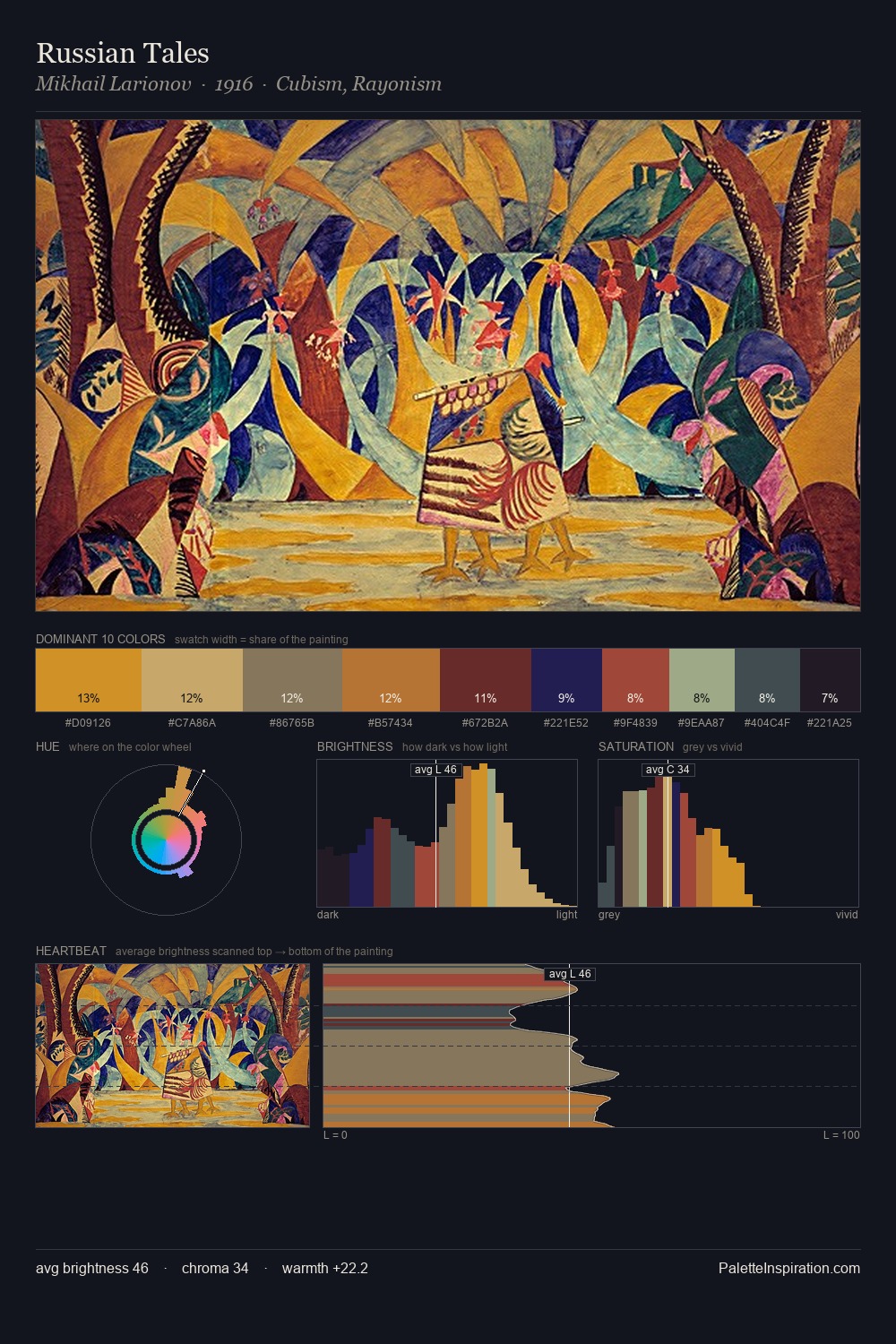
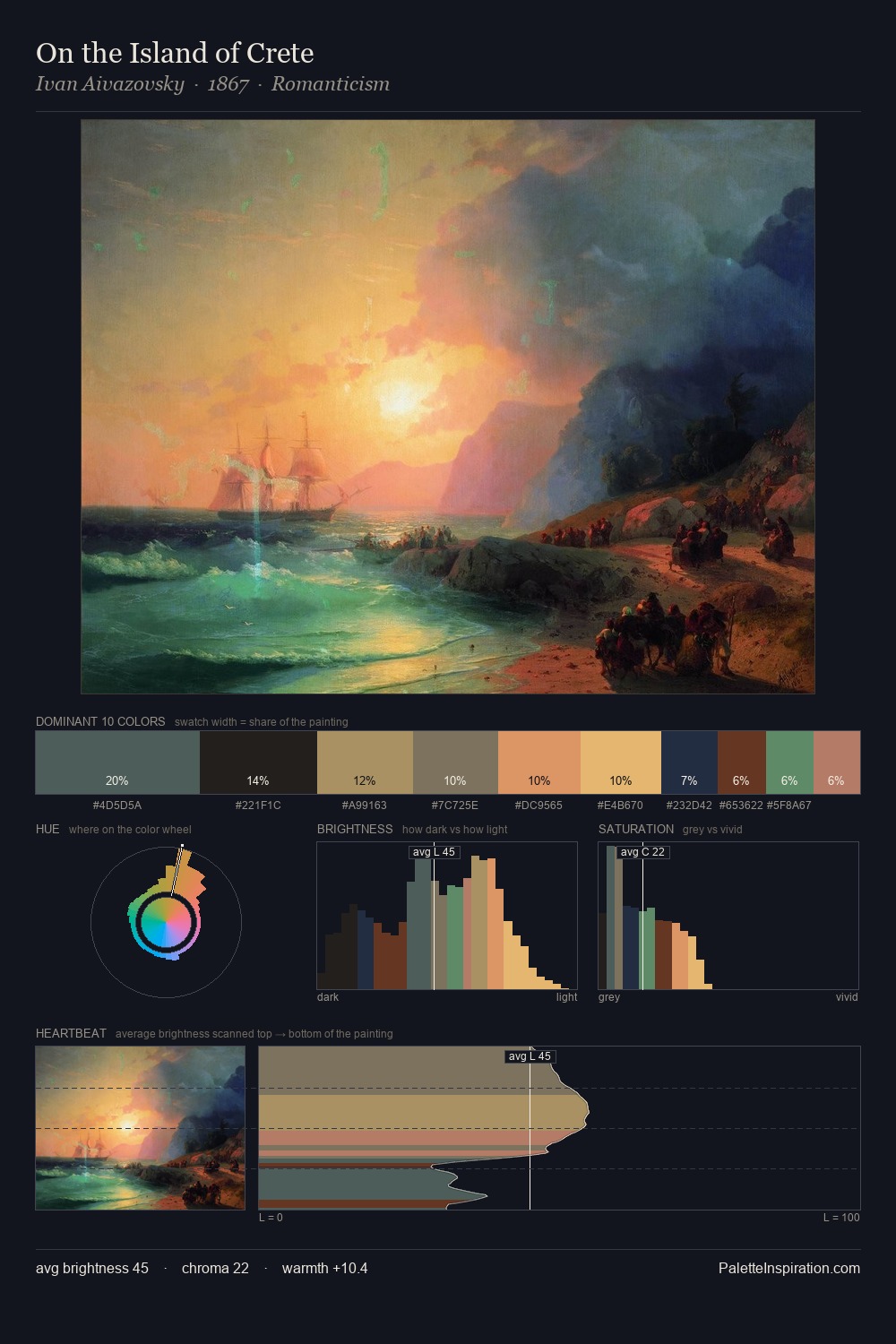
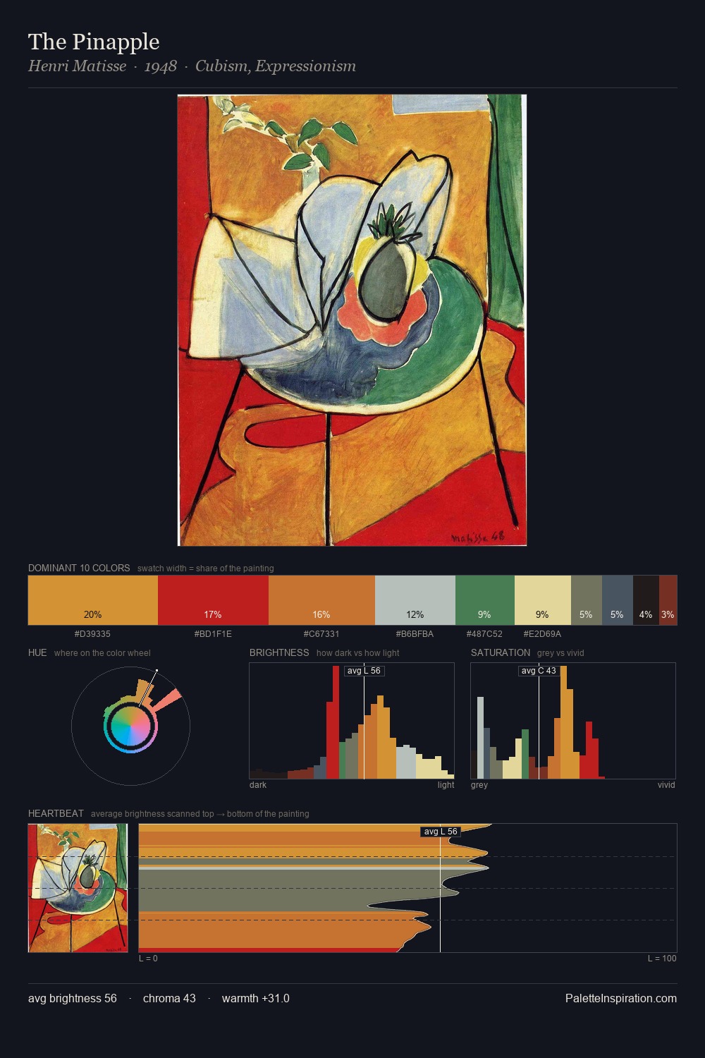
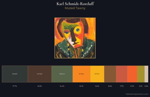
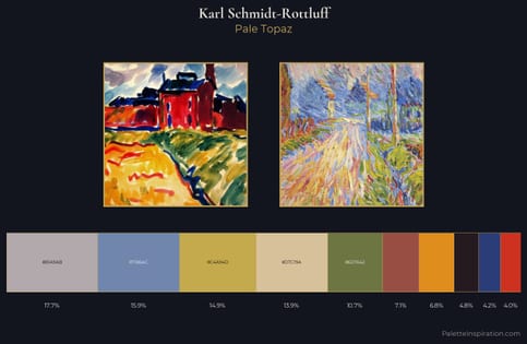
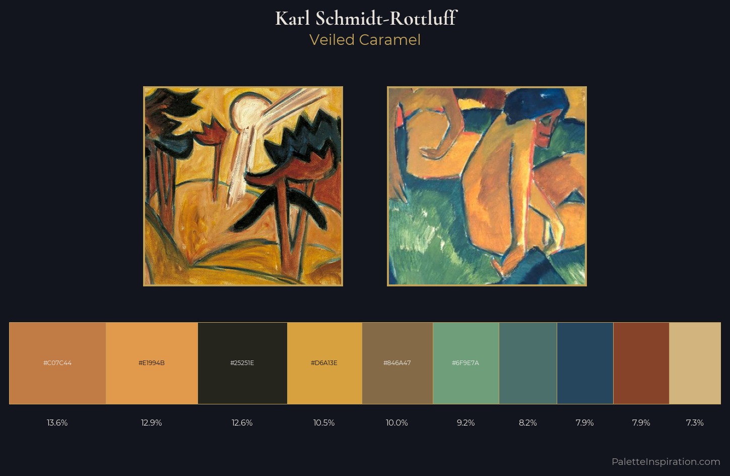
Karl Schmidt-Rottluff keeps values measured and balanced, a hallmark of tonal restraint. Warm and cool are kept in productive tension, creating the kind of chromatic harmony that sustains the eye. Colours are neither washed out nor blazing; they occupy the productive middle ground of the chroma scale. The saturated accent, #D2B47F, registers at 7.3% - sparse enough to feel like a deliberate surprise. 52 units of value spread create a palette that is varied but unified - contrast in the service of harmony. The combination of mid-to-high key, balanced temperature, and elevated chroma is characteristic of Impressionist observation: light broken into its component hues. Palette 3 sits within the larger chromatic argument that Karl Schmidt-Rottluff's complete body of work advances.
Example use cases
- ceramics & pottery
- boutique hospitality
- menswear
- heritage food brands
- craft & artisan brands
I Love This!
Copy, export, or download for your project